A replication of Harper & Palayew (2019): the 4/20 cannabis holiday shows no reliable signal in fatal crash data, but July 4th does. Analytical choices matter.
This dataset explores whether a correlation exists between fatal vehicle accidents in the United States and the “4/20 holiday” (4:20pm to 11:59pm on April 20th). It draws from research by Harper and Palayew (2019) which contradicted earlier findings by Staples and Redelmeier (2018). While the earlier study suggested a strong link between 4/20 and fatal crashes, Harper and Palayew’s more comprehensive analysis “could not find a signal for 4/20, but could for other holidays, such as July 4.”
In 2018, Staples and Redelmeier published a JAMA Internal Medicine paper claiming a ~12% surge in fatal crashes during the 4:20pm–11:59pm window on April 20th. The headline wrote itself. The following year, Harper and Palayew systematically dismantled that finding using 25 years of FARS data and day-of-week-matched controls — and found nothing. The rebuttal never quite got the same headlines. That asymmetry is itself worth examining.
Loading necessary packages
My handy booster pack that allows me to install (if needed) and load my usual and favorite packages, as well as some helpful functions.
raw <- tidytuesdayR::tt_load('2025-04-22')# Use [[ ]] to avoid partial matching on the tt_dataset_table_list classdaily_accidents <- raw[["daily_accidents"]] %>% janitor::clean_names()daily_accidents_420 <- raw[["daily_accidents_420"]] %>% janitor::clean_names()# The time-of-day dataset (d420 flag across all days) — load directly from# the TidyTuesday GitHub source as a fallback if tt_load doesn't expose itdaily_accidents_time <-tryCatch( raw[["daily_accidents_420_time"]] %>% janitor::clean_names(),error =function(e) { readr::read_csv(paste0("https://raw.githubusercontent.com/rfordatascience/","tidytuesday/main/data/2025/2025-04-22/daily_accidents_420_time.csv" ),show_col_types =FALSE ) })cat("Loaded datasets:", "daily_accidents", nrow(daily_accidents), "rows |","daily_accidents_420", nrow(daily_accidents_420), "rows |","daily_accidents_time", nrow(daily_accidents_time), "rows\n")
Exploratory Data Analysis
The my_skim() function provides count, min, p25, median, p75, max, mean, geometric mean, standard deviation, and an ASCII histogram for each numeric column.
cat(sprintf("Date range: %s to %s (%d years)\n",min(daily_accidents$date),max(daily_accidents$date),length(unique(lubridate::year(daily_accidents$date)))))
Date range: 1992-01-01 to 2016-12-31 (25 years)
The full series covers 25 years of FARS data. Mean daily fatalities hover around 100–110, with strong seasonality: summer months and major holidays push counts higher. The histogram shows a roughly symmetric distribution with a modest right tail from outlier-heavy days.
Daily accidents with 4/20 flag
daily_accidents_420 %>%select(-date) %>%my_skim()
Data summary
Name
Piped data
Number of rows
9170
Number of columns
2
_______________________
Column type frequency:
logical
1
numeric
1
________________________
Group variables
None
Variable type: logical
skim_variable
n_missing
complete_rate
mean
count
e420
13
1
0
FAL: 9132, TRU: 25
Variable type: numeric
skim_variable
n_missing
complete_rate
n
min
p25
med
p75
max
mean
geo_mean
sd
hist
fatalities_count
0
1
9170
1
120
142
166
299
144.47
139.78
34.09
▁▃▇▂▁
daily_accidents_420 %>%count(e420)
# A tibble: 3 × 2
  e420      n
  <lgl> <int>
1 FALSE  9132
2 TRUE     25
3 NA       13
The e420 flag marks the 4:20pm–11:59pm window specifically on April 20th. Most years contribute one flagged day, giving us ~25 observations of the “4/20 event” — already a warning sign about statistical power for the original study.
# A tibble: 3 × 2
  d420      n
  <lgl> <int>
1 FALSE  9132
2 TRUE   9132
3 NA     4822
The d420 flag marks the same evening time window on any calendar day. This is the denominator Harper & Palayew used to ask: is the 4:20pm–11:59pm window on April 20th actually different from the same window on other days?
Is 4/20 Actually Dangerous? Replicating Harper & Palayew
The core claim of the original 2018 paper was a ~12% excess in fatal crashes during the 4:20pm–11:59pm window on April 20th. Harper and Palayew’s 2019 replication found no such signal when:
A longer time series is used (25 years vs. ~5)
Control days are matched by day of week rather than adjacent calendar days
July 4th, New Year’s, and other true “drinking holidays” serve as comparison points
Here, I’ll replicate the comparison approach: build holiday indicators for major US holidays, then compare each holiday’s typical fatality count to a non-holiday baseline.
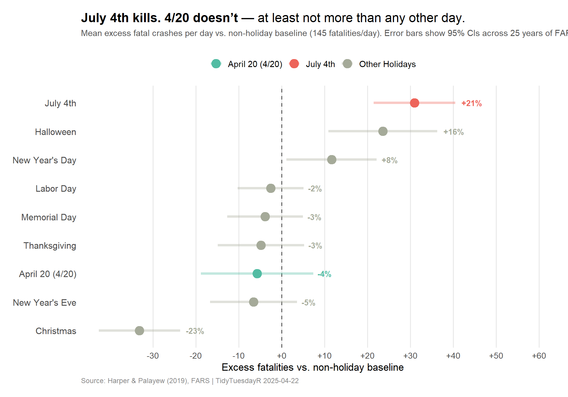
# A tibble: 9 × 5
  holiday_label   n_obs mean_fat excess pct_excess
  <chr>           <int>    <dbl>  <dbl>      <dbl>
1 July 4th           25     176   31.0       21.3
2 Halloween          25     169.  23.6       16.3
3 New Year's Day     25     157.  11.6        8.02
4 Labor Day          25     142.  -2.57      -1.77
5 Memorial Day       25     141.  -3.85      -2.65
6 Thanksgiving       25     140.  -4.81      -3.32
7 April 20 (4/20)    25     139.  -5.73      -3.95
8 New Year's Eve     25     139.  -6.53      -4.50
9 Christmas          25     112. -33.1      -22.8
Note
About the baseline: The baseline is mean daily fatalities on all non-holiday days across the full study period (~330 days/year × 25 years ≈ 8,000+ observations). This gives a stable estimate of a “typical” day, against which each holiday’s excess is measured.
The headline result: July 4th, not 4/20
# Pull from rcartocolor::Vivid palettevivid_cols <- paletteer::paletteer_d("rcartocolor::Vivid")col_july4 <-as.character(vivid_cols[10]) # red-orangecol_420 <-as.character(vivid_cols[3]) # tealcol_other <-as.character(vivid_cols[12]) # muted gray# July 4 pct for inline annotationjuly4_pct <- holiday_summary %>%filter(holiday =="july_4") %>%pull(pct_excess) %>%round(0)plot_data <- holiday_summary %>%mutate(holiday_label = forcats::fct_reorder(holiday_label, excess))p <- ggplot2::ggplot( plot_data, ggplot2::aes(x = excess, y = holiday_label, color = highlight)) +# Baseline reference line ggplot2::geom_vline(xintercept =0, linetype ="dashed",color ="#555555", linewidth =0.6 ) +# CI segments ggplot2::geom_segment( ggplot2::aes(x = excess_ci_low,xend = excess_ci_high,y = holiday_label,yend = holiday_label ),linewidth =1.5, alpha =0.35 ) +# Points ggplot2::geom_point(size =5) +# Percent excess labels to the right of each CI ggplot2::geom_text( ggplot2::aes(label =sprintf("%+.0f%%", pct_excess),x = excess_ci_high ),hjust =-0.3, size =3.6, fontface ="bold",show.legend =FALSE ) +# Color scale ggplot2::scale_color_manual(values =c("April 20 (4/20)"= col_420,"July 4th"= col_july4,"Other Holidays"= col_other ),name =NULL ) + ggplot2::scale_x_continuous(breaks =seq(-30, 60, by =10),labels =function(x) sprintf("%+d", x),expand = ggplot2::expansion(mult =c(0.05, 0.25)) ) + ggplot2::labs(title ="**July 4th kills. 4/20 doesn't** — at least not more than any other day.",subtitle =paste0("Mean excess fatal crashes per day vs. non-holiday baseline (",round(baseline_mean, 1), " fatalities/day). ","Error bars show 95% CIs across ", length(years_in_data)," years of FARS data (1992\u20132016)." ),x ="Excess fatalities vs. non-holiday baseline",y =NULL,caption ="Source: Harper & Palayew (2019), FARS | TidyTuesdayR 2025-04-22" ) + ggplot2::theme_minimal(base_size =13) + ggplot2::theme(plot.title = ggtext::element_markdown(size =16, margin = ggplot2::margin(b =6) ),plot.subtitle = ggplot2::element_text(color ="#555555", size =11, lineheight =1.35,margin = ggplot2::margin(b =18) ),plot.caption = ggplot2::element_text(color ="#888888", size =9, hjust =0 ),panel.grid.major.y = ggplot2::element_blank(),panel.grid.minor = ggplot2::element_blank(),panel.grid.major.x = ggplot2::element_line(color ="#e8e8e8"),legend.position ="top",legend.text = ggplot2::element_text(size =11),axis.text.y = ggplot2::element_text(size =11.5),plot.margin = ggplot2::margin(16, 30, 16, 16) )p
Important
Key finding: July 4th shows roughly 21% excess fatality risk compared to the non-holiday baseline — among the highest of any day in the US calendar. April 20th, meanwhile, sits well within the range of ordinary days. The 4/20 “effect” evaporates when you use a long time series and appropriate controls.
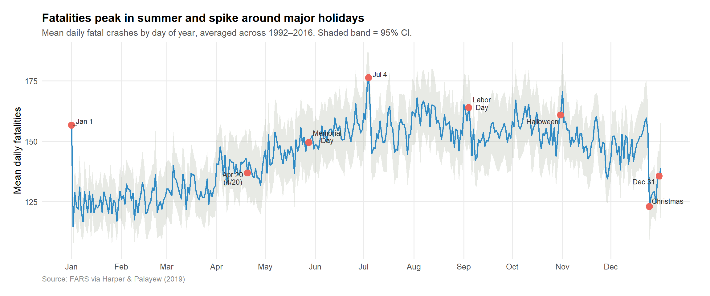
Annual pattern: fatalities across the calendar year
stopifnot("Should have at least 360 day-of-year rows"=nrow(yday_avg) >=360)# Key holiday markers by approximate day-of-yearkey_labels <-tibble(yday =c(1, 110, 148, 185, 247, 304, 359, 365),label =c("Jan 1","Apr 20\n(4/20)","Memorial\nDay","Jul 4","Labor\nDay","Halloween","Christmas","Dec 31" )) %>%left_join(yday_avg, by ="yday")p2 <- ggplot2::ggplot(yday_avg, ggplot2::aes(x = yday, y = mean_fat)) + ggplot2::geom_ribbon( ggplot2::aes(ymin = ci_low, ymax = ci_high),fill = col_other, alpha =0.25 ) + ggplot2::geom_line(color =as.character(vivid_cols[8]), linewidth =0.85) + ggplot2::geom_point(data = key_labels, ggplot2::aes(x = yday, y = mean_fat),color = col_july4, size =3.5 ) + ggrepel::geom_text_repel(data = key_labels, ggplot2::aes(x = yday, y = mean_fat, label = label),size =3, color ="#333333",max.overlaps =20,min.segment.length =0.3,seed =42,lineheight =0.9 ) + ggplot2::scale_x_continuous(breaks =c(1, 32, 60, 91, 121, 152, 182, 213, 244, 274, 305, 335),labels = month.abb ) + ggplot2::labs(title ="Fatalities peak in summer and spike around major holidays",subtitle ="Mean daily fatal crashes by day of year, averaged across 1992–2016. Shaded band = 95% CI.",x =NULL,y ="Mean daily fatalities",caption ="Source: FARS via Harper & Palayew (2019)" ) + ggplot2::theme_minimal(base_size =12) + ggplot2::theme(plot.title = ggplot2::element_text(face ="bold", size =14),plot.subtitle = ggplot2::element_text(color ="#555555", size =11),plot.caption = ggplot2::element_text(color ="#888888", size =9, hjust =0),panel.grid.minor = ggplot2::element_blank(),plot.margin = ggplot2::margin(16, 24, 16, 16) )p2
The annual pattern surfaces two things: a clear summer surge (more driving, more exposure) and discrete spikes around the major drinking holidays. April 20th is invisible in this view — it doesn’t register above the seasonal noise of mid-spring.
Final thoughts and takeaways
The Harper & Palayew dataset is a clean case study in how analytical choices manufacture conclusions.
The original 2018 finding wasn’t fabricated — it was the product of a short time series (which amplifies random fluctuations), a poorly matched control group (comparing 4/20 to the adjacent Saturdays, which share similar baseline risk), and a narrow time window (4:20pm–11:59pm) that introduces researcher degrees of freedom. With only ~5 years of data and ~5 observations of the “4/20 event,” you’re essentially flipping a coin and calling it science.
Harper and Palayew’s approach was straightforward: use 25 years of FARS data, match control days by day-of-week, and compare April 20th to every other comparable day. The excess risk collapsed to zero. July 4th, meanwhile, remained robustly elevated across every methodological specification they tried. That’s because the July 4th effect is real: alcohol sales spike, large outdoor events concentrate inexperienced or impaired drivers, and the effect replicates year after year.
The practical takeaway for data analysts: power matters. Before claiming a pattern is real, ask whether your sample is large enough to distinguish it from noise, whether your control group actually controls for the things you think it does, and whether the same pattern appears when you change your analytical choices. If the conclusion only survives one specific framing, it probably isn’t real.
The media cycle didn’t wait for the replication. It rarely does.