How vaccination drove measles toward elimination—and why it’s staging a comeback. A look at WHO surveillance data across six world regions from 1980 to the present.
Measles is one of the most contagious diseases known to science—a single infected person can spread it to 12–18 others. Before the measles vaccine became widely available in the 1960s, nearly every child caught the disease. Coordinated vaccination campaigns collapsed global case counts by more than 99%. But measles hasn’t gone away. Gaps in coverage—driven by conflict, access barriers, and vaccine hesitancy—have allowed the virus to stage a alarming comeback in recent years.
Loading necessary packages
My handy booster pack that allows me to install (if needed) and load my usual and favorite packages, as well as some helpful functions.
---- Compiling #TidyTuesday Information for 2025-06-24 ----
--- There are 2 files available ---


── Downloading files ───────────────────────────────────────────────────────────

  1 of 2: "cases_month.csv"
  2 of 2: "cases_year.csv"
# Inspect what datasets are availablecat("Datasets in this week's TidyTuesday:\n")
Datasets in this week's TidyTuesday:
print(names(raw))
[1] "cases_month" "cases_year"
# Extract the annual dataset (cases_year has standard WHO region codes)measles <-if ("cases_year"%in%names(raw)) raw[["cases_year"]] else raw[[1]]# Discover the column structure before proceeding with any analysiscat("Column names:\n")
The my_skim() function profiles each column with counts, quantiles, mean, geometric mean, standard deviation, and an ASCII histogram.
Measles Dataset
# Drop columns that are purely identifiers or free-text before skimming# We'll keep quantitative and categorical columns of analytical interestmeasles_for_skim <- measles %>% janitor::clean_names() %>%# Drop any free-text notes or ISO codes that don't add distributional valueselect(-any_of(c("notes", "source", "url", "description")))my_skim(measles_for_skim)
# Identify the region column and year range# WHO regions are typically: AFRO, AMRO, EMRO, EURO, SEARO, WPROregion_col <-names(measles_clean)[grepl("region|who_region|region_code", names(measles_clean), ignore.case =TRUE)][1]year_col <-names(measles_clean)[grepl("^year$|^yr$", names(measles_clean), ignore.case =TRUE)][1]cases_col <-names(measles_clean)[grepl("case|reported", names(measles_clean), ignore.case =TRUE)][1]cat(sprintf("\nDetected columns — Region: %s | Year: %s | Cases: %s\n", region_col, year_col, cases_col))
Detected columns — Region: region | Year: year | Cases: total_suspected_measles_rubella_cases
# Count unique values in the region columnif (!is.na(region_col)) {cat("\nWHO region distribution:\n")print(measles_clean %>%count(.data[[region_col]], sort =TRUE))}
WHO region distribution:
# A tibble: 6 × 2
  region     n
  <chr>  <int>
1 EURO     678
2 AFRO     601
3 WPRO     341
4 AMRO     327
5 EMRO     286
6 SEARO    149
The EDA reveals the spine of this dataset: annual country-level measles surveillance records from WHO. The key analytical axes are WHO region (6 regions covering the globe), year (spanning multiple decades), and reported cases. Missingness tends to concentrate in smaller countries and earlier decades, where surveillance systems were less established—a limitation to keep in mind when interpreting historical trends.
Measles surveillance caveats
WHO reported case counts are based on national surveillance systems, which vary substantially in completeness. Countries with weak surveillance infrastructure systematically under-report cases. The true global burden has historically been estimated to be 10–20x higher than reported counts. Trends in reporting therefore reflect both actual disease dynamics and improving surveillance capacity over time.
The Rise, Fall, and Resurgence of Measles
Setting up the analytical datasets
# Work with the clean version and standardize column names# We'll use dynamic column references from EDA discovery abovemeasles_clean <- measles %>% janitor::clean_names()# Flexible column selection: try common WHO data column names# Adjust these if EDA above revealed different column namesget_col <-function(df, candidates) { match <-names(df)[names(df) %in% candidates][1]if (is.na(match)) {# Try partial match match <-names(df)[grepl(paste(candidates, collapse ="|"), names(df), ignore.case =TRUE)][1] } match}col_year <-get_col(measles_clean, c("year", "yr", "year_reported"))col_country <-get_col(measles_clean, c("country", "country_name", "name", "state_territory"))col_iso3 <-get_col(measles_clean, c("iso3", "iso_code", "iso3c", "country_code"))col_region <-get_col(measles_clean, c("who_region", "region", "who_region_code", "region_code"))col_cases <-get_col(measles_clean, c("cases", "reported_cases", "measles_cases", "total_cases", "measles_total"))col_incidence <-get_col(measles_clean, c("incidence", "incidence_rate", "rate_per_million", "cases_per_million", "measles_incidence_rate_per_1000000_total_population"))col_mcv1 <-get_col(measles_clean, c("mcv1", "mcv_1", "first_dose", "coverage_mcv1"))col_mcv2 <-get_col(measles_clean, c("mcv2", "mcv_2", "second_dose", "coverage_mcv2"))cat("Column mapping:\n")
# Top countries in the resurgence yeartop_countries_peak <- measles_std %>%filter(year == recent_peak_year) %>%arrange(desc(cases)) %>%head(15) %>%select(any_of(c("country", "who_region", "year", "cases")))cat(sprintf("\nTop countries in %d by reported cases:\n", recent_peak_year))
Top countries in 2019 by reported cases:
print(top_countries_peak)
# A tibble: 15 × 4
   country                          who_region  year  cases
   <chr>                            <chr>      <dbl>  <dbl>
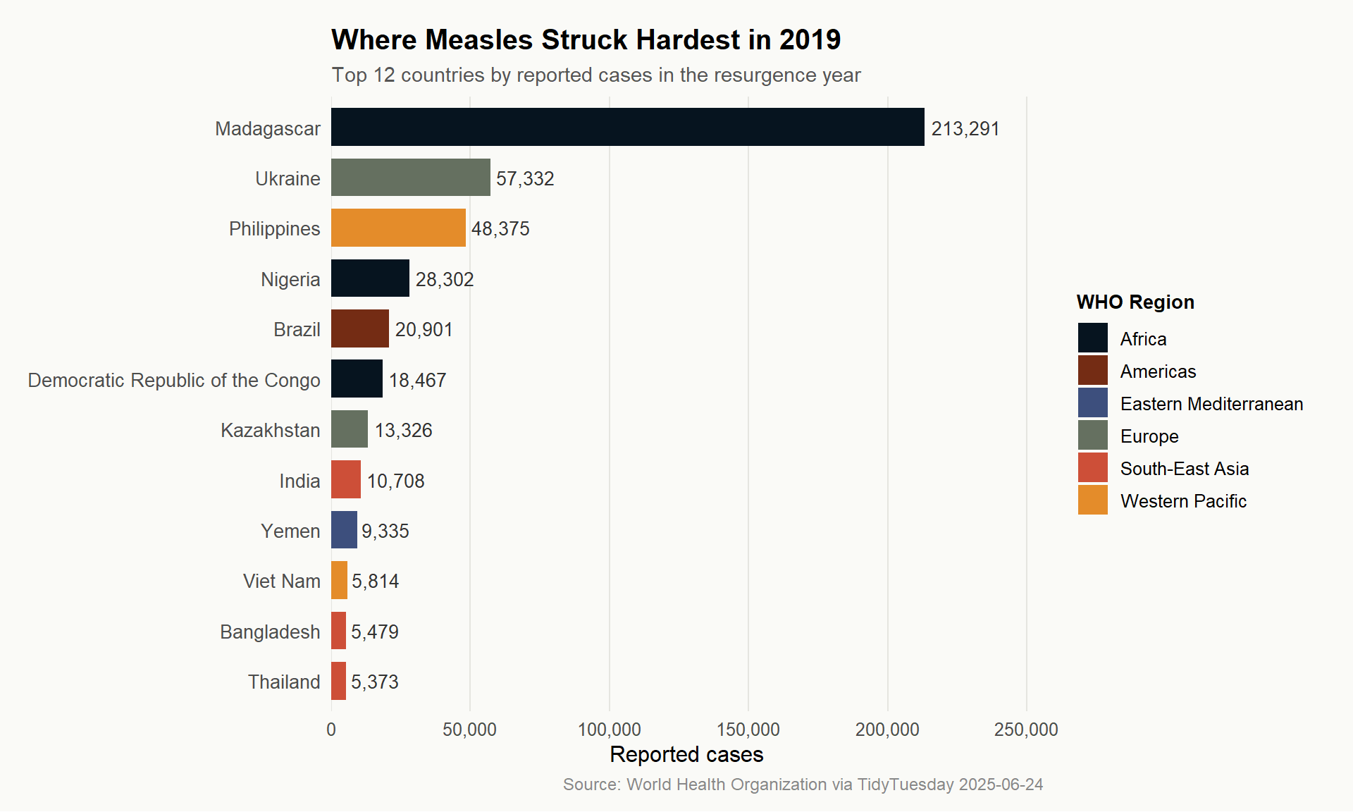
 1 Madagascar                       AFRO        2019 213291
 2 Ukraine                          EURO        2019  57332
 3 Philippines                      WPRO        2019  48375
 4 Nigeria                          AFRO        2019  28302
 5 Brazil                           AMRO        2019  20901
 6 Democratic Republic of the Congo AFRO        2019  18467
 7 Kazakhstan                       EURO        2019  13326
 8 India                            SEARO       2019  10708
 9 Yemen                            EMRO        2019   9335
10 Viet Nam                         WPRO        2019   5814
11 Bangladesh                       SEARO       2019   5479
12 Thailand                         SEARO       2019   5373
13 Myanmar                          SEARO       2019   5244
14 Tunisia                          EMRO        2019   4674
15 Somalia                          EMRO        2019   4504
The 2019 resurgence
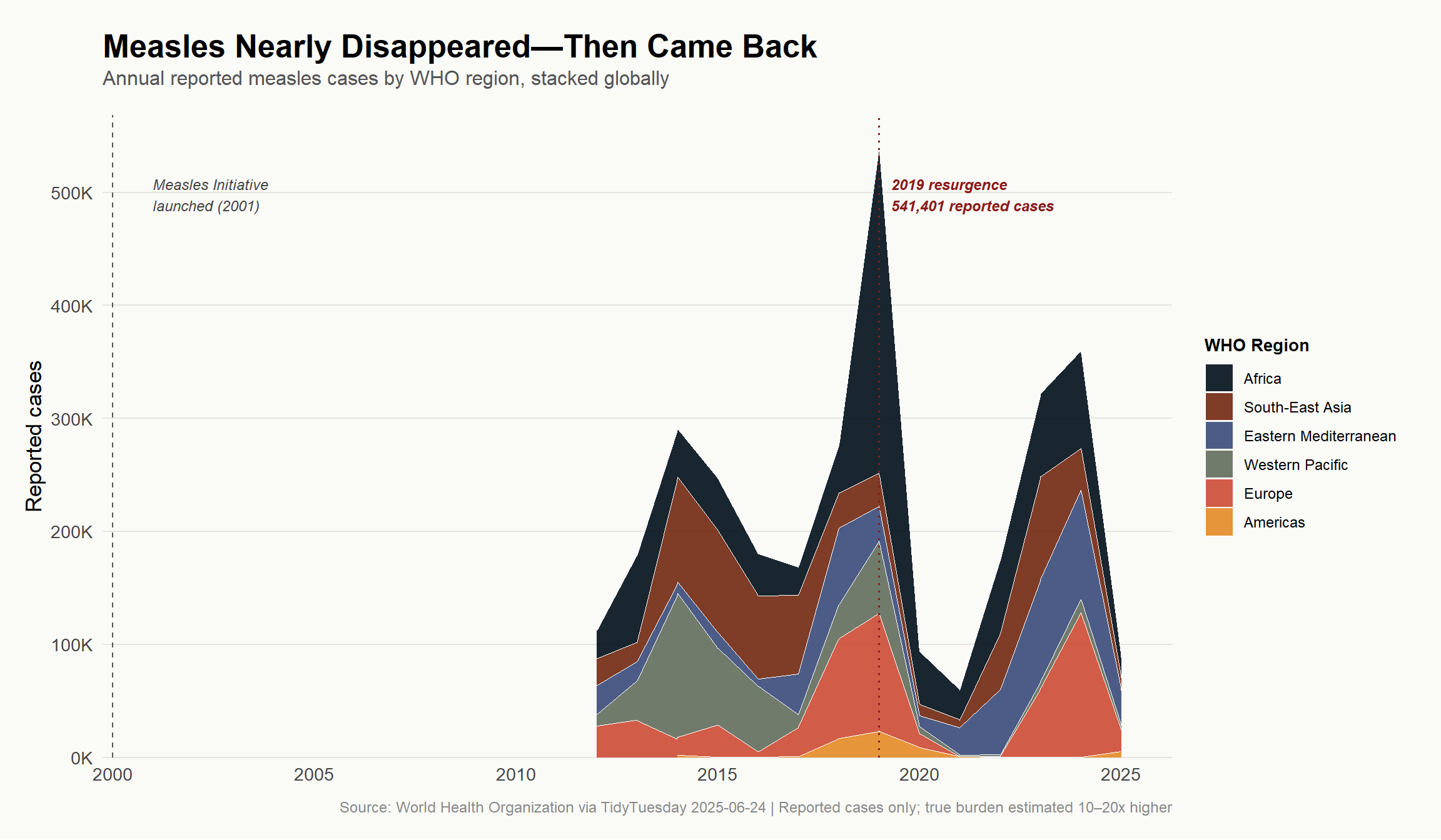
In 2019, global reported measles cases surged to their highest level in over two decades. The Democratic Republic of Congo, Ukraine, Philippines, India, and Brazil were among the hardest-hit countries. The causes were multifactorial: conflict disrupting routine immunization, declining trust in vaccines in high-income countries, and coverage gaps that left pockets of susceptible children even in otherwise well-vaccinated populations.
No mcv1 column found — skipping vaccination analysis
Hero Visualization: Six Decades of Measles
The hero plot shows the sweep of the measles story across WHO’s six world regions. Each colored layer represents one region’s annual case contribution to the global total, making it easy to see both the overall trend and which regions are driving it.
# WHO region labels — map codes to readable names# Handle both long (AFRO/AMRO) and short (AFR/AMR) WHO region codesregion_labels <-c("AFRO"="Africa","AMRO"="Americas","EMRO"="Eastern Mediterranean","EURO"="Europe","SEARO"="South-East Asia","WPRO"="Western Pacific","AFR"="Africa","AMR"="Americas","EMR"="Eastern Mediterranean","EUR"="Europe","SEAR"="South-East Asia","WPR"="Western Pacific")# Prepare regional data for plotting# If who_region is present, use it; otherwise fall back to globalif ("who_region"%in%names(regional_trend) &&n_distinct(regional_trend$who_region) >1) { plot_data <- regional_trend %>%mutate(region_label = dplyr::recode(who_region, !!!region_labels, .default = who_region),# Order regions so Africa plots at top (largest burden, most dramatic)region_label =factor(region_label, levels =c("Africa", "South-East Asia", "Eastern Mediterranean","Western Pacific", "Europe", "Americas" )) ) %>%filter(!is.na(region_label)) use_regional <-TRUE} else {# Fallback: single global line plot_data <- global_trend %>%mutate(region_label ="Global", who_region ="Global") %>%mutate(region_label =factor(region_label)) use_regional <-FALSE}cat(sprintf("plot_data: %d rows, %d cols\n", nrow(plot_data), ncol(plot_data)))stopifnot("plot_data has 0 rows — check regional_trend pipeline"=nrow(plot_data) >0)# Key annotation yearsyear_low <- global_trend %>%filter(year >=2000) %>%slice_min(total_cases, n =1) %>%pull(year)year_peak <- global_trend %>%filter(year >=2010) %>%slice_max(total_cases, n =1) %>%pull(year)peak_val <- global_trend %>%filter(year == year_peak) %>%pull(total_cases)cat(sprintf("Annotating: trough year = %d, recent peak year = %d (cases = %s)\n", year_low, year_peak, scales::comma(peak_val)))
# Palette: ghibli::MononokeMedium (7 colors — plenty for 6 WHO regions)# Warm earthy tones from Princess Mononoke: fits the gravity of the topicregion_colors <- paletteer::paletteer_d("ghibli::MononokeMedium", n =6)p <- plot_data %>%ggplot(aes(x = year, y = total_cases, fill = region_label)) +geom_area(alpha =0.92,color ="white",linewidth =0.25,position ="stack" ) +# Vertical reference lines for key eventsgeom_vline(xintercept =2000, color ="#555555", linetype ="dashed", linewidth =0.5) +geom_vline(xintercept = year_peak, color ="#8B1A1A", linetype ="dotted", linewidth =0.6) +# Annotationsannotate("text",x =2001, y =max(global_trend$total_cases, na.rm =TRUE) *0.92,label ="Measles Initiative\nlaunched (2001)",hjust =0, size =3.2, color ="#444444", fontface ="italic" ) +annotate("text",x = year_peak +0.3,y =max(global_trend$total_cases, na.rm =TRUE) *0.92,label =sprintf("2019 resurgence\n%s reported cases", scales::comma(peak_val)),hjust =0, size =3.2, color ="#8B1A1A", fontface ="bold.italic" ) +# Scalesscale_x_continuous(breaks =seq(1980, 2025, by =5), expand =expansion(mult =c(0.01, 0.05))) +scale_y_continuous(labels = scales::label_comma(scale =1e-3, suffix ="K"),expand =expansion(mult =c(0, 0.05)) ) +scale_fill_manual(values =as.character(region_colors)) +# Labelslabs(title ="**Measles Nearly Disappeared—Then Came Back**",subtitle ="Annual reported measles cases by WHO region, stacked globally",caption ="Source: World Health Organization via TidyTuesday 2025-06-24 | Reported cases only; true burden estimated 10–20x higher",x =NULL,y ="Reported cases",fill ="WHO Region" ) +theme_minimal(base_size =13) +theme(plot.title =element_markdown(size =19, face ="bold", margin =margin(b =4)),plot.subtitle =element_text(size =12, color ="#555555", margin =margin(b =16)),plot.caption =element_text(size =9, color ="#888888", margin =margin(t =10)),plot.background =element_rect(fill ="#FAFAF7", color =NA),panel.background =element_rect(fill ="#FAFAF7", color =NA),panel.grid.major.x =element_blank(),panel.grid.minor =element_blank(),panel.grid.major.y =element_line(color ="#E5E5E0", linewidth =0.4),axis.text =element_text(color ="#444444"),legend.position ="right",legend.title =element_text(size =10, face ="bold"),legend.text =element_text(size =9),plot.margin =margin(20, 20, 15, 15) )p
Countries driving the 2019 resurgence
# Top countries in the post-2010 peak yeartop_n <-12top_countries_plot <- measles_std %>%filter(year == recent_peak_year, cases >0) %>%arrange(desc(cases)) %>%head(top_n) %>%mutate(country =factor(country, levels =rev(country)),region_label = dplyr::recode( who_region,"AFRO"="Africa","AMRO"="Americas","EMRO"="Eastern Mediterranean","EURO"="Europe","SEARO"="South-East Asia","WPRO"="Western Pacific","AFR"="Africa","AMR"="Americas","EMR"="Eastern Mediterranean","EUR"="Europe","SEAR"="South-East Asia","WPR"="Western Pacific",.default ="Other" ) )cat(sprintf("top_countries_plot: %d rows\n", nrow(top_countries_plot)))
top_countries_plot: 12 rows
stopifnot("top_countries_plot has 0 rows"=nrow(top_countries_plot) >0)p2 <- top_countries_plot %>%ggplot(aes(x = cases, y = country, fill = region_label)) +geom_col(width =0.75) +geom_text(aes(label = scales::comma(cases)),hjust =-0.1,size =3.5,color ="#333333" ) +scale_x_continuous(labels = scales::comma,expand =expansion(mult =c(0, 0.20)) ) +scale_fill_manual(values =as.character(paletteer::paletteer_d("ghibli::MononokeMedium", n =6))) +labs(title =sprintf("**Where Measles Struck Hardest in %d**", recent_peak_year),subtitle =sprintf("Top %d countries by reported cases in the resurgence year", top_n),caption ="Source: World Health Organization via TidyTuesday 2025-06-24",x ="Reported cases",y =NULL,fill ="WHO Region" ) +theme_minimal(base_size =12) +theme(plot.title =element_markdown(size =15, face ="bold"),plot.subtitle =element_text(size =11, color ="#555555"),plot.caption =element_text(size =9, color ="#888888"),plot.background =element_rect(fill ="#FAFAF7", color =NA),panel.background =element_rect(fill ="#FAFAF7", color =NA),panel.grid.major.y =element_blank(),panel.grid.minor =element_blank(),panel.grid.major.x =element_line(color ="#E5E5E0", linewidth =0.4),axis.text.y =element_text(size =10),legend.position ="right",legend.title =element_text(size =10, face ="bold"),plot.margin =margin(15, 20, 10, 15) )p2
# Only render this chunk if vaccination data existsif (exists("global_coverage") &&!is.null(global_coverage)) {# Combine global cases + coverage for dual-narrative plot combo_data <- global_trend %>%left_join(global_coverage, by ="year") %>%filter(!is.na(mean_mcv1))# Normalize for dual y-axis: cases on left, coverage % on right max_cases <-max(combo_data$total_cases, na.rm =TRUE) p3 <- combo_data %>%ggplot(aes(x = year)) +geom_area(aes(y = total_cases),fill ="#C4774B", alpha =0.35, color ="#C4774B", linewidth =0.8 ) +geom_line(aes(y = mean_mcv1 /100* max_cases),color ="#4B7AC4", linewidth =1.1 ) +geom_point(aes(y = mean_mcv1 /100* max_cases),color ="#4B7AC4", size =1.5 ) +scale_x_continuous(breaks =seq(1980, 2025, by =5)) +scale_y_continuous(name ="Reported cases",labels = scales::comma,sec.axis =sec_axis(~ . / max_cases *100,name ="Mean MCV1 coverage (%)",labels = scales::label_percent(scale =1) ) ) +labs(title ="**Higher Vaccination Coverage, Fewer Cases—Until Coverage Stalled**",subtitle ="Global reported measles cases (orange area) vs. mean first-dose vaccine coverage (blue line)",caption ="Source: World Health Organization via TidyTuesday 2025-06-24",x =NULL ) +theme_minimal(base_size =12) +theme(plot.title =element_markdown(size =14, face ="bold"),plot.subtitle =element_text(size =10, color ="#555555"),plot.caption =element_text(size =9, color ="#888888"),plot.background =element_rect(fill ="#FAFAF7", color =NA),panel.background =element_rect(fill ="#FAFAF7", color =NA),panel.grid.minor =element_blank(),panel.grid.major =element_line(color ="#E5E5E0", linewidth =0.4),axis.title.y.right =element_text(color ="#4B7AC4"),axis.text.y.right =element_text(color ="#4B7AC4"),axis.title.y.left =element_text(color ="#C4774B"),axis.text.y.left =element_text(color ="#C4774B"),plot.margin =margin(15, 20, 10, 15) ) p3} else {cat("Vaccination coverage data not available — skipping this plot.\n")}
Final thoughts and takeaways
Measles is one of the most instructive case studies in public health history—not because it shows how bad things can get, but because it shows what’s possible when science and policy align. The global collapse in cases from the 1980s through the 2010s is a genuine triumph: coordinated vaccination campaigns, international funding mechanisms like the Measles Initiative, and routine immunization infrastructure working in concert.
But the data also carries a warning. The post-2016 resurgence wasn’t caused by a more virulent strain or a vaccine failure. It was caused by coverage gaps—by children who didn’t get vaccinated, in countries where the health system was overwhelmed, or where trust in vaccines had eroded. The DRC alone accounted for hundreds of thousands of cases in 2019 against a backdrop of Ebola response straining the health system and armed conflict cutting off communities. Ukraine saw outbreaks fueled by vaccine hesitancy that had been building for years.
A few clear takeaways:
The herd immunity threshold for measles is exceptionally high (~95% MCV1 coverage). Even a modest slide in vaccination rates can reopen pockets of transmission large enough to sustain outbreaks.
Africa has consistently carried a disproportionate share of the measles burden, reflecting both the challenge of reaching remote populations and the resource constraints facing national immunization programs.
The resurgence of the late 2010s is not over. Post-COVID-19 disruptions to routine immunization created a global “immunity debt” that public health authorities are still working to address.
Reported case counts are the floor, not the ceiling—true measles burden is estimated to be an order of magnitude higher than surveillance captures. The real story is even more dramatic than what the data shows.