# Palette: ghibli::PonyoMedium
# 3 colors for 3 grades: regular, midgrade, premium
grade_colors <- paletteer::paletteer_d("ghibli::PonyoMedium", n = 4)
# Use indices 2, 3, 4 for better contrast on white background
grade_colors_use <- c(
regular = as.character(grade_colors[2]),
midgrade = as.character(grade_colors[3]),
premium = as.character(grade_colors[4])
)
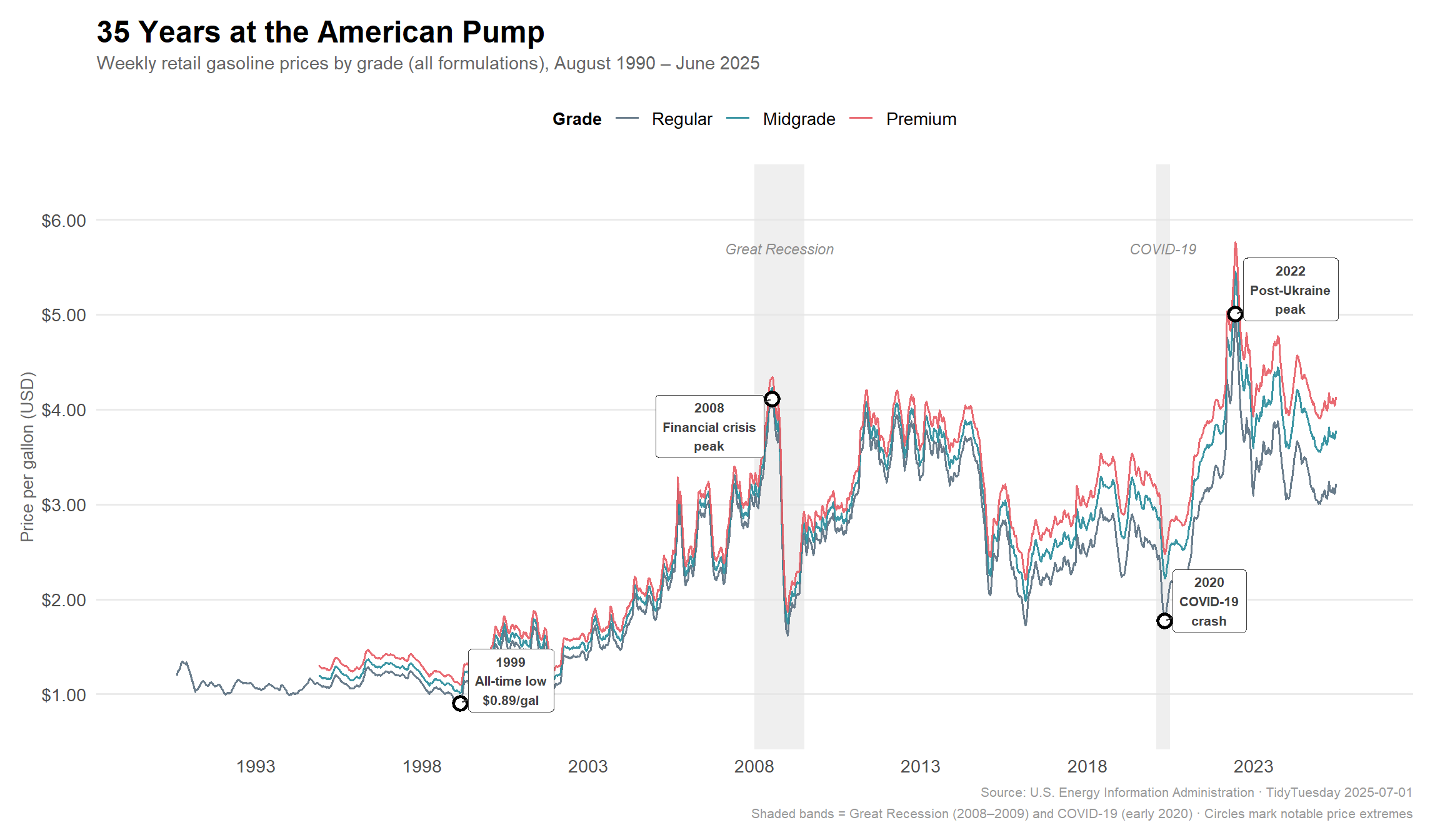
p_hero <- gas_grades %>%
ggplot2::ggplot(ggplot2::aes(x = date, y = price, color = grade)) +
# Recession shading
ggplot2::geom_rect(
data = recession_bands,
ggplot2::aes(xmin = xmin, xmax = xmax, ymin = -Inf, ymax = Inf),
inherit.aes = FALSE,
fill = "grey90", alpha = 0.6
) +
# Recession labels
ggplot2::geom_text(
data = recession_bands,
ggplot2::aes(x = xmin + (xmax - xmin) / 2, y = 5.7, label = label),
inherit.aes = FALSE,
color = "grey55", size = 3, fontface = "italic"
) +
# Main lines
ggplot2::geom_line(linewidth = 0.7, alpha = 0.9) +
# Shock event points (on regular only)
ggplot2::geom_point(
data = shock_events %>%
dplyr::mutate(grade = factor("regular", levels = c("regular", "midgrade", "premium"))),
ggplot2::aes(x = date, y = price),
color = "black", size = 3, shape = 21, fill = "white", stroke = 1.5,
inherit.aes = FALSE
) +
# Shock event labels
ggrepel::geom_label_repel(
data = shock_events %>%
dplyr::mutate(grade = factor("regular", levels = c("regular", "midgrade", "premium"))),
ggplot2::aes(x = date, y = price, label = label),
inherit.aes = FALSE,
size = 2.8,
fontface = "bold",
fill = "white",
color = "grey25",
label.size = 0.2,
label.padding = ggplot2::unit(0.3, "lines"),
min.segment.length = 0,
seed = 42
) +
# Grade color mapping
ggplot2::scale_color_manual(
values = grade_colors_use,
labels = c(regular = "Regular", midgrade = "Midgrade", premium = "Premium")
) +
# Axes
ggplot2::scale_y_continuous(
labels = scales::dollar_format(accuracy = 0.01),
breaks = seq(1, 6, 1),
limits = c(0.7, 6.3)
) +
ggplot2::scale_x_date(
date_breaks = "5 years",
date_labels = "%Y",
limits = c(as.Date("1990-01-01"), as.Date("2025-12-31"))
) +
# Labels
ggplot2::labs(
title = "**35 Years at the American Pump**",
subtitle = "Weekly retail gasoline prices by grade (all formulations), August 1990 – June 2025",
x = NULL,
y = "Price per gallon (USD)",
color = "Grade",
caption = "Source: U.S. Energy Information Administration · TidyTuesday 2025-07-01\nShaded bands = Great Recession (2008–2009) and COVID-19 (early 2020) · Circles mark notable price extremes"
) +
ggplot2::theme_minimal(base_size = 13) +
ggplot2::theme(
plot.title = ggtext::element_markdown(face = "bold", size = 18, margin = ggplot2::margin(b = 4)),
plot.subtitle = ggplot2::element_text(color = "grey40", size = 11, margin = ggplot2::margin(b = 12)),
plot.caption = ggplot2::element_text(color = "grey60", size = 8, lineheight = 1.3),
axis.text = ggplot2::element_text(color = "grey30"),
axis.title.y = ggplot2::element_text(color = "grey40", size = 10),
panel.grid.major.x = ggplot2::element_blank(),
panel.grid.minor = ggplot2::element_blank(),
legend.position = "top",
legend.direction = "horizontal",
legend.title = ggplot2::element_text(size = 10, face = "bold"),
plot.margin = ggplot2::margin(12, 16, 12, 12)
)
p_hero