
Tidy Tuesday: The xkcd Color Survey Results
tidytuesday
R
color
perception
Where do ‘purple’, ‘green’, ‘blue’, ‘pink’, and ‘brown’ actually live in color space? Mapping the hex clouds people called by name in Randall Munroe’s 2010 color survey.
Preface
From the TidyTuesday repository.
In 2010 Randall Munroe (the author of xkcd) ran a survey to collect the names people give to colors. Visitors were shown a square of color and asked to name it freely; over five million answers came in from more than 150,000 people. The cleaned-up release captures the most common names people gave for the most common monitor colors, along with a little metadata about the participants (monitor type, self-reported sex chromosome, colorblindness).
The natural questions:
- Where in color space does each common color name actually live?
- How wide is each color’s “name territory” — is “purple” a tighter or looser concept than “brown”?
- Do men and women (proxied here by self-reported
y_chromosome) draw those boundaries in the same place?
Loading necessary packages
My handy booster pack that allows me to install (if needed) and load my usual and favorite packages, as well as some helpful functions.
Code
# Packages ----------------------------------------------------------------

{
  if (!requireNamespace("pak", quietly = TRUE)) {
    install.packages("pak", repos = "https://cloud.r-project.org")
  }

  install_booster_pack <- function(package, load = TRUE) {
    for (pkg in package) {
      if (!requireNamespace(pkg, quietly = TRUE)) {
        pak::pkg_install(pkg)
      }
      if (load) {
        library(pkg, character.only = TRUE)
      }
    }
  }

  core_packages <- c(
    'fs',
    'here',
    'janitor',
    'rio',
    'tidyverse',
    'skimr',
    'paletteer',
    'tidytuesdayR'
  )

  optional_packages <- c('ggdist', 'ggtext', 'patchwork')

  install_booster_pack(package = unique(c(core_packages, optional_packages)), load = TRUE)
  rm(install_booster_pack, core_packages, optional_packages)

  # Custom Functions ----

  `%ni%` <- Negate(`%in%`)

  geometric_mean <- function(x) {
    exp(mean(log(x[x > 0]), na.rm = TRUE))
  }

  my_skim <- skim_with(
    numeric = sfl(
      n = length,
      min = ~ min(.x, na.rm = T),
      p25 = ~ stats::quantile(., probs = .25, na.rm = TRUE, names = FALSE),
      med = ~ median(.x, na.rm = T),
      p75 = ~ stats::quantile(., probs = .75, na.rm = TRUE, names = FALSE),
      max = ~ max(.x, na.rm = T),
      mean = ~ mean(.x, na.rm = T),
      geo_mean = ~ geometric_mean(.x),
      sd = ~ stats::sd(., na.rm = TRUE),
      hist = ~ inline_hist(., 5)
    ),
    append = FALSE
  )
}
Load raw data from package
raw <- tidytuesdayR::tt_load('2025-07-08')

answers     <- raw$answers
color_ranks <- raw$color_ranks
users       <- raw$users
Exploratory Data Analysis
The release ships three tables:
answers— one row per(user, hex)pair, with therankof the canonical color name the user gave it.color_ranks— the canonical lookup of 949 colors, ranked by global popularity of the name.users— one row per participant with a few demographic and technical flags.
Because the answers table is pre-filtered to only the top 5 canonical names, every row’s rank is between 1 and 5. That makes for a clean comparative question across the five most-named hues.
color_ranks
color_ranks %>%
  select(-hex) %>%
my_skim()| Name | Piped data |
| Number of rows | 949 |
| Number of columns | 2 |
| _______________________ | |
| Column type frequency: | |
| character | 1 |
| numeric | 1 |
| ________________________ | |
| Group variables | None |
Variable type: character
| skim_variable | n_missing | complete_rate | min | max | empty | n_unique | whitespace |
|---|---|---|---|---|---|---|---|
| color | 0 | 1 | 3 | 26 | 0 | 949 | 0 |
Variable type: numeric
| skim_variable | n_missing | complete_rate | n | min | p25 | med | p75 | max | mean | geo_mean | sd | hist |
|---|---|---|---|---|---|---|---|---|---|---|---|---|
| rank | 0 | 1 | 949 | 1 | 238 | 475 | 712 | 949 | 475 | 350.72 | 274.1 | ▇▇▇▇▇ |
color_ranks %>% head(10)# A tibble: 10 × 3
color rank hex
<chr> <dbl> <chr>
1 purple 1 #7e1e9c
2 green 2 #15b01a
3 blue 3 #0343df
4 pink 4 #ff81c0
5 brown 5 #653700
6 red 6 #e50000
7 light blue 7 #95d0fc
8 teal 8 #029386
9 orange 9 #f97306
10 light green 10 #96f97bThe top 10 give us the lay of the land: purple, green, blue, pink, brown at ranks 1–5, then red, light blue, teal, orange, light green. The first five are the only ones present in answers.
answers
answers %>%
  select(rank) %>%
my_skim()| Name | Piped data |
| Number of rows | 1058211 |
| Number of columns | 1 |
| _______________________ | |
| Column type frequency: | |
| numeric | 1 |
| ________________________ | |
| Group variables | None |
Variable type: numeric
| skim_variable | n_missing | complete_rate | n | min | p25 | med | p75 | max | mean | geo_mean | sd | hist |
|---|---|---|---|---|---|---|---|---|---|---|---|---|
| rank | 0 | 1 | 1058211 | 1 | 2 | 2 | 3 | 5 | 2.5 | 2.21 | 1.18 | ▆▇▇▃▂ |
answers %>%
  count(rank, name = "n_responses") %>%
  inner_join(color_ranks %>% select(rank, color), by = "rank") %>%
  arrange(rank)
# A tibble: 5 × 3
rank n_responses color
<dbl> <int> <chr>
1 1 249199 purple
2 2 314172 green
3 3 288015 blue
4 4 131013 pink
5 5 75812 brown Over one million labeled responses, lopsided toward the cooler / more saturated end (green, blue, purple).
users
users %>% my_skim()| Name | Piped data |
| Number of rows | 152401 |
| Number of columns | 5 |
| _______________________ | |
| Column type frequency: | |
| character | 1 |
| numeric | 4 |
| ________________________ | |
| Group variables | None |
Variable type: character
| skim_variable | n_missing | complete_rate | min | max | empty | n_unique | whitespace |
|---|---|---|---|---|---|---|---|
| monitor | 0 | 1 | 3 | 13 | 0 | 3 | 0 |
Variable type: numeric
| skim_variable | n_missing | complete_rate | n | min | p25 | med | p75 | max | mean | geo_mean | sd | hist |
|---|---|---|---|---|---|---|---|---|---|---|---|---|
| user_id | 0 | 1.00 | 152401 | 1 | 38101 | 76201.00 | 114301.00 | 152401.00 | 76201.00 | 56067.73 | 43994.52 | ▇▇▇▇▇ |
| y_chromosome | 7507 | 0.95 | 152401 | 0 | 0 | 1.00 | 1.00 | 1.00 | 0.71 | 1.00 | 0.45 | ▃▁▁▁▇ |
| colorblind | 9848 | 0.94 | 152401 | 0 | 0 | 0.00 | 0.00 | 1.00 | 0.04 | 1.00 | 0.19 | ▇▁▁▁▁ |
| spam_prob | 0 | 1.00 | 152401 | 0 | 0 | 0.03 | 0.09 | 8.43 | 0.22 | 0.02 | 0.86 | ▇▁▁▁▁ |
users %>% count(monitor)# A tibble: 3 × 2
monitor n
<chr> <int>
1 CRT 5888
2 LCD 145973
3 monitor-other 540users %>% count(y_chromosome)# A tibble: 3 × 2
y_chromosome n
<dbl> <int>
1 0 41464
2 1 103430
3 NA 7507users %>% count(colorblind)# A tibble: 3 × 2
colorblind n
<dbl> <int>
1 0 136965
2 1 5588
3 NA 9848A few things worth flagging:
- Monitor type is essentially all LCD — CRT is rare, “other” is rounding error.
y_chromosomeandcolorblindboth have a non-trivial chunk ofNA(people who declined the question).spam_probhas a long right tail and a few values above 1.0; standard practice in the xkcd data is to drop anything above 0.5.
What each color name actually looks like
The interesting move is to take every hex value that anyone called “purple,” every hex anyone called “green,” etc., and ask where the cloud sits in color space. RGB is awkward for this because perceptual distance is non-linear, so I’ll convert to HSV — hue captures the rainbow position, saturation captures “how pure,” and value captures “how bright.”
Note
HSV is not perceptually uniform either (CIELAB is the gold standard), but for this discrete top-5 question, hue is intuitive enough — pink and red wrap around the 0/1 boundary, which I’ll handle by rotating the axis.
# Join answers to canonical names, then to user metadata, then drop spam.
named <- answers %>%
  inner_join(color_ranks %>% select(rank, color_name = color, canonical_hex = hex),
             by = "rank") %>%
  inner_join(users %>% select(user_id, y_chromosome, colorblind, spam_prob),
             by = "user_id") %>%
  filter(spam_prob < 0.5, !is.na(y_chromosome))

cat(sprintf("named: %d rows, %d distinct hex values\n",
            nrow(named), dplyr::n_distinct(named$hex)))
named: 1018000 rows, 974027 distinct hex valuesstopifnot("named has 0 rows — check filter values" = nrow(named) > 0)
# Convert hex -> HSV.
hex_to_hsv <- function(hex) {
hx <- gsub("#", "", hex)
r <- strtoi(substr(hx, 1, 2), 16L)
g <- strtoi(substr(hx, 3, 4), 16L)
b <- strtoi(substr(hx, 5, 6), 16L)
hsv <- t(grDevices::rgb2hsv(r, g, b, maxColorValue = 255))
tibble::as_tibble(hsv)
}
named_hsv <- bind_cols(named, hex_to_hsv(named$hex))
# Rotate the hue axis so pink/red (h ~ 0) doesn't get split in half.
# Shift so the cut is between brown's red end (~0.05) and pink's red end (~0.95).
named_hsv <- named_hsv %>%
mutate(h_rot = (h + 0.5) %% 1)
named_hsv %>%
group_by(color_name) %>%
summarize(n = n(),
median_h = median(h),
median_s = median(s),
median_v = median(v),
.groups = "drop") %>%
arrange(desc(n))# A tibble: 5 × 5
color_name n median_h median_s median_v
<chr> <int> <dbl> <dbl> <dbl>
1 green 302173 0.326 0.785 0.749
2 blue 275975 0.62 0.803 0.812
3 purple 240361 0.789 0.73 0.722
4 pink 126323 0.898 0.610 0.918
5 brown 73168 0.0857 0.710 0.541Stable medians match intuition: green sits around hue 0.32 (the middle of the rainbow), blue at 0.62, purple at 0.79, pink wraps near 0.89, brown lives at low hue but distinguishes itself by low value (~0.55) — the only one of the five that’s darkness-defined rather than hue-defined.
Hero: the territory each color name claims
The hero shows the density of named hex values along the hue axis, faceted by whether the participant reported a Y chromosome. The canonical hex from color_ranks is drawn as a tick mark for reference — that’s the single hex Randall’s data crowned as the “true” purple, green, etc.
# Order from rank 1 -> 5 (purple, green, blue, pink, brown).
name_order <- color_ranks %>%
  filter(rank %in% 1:5) %>%
  arrange(rank) %>%
  pull(color)

plot_df <- named_hsv %>%
  mutate(
    color_name   = factor(color_name, levels = name_order),
    y_chromosome = factor(y_chromosome,
                          levels = c(1, 0),
                          labels = c("Y chromosome: yes", "Y chromosome: no"))
  )

# Canonical hex anchors (one per color name, the official xkcd hex).
anchors <- color_ranks %>%
  filter(rank %in% 1:5) %>%
  transmute(
    color_name = factor(color, levels = name_order),
    hex        = hex
  ) %>%
  bind_cols(hex_to_hsv(.$hex)) %>%
  mutate(h_rot = (h + 0.5) %% 1)

# Use the canonical xkcd hex for each ridge's fill so each name is shown
# *in its own color* — the data telling its own visual story.
fill_lookup <- setNames(anchors$hex, as.character(anchors$color_name))

# Background accent ticks from the chosen paletteer banner palette.
accent <- as.character(paletteer::paletteer_d("MetBrewer::Signac", n = 5))

p <- ggplot(plot_df, aes(x = h_rot, fill = color_name)) +
  geom_density(
    aes(y = after_stat(scaled)),
    color = "grey20",
    alpha = 0.9,
    bw    = 0.012,
    trim  = TRUE
  ) +
  geom_segment(
    data = anchors,
    aes(x = h_rot, xend = h_rot, y = 0, yend = 1.05),
    inherit.aes = FALSE,
    color = "grey15",
    linewidth = 0.4,
    linetype = "31"
  ) +
  geom_point(
    data = anchors,
    aes(x = h_rot, y = 1.08),
    inherit.aes = FALSE,
    shape = 25,
    size = 2.6,
    fill = "grey15",
    color = "grey15"
  ) +
  scale_fill_manual(values = fill_lookup, guide = "none") +
  scale_x_continuous(
    name = "Hue (rotated so pink/red doesn't wrap)",
    breaks = c(0, 0.25, 0.5, 0.75, 1),
    labels = c("cyan", "green", "red", "blue", "cyan"),
    limits = c(0, 1),
    expand = expansion(0)
  ) +
  scale_y_continuous(name = NULL, breaks = NULL, expand = expansion(c(0, 0.18))) +
  facet_grid(color_name ~ y_chromosome, switch = "y") +
  labs(
    title    = "What people *call* a color, vs what the survey says it 'is'",
    subtitle = "Each ridge is the density of hex values labeled with that name. The tick marks the canonical xkcd hex.",
    caption  = "Source: xkcd Color Survey (2010) via TidyTuesday 2025-07-08  ·  hex → HSV  ·  spam_prob < 0.5"
  ) +
  theme_minimal(base_size = 12) +
  theme(
    plot.title.position = "plot",
    plot.title          = element_text(face = "bold", size = 15),
    plot.subtitle       = element_text(color = "grey30", margin = margin(b = 12)),
    plot.caption        = element_text(color = "grey45", hjust = 0),
    strip.text.x        = element_text(face = "bold"),
    strip.text.y.left   = element_text(angle = 0, hjust = 1, face = "bold"),
    strip.placement     = "outside",
    panel.grid.major.x  = element_line(color = "grey92"),
    panel.grid.minor    = element_blank(),
    panel.spacing       = unit(0.6, "lines"),
    plot.background     = element_rect(fill = "grey98", color = NA),
    panel.background    = element_rect(fill = "grey98", color = NA)
  )

p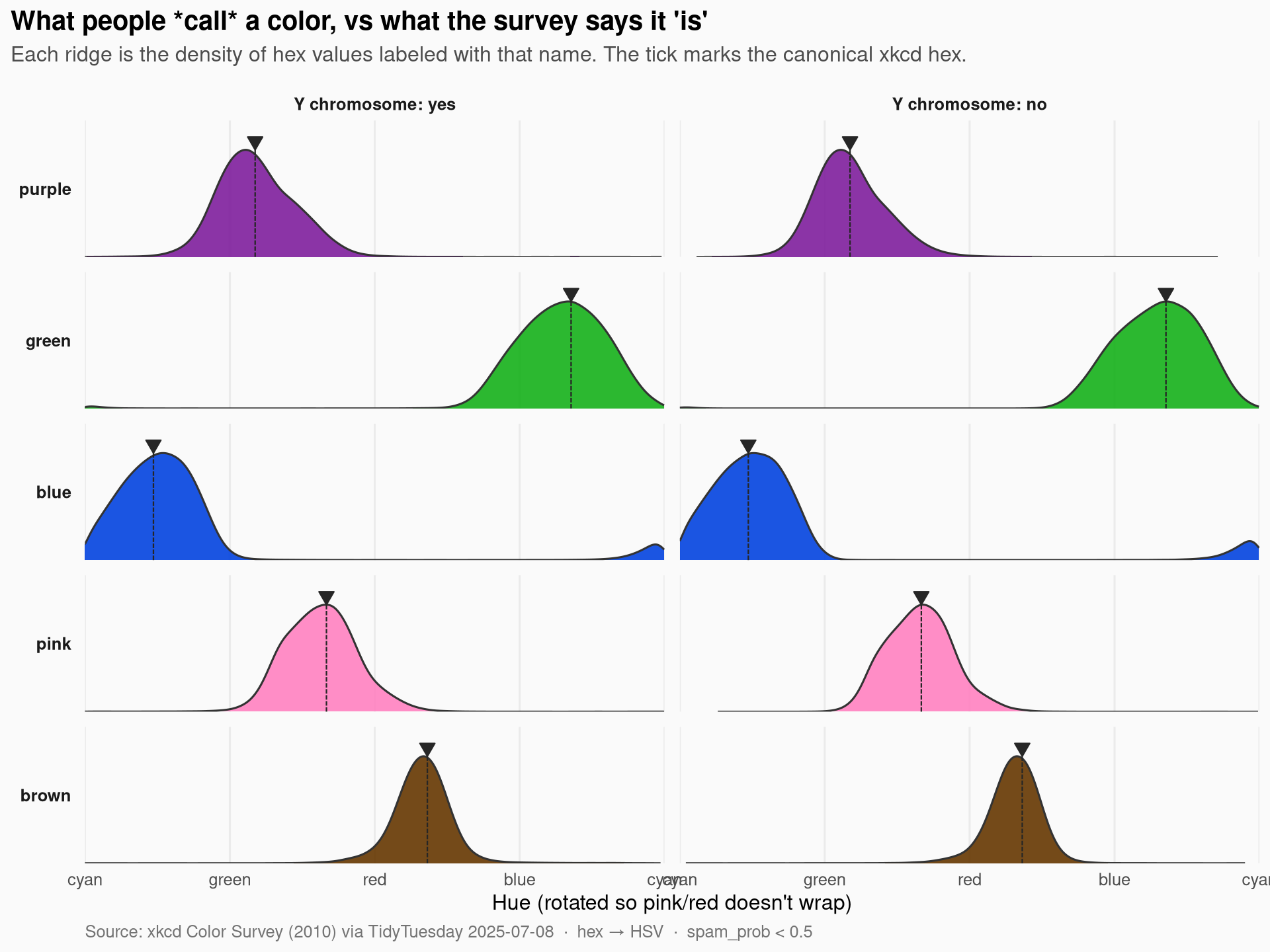
A few things to notice:
- Green and blue are the tightest claims — narrow ridges around a clear hue. People agree where they live.
- Pink and purple are wider — fuzzy boundaries, especially on the purple side that bleeds into blue.
- Brown is everywhere on the hue axis because brown is not really a hue — it’s a dark, desaturated orange/red. The density looks scattered because the wrong axis is being asked to describe it.
- Across Y chromosome groups, the ridge shapes are nearly identical. The famous “men and women see colors differently” claim from the original xkcd writeup mostly shows up not in where the center sits but in vocabulary richness (which we can’t see here because the data only kept the top-5 names).
A closer look at brown — it’s not where you think
Brown is the misfit of the top 5. The ridge plot makes it look like brown is “all over,” but that’s an artifact of plotting it on a hue axis. Let me re-plot brown specifically on a saturation × value plane, with the other four for context.
sv_df <- named_hsv %>%
  filter(color_name %in% c("brown", "red", "orange", "green", "blue") |
         color_name %in% name_order) %>%
  mutate(color_name = factor(color_name, levels = name_order))

# Sample to keep the plot honest (1M points crushes a scatter).
set.seed(42)
sv_sample <- sv_df %>%
  group_by(color_name) %>%
  slice_sample(n = 3000) %>%
  ungroup()

p2 <- ggplot(sv_sample, aes(x = s, y = v, color = hex)) +
  geom_point(size = 0.6, alpha = 0.55) +
  scale_color_identity() +
  facet_wrap(~ color_name, nrow = 1) +
  scale_x_continuous(name = "Saturation →", limits = c(0, 1), expand = expansion(0.01)) +
  scale_y_continuous(name = "Value (brightness) →", limits = c(0, 1), expand = expansion(0.01)) +
  labs(
    title    = "Brown lives in the basement",
    subtitle = "Each dot is one named hex value, drawn in its own color. Brown is the only top-5 name that sits low on the Value axis.",
    caption  = "n = 3,000 sampled per color  ·  source: xkcd Color Survey"
  ) +
  theme_minimal(base_size = 12) +
  theme(
    plot.title.position = "plot",
    plot.title          = element_text(face = "bold", size = 15),
    plot.subtitle       = element_text(color = "grey30", margin = margin(b = 10)),
    plot.caption        = element_text(color = "grey45", hjust = 0),
    strip.text          = element_text(face = "bold"),
    panel.grid.minor    = element_blank(),
    panel.background    = element_rect(fill = "grey15", color = NA),
    panel.grid.major    = element_line(color = "grey25"),
    plot.background     = element_rect(fill = "grey98", color = NA)
  )

p2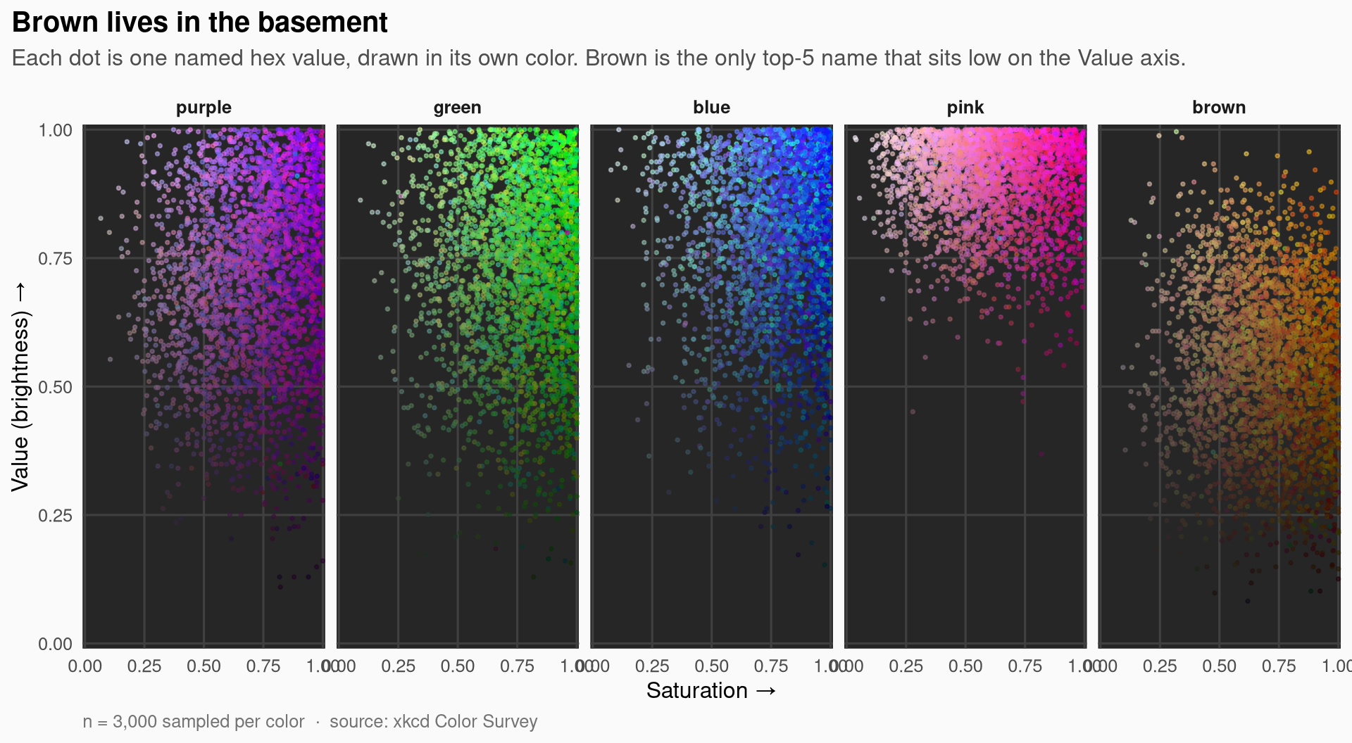
The S × V scatter makes the structural point: brown occupies the lower half of the value axis, while the other four crowd into the bright top corner. Brown is a brightness category masquerading as a color category — it’s what we call dark, low-saturation oranges and reds. The hue axis is the wrong frame for it.
Append palette to log
palette_log_path <- here::here("posts", "palette-log.csv")
if (!file.exists(palette_log_path)) {
  writeLines("post_date,palette,package,type", palette_log_path)
}

palette_log <- read.csv(palette_log_path)

new_entry <- data.frame(
  post_date = "2025-07-08",
  palette   = "Signac",
  package   = "MetBrewer",
  type      = "discrete"
)

if (!any(palette_log$post_date == new_entry$post_date &
         palette_log$palette  == new_entry$palette)) {
  write.table(
    new_entry,
    palette_log_path,
    append    = TRUE,
    sep       = ",",
    row.names = FALSE,
    col.names = FALSE
  )
}
Final thoughts and takeaways
The xkcd color survey is one of those rare datasets where the substance and the medium are the same thing: it’s a study about color, and you can’t honestly visualize it in anything but color. Three things stuck with me after digging in:
Color names are not equally precise. “Green” and “blue” describe narrow hue bands; “pink” and “purple” overlap on the warm-violet boundary; “brown” doesn’t even live on the same axis as the others. Vocabulary precision is a property of the word, not just the speaker.
The Y-chromosome split is mostly a vocabulary story, not a perception story. With only the top 5 canonical names in this release, the boundaries of each color land in nearly the same place across groups. The original xkcd writeup’s finding — that women use more distinct color words — would require the full free-text answers, which aren’t included here. The cleaner story you can tell from this slice is that the basic five are remarkably consensus-driven.
Brown is the trick question. Brown reveals that “color name” and “hue” are not the same dimension. Any honest color taxonomy needs at least lightness as a co-equal axis. This is why the dark-orange / brown distinction breaks naive hue-based color pickers and why CIELAB exists.
If I were extending this analysis, the obvious next step is the full unfiltered survey (with all 949 names, not just the top 5) — at that scale you can start asking when neighborhoods of names start crowding each other out, and the gender-vocabulary finding would actually be testable.