This dataset explores income inequality across countries, comparing Gini coefficients before and after taxes and government benefits. The data comes from Our World in Data (curated by Joe Hasell), drawing on the Luxembourg Income Study, OECD, and UN World Population Prospects. Two Gini measures are provided: gini_mi_eq (market income, before redistribution) and gini_dhi_eq (disposable household income, after taxes and transfers). The gap between them is a direct measure of how much a country’s tax and transfer system compresses inequality.
The Gini coefficient ranges from 0 (perfect equality) to 1 (perfect inequality). What makes this dataset compelling is not just the level of inequality in any country, but the distance that taxes and transfers move it — countries with nearly identical pre-tax inequality can end up in very different places depending on the strength and design of their redistribution systems.
Loading necessary packages
My handy booster pack that allows me to install (if needed) and load my usual and favorite packages, as well as some helpful functions.
raw <- tidytuesdayR::tt_load('2025-08-05')income_inequality_processed <- raw$income_inequality_processedincome_inequality_raw <- raw$income_inequality_raw
Exploratory Data Analysis
The my_skim() function is a modified version of the skimr::skim() function that returns the number of missing data points (cells as NA) as well as the inverse (e.g.: number of rows that are notNA), the count, minimum, 25%, median, 75%, max, mean, geometric mean, and standard deviation. It also generates a little ASCII histogram. Neat!
Processed dataset
The processed dataset is the analysis-ready form: 52 countries with Gini coefficients for both market income and disposable income. I’ll drop Code (ISO identifier, not analytically meaningful on its own) from the skim but keep it for joins.
gini_mi_eq (pre-tax market income inequality) has a mean of ~0.47 and a notably wide range (0.33–0.75). The right tail suggests a handful of countries with extreme pre-tax inequality.
gini_dhi_eq (post-tax disposable income) has a mean of ~0.34 — roughly 0.13 Gini points lower on average. That systematic downward shift is the signature of redistribution.
Pre-tax Gini has 398 NAs vs. none for disposable income, meaning some countries only report post-redistribution figures. For the cross-sectional analysis I’ll restrict to rows where both values are present.
The raw dataset spans an enormous time range but is extremely sparse: only ~600 country-year observations have actual Gini values. The owid_region column (6 values: Africa, Asia, Europe, North America, Oceania, South America) is present for real countries but absent for aggregates and historical entities. I’ll use this exclusively as a lookup table for regional classification.
The Redistribution Landscape
The central question this data answers is: how much does each country’s tax and transfer system reduce inequality? The metric I care about is the redistribution gap — the difference between a country’s pre-tax Gini and its post-tax Gini. Larger gaps mean stronger redistribution.
Data preparation
# Build a region lookup from the raw dataset# Use 3-character ISO codes to filter out aggregates and historical entitiesregion_lookup <- income_inequality_raw %>%filter(!is.na(owid_region), nchar(Code) ==3) %>%select(Entity, owid_region) %>%distinct()cat(sprintf("Countries in region lookup: %d\n", nrow(region_lookup)))
Countries in region lookup: 244
# Get latest year per country where BOTH Gini measures are non-NAlatest_both <- income_inequality_processed %>%filter(!is.na(gini_mi_eq), !is.na(gini_dhi_eq)) %>%group_by(Entity, Code) %>%slice_max(Year, n =1) %>%ungroup()cat(sprintf("Countries with both Gini measures: %d\n", nrow(latest_both)))
Countries with both Gini measures: 30
# Get most recent population from raw datasetpop_lookup <- income_inequality_raw %>%filter(!is.na(population_historical), nchar(Code) ==3) %>%group_by(Entity, Code) %>%slice_max(Year, n =1) %>%ungroup() %>%select(Entity, Code, population_historical)# Join region and population onto the cross-sectional datasetplot_data <- latest_both %>%left_join(region_lookup, by ="Entity") %>%left_join(pop_lookup, by =c("Entity", "Code")) %>%filter(!is.na(owid_region)) %>%# keep only entities with a region assignmentmutate(redistribution_gap = gini_mi_eq - gini_dhi_eq,region = owid_region )cat(sprintf("plot_data: %d rows, %d cols\n", nrow(plot_data), ncol(plot_data)))
plot_data: 30 rows, 9 cols
stopifnot("Plot data has 0 rows — check join logic"=nrow(plot_data) >0)# Verify redistribution gap is not degenerateif (length(unique(round(plot_data$redistribution_gap, 3))) ==1) {warning("All redistribution_gap values identical — check computation")}cat("Redistribution gap range:", round(min(plot_data$redistribution_gap), 3), "to",round(max(plot_data$redistribution_gap), 3), "\n")
Redistribution gap range: 0.008 to 0.231
cat("Countries per region:\n")
Countries per region:
print(count(plot_data, region, sort =TRUE))
# A tibble: 6 × 2
  region            n
  <chr>         <int>
1 Europe           22
2 North America     3
3 Asia              2
4 Africa            1
5 Oceania           1
6 South America     1
# Who are the top and bottom redistributors?plot_data %>%select(Entity, Year, gini_mi_eq, gini_dhi_eq, redistribution_gap, region) %>%arrange(desc(redistribution_gap)) %>%slice(c(1:8, (n()-7):n())) %>%mutate(across(where(is.numeric), ~round(.x, 3))) %>%print()
# A tibble: 16 × 6
   Entity              Year gini_mi_eq gini_dhi_eq redistribution_gap region
   <chr>              <dbl>      <dbl>       <dbl>              <dbl> <chr>
 1 Belgium             2021      0.486       0.255              0.231 Europe
 2 Italy               2020      0.563       0.335              0.228 Europe
 3 Ireland             2021      0.514       0.29               0.224 Europe
 4 Austria             2022      0.494       0.287              0.207 Europe
 5 Germany             2020      0.506       0.302              0.204 Europe
 6 Norway              2004      0.452       0.261              0.191 Europe
 7 Czechia             2016      0.444       0.254              0.19  Europe
 8 Denmark             2022      0.477       0.288              0.189 Europe
 9 Finland             2016      0.382       0.258              0.124 Europe
10 Japan               2020      0.423       0.305              0.118 Asia
11 United States       2023      0.507       0.392              0.115 North Ame…
12 Brazil              2015      0.555       0.446              0.109 South Ame…
13 Switzerland         2019      0.401       0.31               0.091 Europe
14 South Africa        2017      0.706       0.616              0.09  Africa
15 Iceland             2017      0.326       0.251              0.075 Europe
16 Dominican Republic  2007      0.523       0.515              0.008 North Ame…
NoteWhat is the Gini coefficient?
The Gini coefficient measures income inequality on a 0–1 scale. A score of 0 means every person in a country earns exactly the same; a score of 1 means one person earns everything. In practice, modern economies range from roughly 0.25 (very equal) to over 0.60 (highly unequal). A reduction of even 0.10 Gini points through redistribution represents a substantial compression of the income distribution.
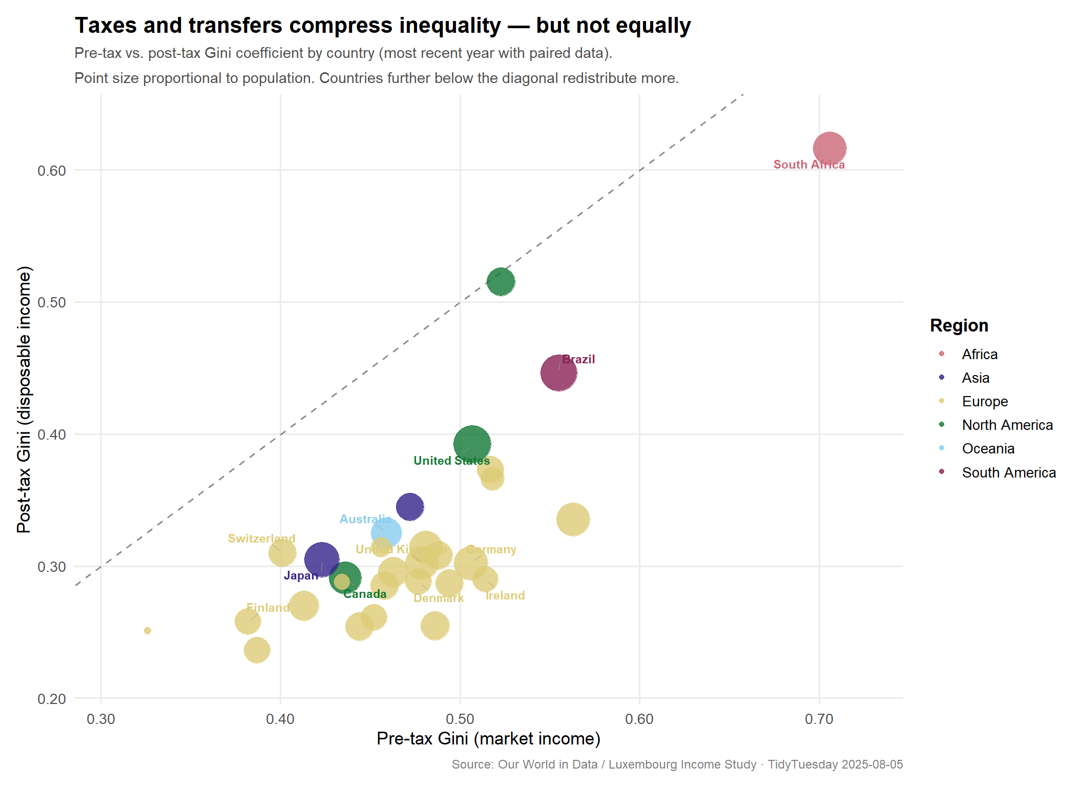
Before vs. after taxes: country scatter plot
The cleanest way to visualize the redistribution effect is to plot each country’s pre-tax Gini on the x-axis against its post-tax Gini on the y-axis. The diagonal line represents no redistribution — a country on the line has the same inequality before and after taxes. Every country falls below the diagonal (taxes reduce inequality everywhere), but how far below varies enormously. Points further from the diagonal are stronger redistributors.
# Countries to annotatelabel_entities <-c("United States", "France", "Ireland", "Denmark", "Finland","South Korea", "South Africa", "Brazil", "Japan", "Germany","United Kingdom", "Poland", "Australia", "Canada", "Switzerland")label_data <- plot_data %>%filter(Entity %in% label_entities)cat(sprintf("Labelled countries in plot: %d\n", nrow(label_data)))
Labelled countries in plot: 12
stopifnot("No label data"=nrow(label_data) >0)# Palette: khroma "muted" (9 colorblind-safe colors)n_regions <-length(unique(plot_data$region))region_cols <-as.vector(khroma::color("muted")(n_regions))names(region_cols) <-sort(unique(plot_data$region))# Axis limits with a little paddingx_range <-range(plot_data$gini_mi_eq, na.rm =TRUE)y_range <-range(plot_data$gini_dhi_eq, na.rm =TRUE)pad <-0.02p_scatter <- ggplot2::ggplot( plot_data, ggplot2::aes(x = gini_mi_eq,y = gini_dhi_eq,color = region,size =log1p(population_historical) )) +# Reference diagonal: no redistribution ggplot2::geom_abline(slope =1,intercept =0,linetype ="dashed",color ="grey55",linewidth =0.7 ) + ggplot2::annotate("text",x = x_range[2] -0.015,y = x_range[2] +0.012,label ="← No redistribution",angle =43,hjust =1,color ="grey45",size =3.3,fontface ="italic" ) +# Points ggplot2::geom_point(alpha =0.80, stroke =0) +# Labels for selected countries ggrepel::geom_text_repel(data = label_data, ggplot2::aes(label = Entity),size =3.0,fontface ="bold",box.padding =0.45,point.padding =0.3,segment.color ="grey60",segment.size =0.35,min.segment.length =0.2,seed =2025,show.legend =FALSE ) +# Scales ggplot2::scale_color_manual(values = region_cols) + ggplot2::scale_size_continuous(range =c(2.5, 13), guide ="none") + ggplot2::scale_x_continuous(limits =c(x_range[1] - pad, x_range[2] + pad),labels = scales::number_format(accuracy =0.01) ) + ggplot2::scale_y_continuous(limits =c(y_range[1] - pad, y_range[2] + pad),labels = scales::number_format(accuracy =0.01) ) +# Labels ggplot2::labs(title ="Taxes and transfers compress inequality — but not equally",subtitle ="Pre-tax vs. post-tax Gini coefficient by country (most recent year with paired data).\nPoint size proportional to population. Countries further below the diagonal redistribute more.",x ="Pre-tax Gini (market income)",y ="Post-tax Gini (disposable income)",color ="Region",caption ="Source: Our World in Data / Luxembourg Income Study · TidyTuesday 2025-08-05" ) + ggplot2::theme_minimal(base_size =13) + ggplot2::theme(plot.title = ggtext::element_markdown(face ="bold", size =16, lineheight =1.2),plot.subtitle = ggplot2::element_text(color ="grey30", size =11, lineheight =1.4),plot.caption = ggplot2::element_text(color ="grey50", size =9, margin = ggplot2::margin(t =8)),panel.grid.minor = ggplot2::element_blank(),panel.grid.major = ggplot2::element_line(color ="grey92"),legend.position ="right",legend.title = ggplot2::element_text(face ="bold"),plot.margin = ggplot2::margin(12, 12, 12, 12) )p_scatter
Several patterns jump out:
European welfare states cluster in the bottom-left corner — low post-tax inequality despite moderate pre-tax inequality. Denmark, Finland, and Ireland sit furthest below the diagonal, indicating the largest redistribution gaps.
The United States is an outlier in two ways: it has relatively high pre-tax inequality and relatively modest redistribution, leaving post-tax inequality well above most peer nations.
Brazil and South Africa occupy the top-right: extreme pre-tax inequality that redistribution narrows only partially, leaving post-tax Gini still among the world’s highest.
South Korea and Japan fall near the diagonal with low pre-tax inequality to begin with, so less redistribution is needed to achieve comparably equal outcomes.
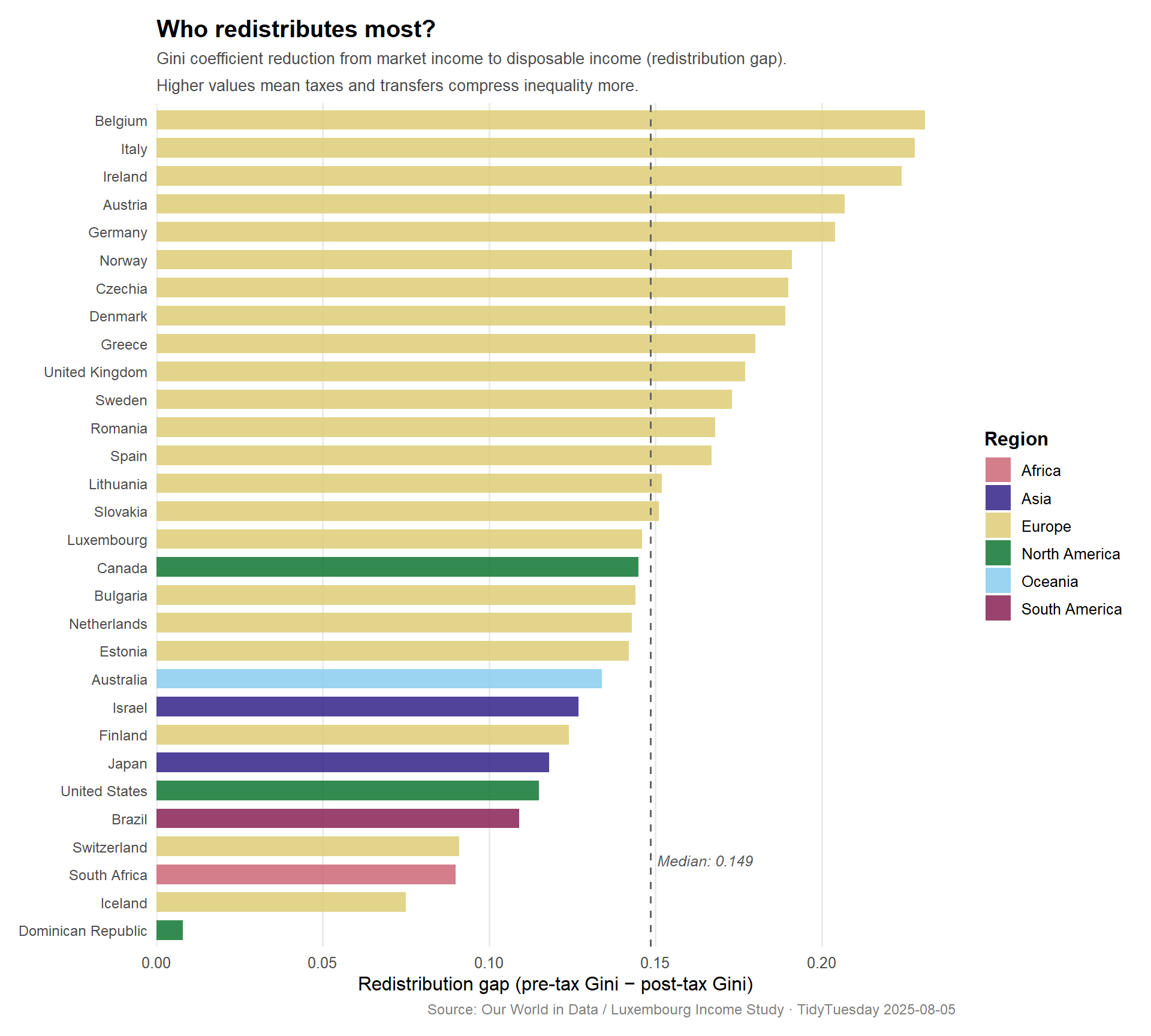
Redistribution by country: ranked gap
A direct ranking of the redistribution gap makes the cross-country comparisons clearest.
# Rank countries by redistribution gapranked_data <- plot_data %>%arrange(redistribution_gap) %>%mutate(Entity = forcats::fct_inorder(Entity),label =sprintf("%.3f", redistribution_gap) )cat(sprintf("ranked_data: %d rows\n", nrow(ranked_data)))
ranked_data: 30 rows
stopifnot("Ranked data empty"=nrow(ranked_data) >0)p_ranked <- ggplot2::ggplot( ranked_data, ggplot2::aes(x = redistribution_gap, y = Entity, fill = region)) + ggplot2::geom_col(alpha =0.85, width =0.7) + ggplot2::geom_vline(xintercept =median(ranked_data$redistribution_gap),linetype ="dashed",color ="grey40",linewidth =0.6 ) + ggplot2::annotate("text",x =median(ranked_data$redistribution_gap) +0.002,y =3.5,label =sprintf("Median: %.3f", median(ranked_data$redistribution_gap)),hjust =0,color ="grey35",size =3.3,fontface ="italic" ) + ggplot2::scale_fill_manual(values = region_cols) + ggplot2::scale_x_continuous(expand = ggplot2::expansion(mult =c(0, 0.04)),labels = scales::number_format(accuracy =0.01) ) + ggplot2::labs(title ="Who redistributes most?",subtitle ="Gini coefficient reduction from market income to disposable income (redistribution gap).\nHigher values mean taxes and transfers compress inequality more.",x ="Redistribution gap (pre-tax Gini − post-tax Gini)",y =NULL,fill ="Region",caption ="Source: Our World in Data / Luxembourg Income Study · TidyTuesday 2025-08-05" ) + ggplot2::theme_minimal(base_size =12) + ggplot2::theme(plot.title = ggplot2::element_text(face ="bold", size =15),plot.subtitle = ggplot2::element_text(color ="grey30", size =10, lineheight =1.4),plot.caption = ggplot2::element_text(color ="grey50", size =9),panel.grid.minor = ggplot2::element_blank(),panel.grid.major.y = ggplot2::element_blank(),axis.text.y = ggplot2::element_text(size =9),legend.position ="right",legend.title = ggplot2::element_text(face ="bold"),plot.margin = ggplot2::margin(12, 12, 12, 12) )p_ranked
ImportantThe outlier at the top
The country with the largest redistribution gap in this dataset has a pre-tax Gini above 0.55 — higher than almost anywhere else — yet achieves a post-tax Gini in the mid-range. This points to a redistributive system working very hard against a deeply unequal primary distribution of wages and capital income, rather than a system that prevents inequality from forming in the first place.
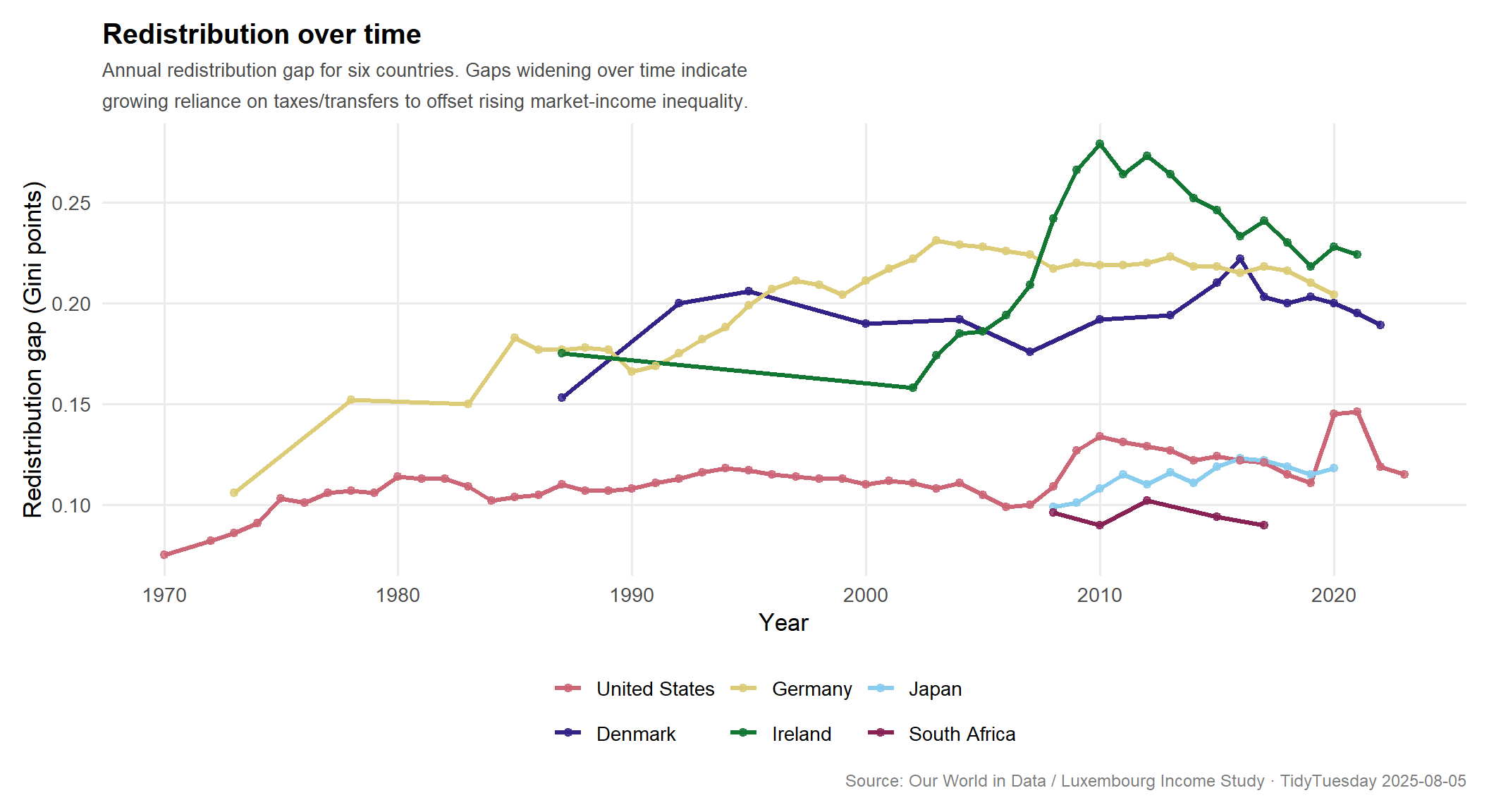
Redistribution over time: selected countries
# Select a mix of strong and moderate redistributors with good time coveragets_countries <-c("United States", "Denmark", "Germany","Ireland", "Japan", "South Africa")ts_data <- income_inequality_processed %>%filter(Entity %in% ts_countries,!is.na(gini_mi_eq),!is.na(gini_dhi_eq)) %>%mutate(redistribution_gap = gini_mi_eq - gini_dhi_eq,Entity = forcats::fct_relevel(Entity, ts_countries))cat(sprintf("ts_data: %d rows, %d cols\n", nrow(ts_data), ncol(ts_data)))
ts_data: 147 rows, 6 cols
stopifnot("Time series data empty"=nrow(ts_data) >0)# Distinct colors for 6 countries using the same region_cols logicts_cols <-as.vector(khroma::color("muted")(6))names(ts_cols) <- ts_countriesp_ts <- ggplot2::ggplot( ts_data, ggplot2::aes(x = Year, y = redistribution_gap, color = Entity)) + ggplot2::geom_line(linewidth =1.1) + ggplot2::geom_point(size =1.8, alpha =0.8) + ggplot2::scale_color_manual(values = ts_cols) + ggplot2::scale_y_continuous(labels = scales::number_format(accuracy =0.01)) + ggplot2::labs(title ="Redistribution over time",subtitle ="Annual redistribution gap for six countries. Gaps widening over time indicate\ngrowing reliance on taxes/transfers to offset rising market-income inequality.",x ="Year",y ="Redistribution gap (Gini points)",color =NULL,caption ="Source: Our World in Data / Luxembourg Income Study · TidyTuesday 2025-08-05" ) + ggplot2::theme_minimal(base_size =13) + ggplot2::theme(plot.title = ggplot2::element_text(face ="bold", size =15),plot.subtitle = ggplot2::element_text(color ="grey30", size =10, lineheight =1.4),plot.caption = ggplot2::element_text(color ="grey50", size =9),panel.grid.minor = ggplot2::element_blank(),panel.grid.major = ggplot2::element_line(color ="grey92"),legend.position ="bottom",plot.margin = ggplot2::margin(12, 12, 12, 12) )p_ts
Final thoughts and takeaways
The pre-tax/post-tax Gini comparison is a rare case in social data where the policy mechanism is visible in the numbers. Market income inequality reflects labor markets, capital concentration, and demographic structure. Disposable income inequality reflects all of that plus the deliberate choices a government makes about who pays taxes and who receives transfers.
The most striking finding here is not that redistribution happens everywhere — it does — but how dramatically the degree of redistribution varies. Ireland and Denmark compress their Gini by more than 0.20 points. The United States compresses by roughly half that. These are not small calibration differences: they correspond to substantially different lived experiences of economic precarity, mobility, and access to resources.
The time series suggests that in countries like the United States and Germany, redistribution gaps have grown over time — not because policy became more generous, but because pre-tax inequality rose faster than redistribution could offset it. This is a treadmill dynamic: the welfare state is working harder just to stay in the same relative place.
A few caveats worth noting:
Missing data for gini_mi_eq means a subset of countries (particularly lower-income economies) are excluded from the cross-sectional comparison. The 52-country sample skews toward high- and upper-middle-income nations.
“Most recent year” varies by country — some observations are from the 2010s, others from the early 2020s, making strict comparisons slightly imprecise.
Gini coefficients compress information. A redistribution gap of 0.15 could reflect a targeted poverty-reduction transfer system, a broad middle-class tax credit, or a pension system. The number alone doesn’t reveal the mechanism.
Still, the core signal is clear: the raw market distribution of income is not the same thing as inequality as people actually experience it — and the gap between those two things is a political choice.