Tidy Tuesday: Extreme Weather Attribution Studies
tidytuesday
R
climate
attribution
How often do climate scientists actually find a human fingerprint on extreme weather? Mapping the track record of attribution studies from 2004 to 2024 across event types, regions, and time.
Preface
From the TidyTuesday repository.
The Carbon Brief database of extreme weather attribution studies catalogues peer-reviewed research examining whether and to what degree climate change influenced specific extreme weather events or trends. Each row represents one scientific study, covering events from 2003 through the early 2020s, along with the study’s conclusion — whether human influence made the event more severe, less severe, or left no discernible fingerprint.
The questions I want to answer:
- What fraction of studies find a human climate fingerprint, and does that vary by event type?
- Have attribution studies grown more likely to detect a human signal over time, as methodology matures and warming accumulates?
- Which regions are most studied, and which event types generate the most research attention?
Loading necessary packages
My handy booster pack that allows me to install (if needed) and load my usual and favorite packages, as well as some helpful functions.
Code
# Packages ----------------------------------------------------------------

{
  if (!requireNamespace("pak", quietly = TRUE)) {
    install.packages("pak", repos = "https://cloud.r-project.org")
  }

  install_booster_pack <- function(package, load = TRUE) {
    for (pkg in package) {
      if (!requireNamespace(pkg, quietly = TRUE)) {
        pak::pkg_install(pkg)
      }
      if (load) {
        library(pkg, character.only = TRUE)
      }
    }
  }

  core_packages <- c(
    'fs',
    'here',
    'janitor',
    'rio',
    'tidyverse',
    'skimr',
    'paletteer',
    'tidytuesdayR'
  )

  optional_packages <- c('ggrepel', 'scales', 'ggtext')

  install_booster_pack(package = unique(c(core_packages, optional_packages)), load = TRUE)
  rm(install_booster_pack, core_packages, optional_packages)

  # Custom Functions ----

  `%ni%` <- Negate(`%in%`)

  geometric_mean <- function(x) {
    exp(mean(log(x[x > 0]), na.rm = TRUE))
  }

  my_skim <- skim_with(
    numeric = sfl(
      n = length,
      min = ~ min(.x, na.rm = T),
      p25 = ~ stats::quantile(., probs = .25, na.rm = TRUE, names = FALSE),
      med = ~ median(.x, na.rm = T),
      p75 = ~ stats::quantile(., probs = .75, na.rm = TRUE, names = FALSE),
      max = ~ max(.x, na.rm = T),
      mean = ~ mean(.x, na.rm = T),
      geo_mean = ~ geometric_mean(.x),
      sd = ~ stats::sd(., na.rm = TRUE),
      hist = ~ inline_hist(., 5)
    ),
    append = FALSE
  )
}
Load raw data from package
raw <- tidytuesdayR::tt_load('2025-08-12')

attribution_studies     <- raw$attribution_studies
attribution_studies_raw <- raw$attribution_studies_raw
Exploratory Data Analysis
The my_skim() function is a modified version of the skimr::skim() function that returns the number of missing data points (cells as NA) as well as the inverse (e.g.: number of rows that are not NA), the count, minimum, 25%, median, 75%, max, mean, geometric mean, and standard deviation. It also generates a little ASCII histogram. Neat!
attribution_studies
attribution_studies %>%
  select(publication_year) %>%
my_skim()| Name | Piped data |
| Number of rows | 744 |
| Number of columns | 1 |
| _______________________ | |
| Column type frequency: | |
| numeric | 1 |
| ________________________ | |
| Group variables | None |
Variable type: numeric
| skim_variable | n_missing | complete_rate | n | min | p25 | med | p75 | max | mean | geo_mean | sd | hist |
|---|---|---|---|---|---|---|---|---|---|---|---|---|
| publication_year | 1 | 1 | 744 | 2004 | 2016 | 2020 | 2022 | 2024 | 2019.08 | 2019.08 | 3.72 | ▁▁▅▅▇ |
attribution_studies %>%
  count(event_type, sort = TRUE)
# A tibble: 12 × 2
event_type n
<chr> <int>
1 Heat 207
2 Rain & flooding 177
3 Drought 106
4 Storm 61
5 Cold, snow & ice 57
6 Compound 33
7 Impact 33
8 Wildfire 31
9 Oceans 25
10 Atmosphere 7
11 Sunshine 4
12 River flow 3attribution_studies %>%
count(classification, sort = TRUE)# A tibble: 4 × 2
classification n
<chr> <int>
1 More severe or more likely to occur 554
2 No discernible human influence 71
3 Decrease, less severe or less likely to occur 66
4 Insufficient data/inconclusive 53attribution_studies %>%
count(cb_region, sort = TRUE)# A tibble: 13 × 2
cb_region n
<chr> <int>
1 Europe 165
2 Eastern and south-eastern Asia 161
3 Northern America 137
4 Global 63
5 Sub-Saharan Africa 56
6 Australia and New Zealand 49
7 Central and southern Asia 36
8 Latin America and the Caribbean 32
9 Northern hemisphere 15
10 Arctic 11
11 Northern Africa and western Asia 8
12 Oceania 8
13 Antarctica 3A few patterns jump out immediately:
- Heat events dominate — 207 studies, nearly twice the next category (Rain & flooding at 177). This reflects both how common heat waves are becoming and how tractable they are for attribution methods.
- The vast majority of studies find a human fingerprint — 554 of 744 studies (74%) classify the event as “More severe or more likely to occur.” Only 71 (10%) find no discernible human influence.
- Europe and East/Southeast Asia are the most-studied regions, together accounting for nearly half the database.
- The database spans 2004–2024, with a median publication year of 2020.
The human fingerprint across weather types
The central question in attribution science is whether human-caused climate change made a given event more likely or severe. The classification column is the punchline of each study. Let me look at how that verdict varies across the twelve event types.
# Collapse the four classifications into three cleaner buckets
# and compute proportions within each event type.
clf_levels <- c(
  "More severe or more likely to occur",
  "No discernible human influence",
  "Decrease, less severe or less likely to occur",
  "Insufficient data/inconclusive"
)

clf_labels <- c(
  "More likely / worse",
  "No human signal",
  "Less likely / milder",
  "Inconclusive"
)

event_clf <- attribution_studies %>%
  filter(!is.na(classification), !is.na(event_type)) %>%
  mutate(
    classification = factor(classification, levels = clf_levels, labels = clf_labels),
    event_type     = fct_infreq(event_type)
  ) %>%
  count(event_type, classification) %>%
  group_by(event_type) %>%
  mutate(
    total = sum(n),
    pct   = n / total
  ) %>%
  ungroup()

cat(sprintf("event_clf: %d rows\n", nrow(event_clf)))
event_clf: 35 rowsstopifnot("Plot data empty - check filter values" = nrow(event_clf) > 0)
if (length(unique(event_clf$pct)) == 1) stop("All pct values identical - check grouping")
# Sanity: show the "more likely/worse" rate per event type
event_clf %>%
filter(classification == "More likely / worse") %>%
arrange(desc(pct)) %>%
select(event_type, total, n, pct) %>%
mutate(pct = scales::percent(pct, accuracy = 1))# A tibble: 12 × 4
event_type total n pct
<fct> <int> <int> <chr>
1 Sunshine 4 4 100%
2 Compound 33 32 97%
3 Heat 207 196 95%
4 Oceans 25 23 92%
5 Impact 33 30 91%
6 Wildfire 31 27 87%
7 Storm 61 46 75%
8 Atmosphere 7 5 71%
9 Drought 106 74 70%
10 Rain & flooding 177 110 62%
11 River flow 3 1 33%
12 Cold, snow & ice 57 6 11% # Pull Cassatt1 colors — we need 4 for the four classification outcomes.
clf_colors <- as.character(paletteer::paletteer_d("MetBrewer::Cassatt1", n = 4))
names(clf_colors) <- clf_labels
# Order event types by their "more likely/worse" rate for a meaningful sort.
et_order <- event_clf %>%
filter(classification == "More likely / worse") %>%
arrange(pct) %>%
pull(event_type) %>%
as.character()
plot_df <- event_clf %>%
mutate(event_type = factor(as.character(event_type), levels = et_order))
cat(sprintf("plot_df: %d rows\n", nrow(plot_df)))plot_df: 35 rowsstopifnot("Plot data empty - check filter values" = nrow(plot_df) > 0)
p <- ggplot(plot_df, aes(x = pct, y = event_type, fill = classification)) +
geom_col(position = "stack", width = 0.72) +
geom_text(
data = plot_df %>% filter(pct >= 0.07),
aes(label = scales::percent(pct, accuracy = 1)),
position = position_stack(vjust = 0.5),
size = 3.2,
color = "white",
fontface = "bold"
) +
# Total count label at right end of bar
geom_text(
data = plot_df %>%
group_by(event_type) %>%
summarize(total = first(total), .groups = "drop"),
aes(x = 1.01, y = event_type, label = paste0("n=", total)),
inherit.aes = FALSE,
hjust = 0,
size = 3.1,
color = "grey40"
) +
scale_fill_manual(
values = clf_colors,
name = "Attribution finding"
) +
scale_x_continuous(
labels = scales::percent_format(accuracy = 1),
expand = expansion(mult = c(0, 0.12)),
name = "Share of studies"
) +
scale_y_discrete(name = NULL) +
labs(
title = "Climate change fingerprint found in ~3 out of 4 attribution studies",
subtitle = "Each bar shows the distribution of findings across 744 peer-reviewed studies (2004–2024), sorted by rate of attribution",
caption = "Source: Carbon Brief Database of Extreme Weather Attribution Studies via TidyTuesday 2025-08-12"
) +
theme_minimal(base_size = 12) +
theme(
plot.title.position = "plot",
plot.title = element_text(face = "bold", size = 14),
plot.subtitle = element_text(color = "grey35", margin = margin(b = 14)),
plot.caption = element_text(color = "grey45", hjust = 0, size = 9),
legend.position = "bottom",
legend.title = element_text(face = "bold", size = 10),
legend.key.size = unit(0.45, "cm"),
panel.grid.major.y = element_blank(),
panel.grid.minor = element_blank(),
panel.grid.major.x = element_line(color = "grey90"),
plot.background = element_rect(fill = "grey98", color = NA),
panel.background = element_rect(fill = "grey98", color = NA),
axis.text.y = element_text(size = 11)
) +
guides(fill = guide_legend(nrow = 2, byrow = TRUE))
p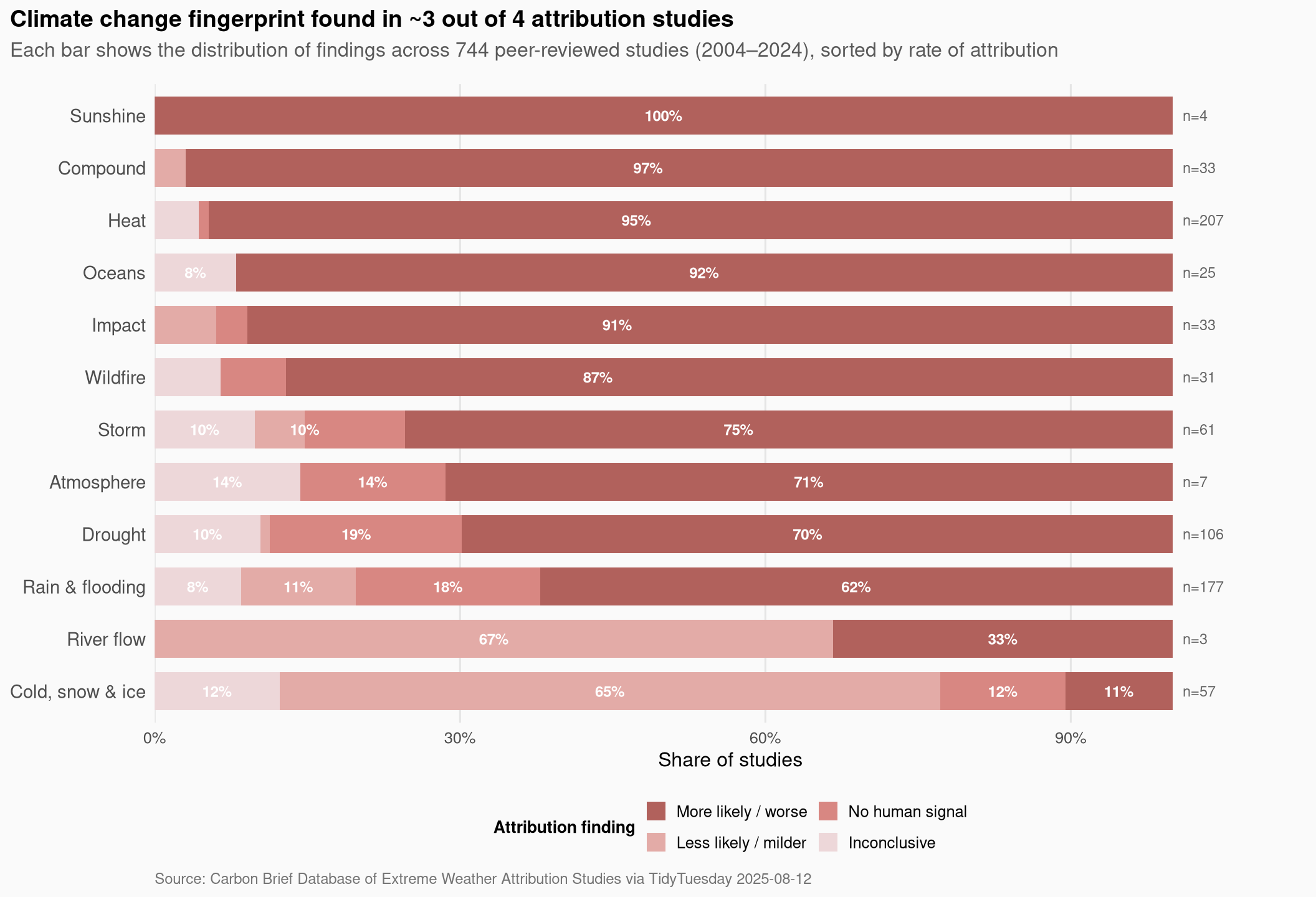
A few things stand out immediately:
- Wildfire and heat are the highest-attribution event types — nearly every study on these events concludes that climate change made them more likely or more severe. This is consistent with the mechanistic story: higher baseline temperatures directly raise fire danger and heat-wave intensity.
- Ocean events and compound events show the second tier of attribution confidence, though the sample sizes are smaller.
- “No human signal” findings cluster in Cold, snow & ice events and Drought — for cold events this makes intuitive sense (warming reduces cold extremes, so it would if anything decrease their frequency). Drought attribution is more regionally dependent and methodologically challenging.
- Atmospheric and River flow categories are barely-studied niches with small totals; conclusions there carry wide uncertainty bands even before you look at the data.
Attribution rate over time
Has the science gotten more confident? Attribution methodology has matured substantially since the early 2000s, and the amount of observed warming has itself increased, both of which should make the human signal easier to detect.
time_df <- attribution_studies %>%
  filter(!is.na(publication_year), !is.na(classification)) %>%
  mutate(
    attributed = classification == "More severe or more likely to occur",
    pub_year   = as.integer(publication_year)
  ) %>%
  filter(pub_year >= 2004, pub_year <= 2024) %>%
  group_by(pub_year) %>%
  summarize(
    n_studies    = n(),
    n_attributed = sum(attributed),
    pct_attr     = n_attributed / n_studies,
    .groups = "drop"
  )

cat(sprintf("time_df: %d rows\n", nrow(time_df)))
time_df: 18 rowsstopifnot("Plot data empty - check filter values" = nrow(time_df) > 0)
if (length(unique(time_df$pct_attr)) == 1) stop("All pct_attr values identical - check grouping")
accent_color <- as.character(paletteer::paletteer_d("MetBrewer::Cassatt1", n = 1))
p2 <- ggplot(time_df, aes(x = pub_year)) +
geom_col(aes(y = n_studies), fill = "grey85", width = 0.75) +
geom_line(aes(y = pct_attr * max(n_studies)),
color = accent_color, linewidth = 1.2) +
geom_point(aes(y = pct_attr * max(n_studies)),
color = accent_color, size = 2.8) +
scale_x_continuous(breaks = seq(2004, 2024, by = 2), name = NULL) +
scale_y_continuous(
name = "Studies published",
sec.axis = sec_axis(
~ . / max(time_df$n_studies),
name = "Attribution rate",
labels = scales::percent_format(accuracy = 1)
),
expand = expansion(mult = c(0, 0.05))
) +
labs(
title = "Attribution studies have surged — attribution rate has held steady above 70%",
subtitle = "Bars: total studies published each year. Line: share concluding climate change made the event worse/more likely.",
caption = "Source: Carbon Brief Database via TidyTuesday 2025-08-12 · publication_year used throughout"
) +
theme_minimal(base_size = 12) +
theme(
plot.title.position = "plot",
plot.title = element_text(face = "bold", size = 13),
plot.subtitle = element_text(color = "grey35", margin = margin(b = 12)),
plot.caption = element_text(color = "grey45", hjust = 0, size = 9),
panel.grid.minor = element_blank(),
panel.grid.major.x = element_blank(),
plot.background = element_rect(fill = "grey98", color = NA),
panel.background = element_rect(fill = "grey98", color = NA),
axis.title.y.right = element_text(color = accent_color, face = "bold"),
axis.text.y.right = element_text(color = accent_color)
)
p2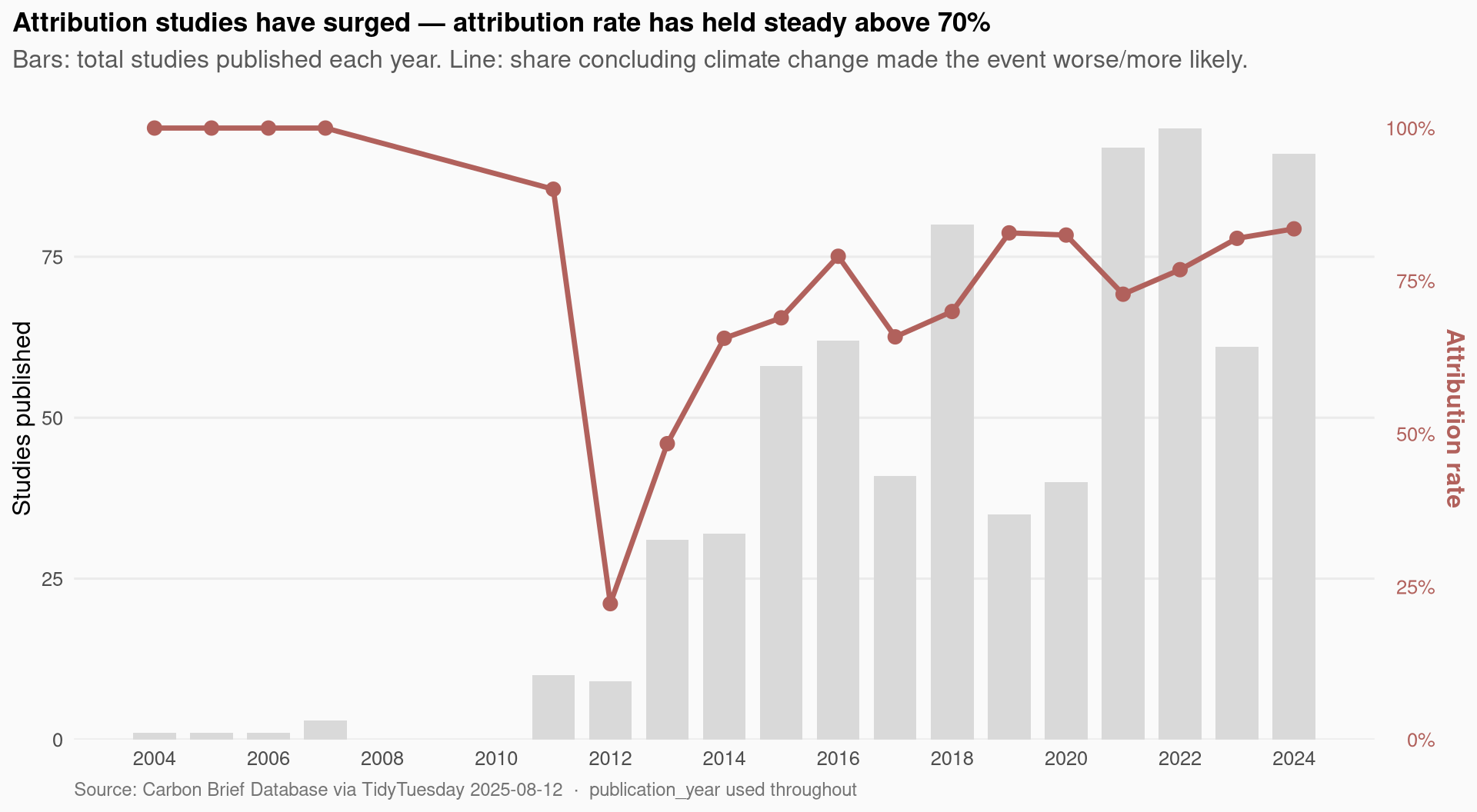
The volume of attribution research exploded in the 2010s and stayed elevated through 2024, likely driven by the formalization of rapid attribution methods (like those used by World Weather Attribution). The attribution rate — the share of studies finding a human signal — has been consistently high since the start of the database, hovering in the 70–85% range most years. There’s no strong upward trend in detection rate; rather, the science came in confident and stayed confident.
Final thoughts and takeaways
The Carbon Brief attribution database is a useful reality check against the common framing that “we can’t tell if any individual weather event is caused by climate change.” The record says something more nuanced: in aggregate, 74% of attribution studies find that climate change made the event worse or more likely. That figure is not uniform — wildfire and heat events are near-certain attributions, while cold-weather events and some droughts are genuinely ambiguous — but the overall direction of the evidence is lopsided.
Three things I’ll carry away from this dataset:
Heat attribution is the settled case. Almost every study on a heat event concludes that climate change played a role. This is the mechanistic floor: if you add heat to a system, heat events get worse. The signal is essentially always detectable.
Rapid attribution studies are a growing share of the database. 103 of 744 studies are flagged as rapid attribution, a genre that emerged partly from World Weather Attribution and aims to publish findings within days or weeks of a major event. That they can do this while still getting the same general answer (attribution rate appears similar) says something about how robust the signal is.
The regions with the most studies — Europe, East Asia, North America — are also the regions with the most institutional capacity to run them. Sub-Saharan Africa and Central/Southern Asia appear in 56 and 36 studies respectively, despite being highly vulnerable to climate extremes. The scientific record reflects where the scientists are, not necessarily where the impacts are largest.