Seven decades of chart-toppers: how the sonic DNA of Billboard Hot 100 #1 hits has shifted from doo-wop to drill — and what the instruments that disappeared can tell us about pop culture.
This week we’re exploring every song that has ever reached #1 on the Billboard Hot 100. The dataset includes rich metadata for each chart-topper: audio features (energy, danceability, happiness, BPM, loudness, acousticness), the presence of 23 specific instruments, artist demographics, lyrical topics, production credits, and label information. Songs span from August 1958 through early 2025 — nearly 70 years of American popular music.
Suggested questions: What genres and artists have dominated the chart over time? How have the sonic characteristics of #1 hits changed? Which instruments have risen and fallen from pop music’s spotlight?
Loading necessary packages
My handy booster pack that allows me to install (if needed) and load my usual and favorite packages, as well as some helpful functions.
raw <- tidytuesdayR::tt_load("2025-08-26")billboard <- raw$billboardtopics <- raw$topics
Exploratory Data Analysis
The my_skim() function is a modified version of the skimr::skim() function that returns the number of missing data points (cells as NA) as well as the inverse (e.g.: number of rows that are notNA), the count, minimum, 25%, median, 75%, max, mean, geometric mean, and standard deviation. It also generates a little ASCII histogram. Neat!
Billboard Hot 100
The dataset contains 105 columns — far more than we need in one place. For EDA, I’ll profile the core numeric features that drive the analysis: audio characteristics, weeks at #1, and ratings. Free-text columns (lyrics, songwriter credits, featured artists) and binary indicator flags are dropped from the skim since they don’t have meaningful numeric distributions.
The dataset spans 1177 chart-topping songs from August 1958 through January 2025 — nearly 70 years of American pop history. Most #1 songs hold the top spot for just 2 weeks (median), though outliers like Old Town Road and A Bar Song (Tipsy) each lasted 19 weeks.
Audio features are scaled 0–100, making them directly comparable. A few patterns jump out immediately:
BPM has a wide standard deviation — pop music tolerates a wide tempo range
Happiness centers around 61 but has a long left tail, suggesting many somber #1s
Acousticness is heavily right-skewed (median near 20) — modern pop production favors electronic and produced sounds
Loudness ranges from a quiet -23 dB to a wall-of-sound -1 dB, reflecting decades of the “loudness war”
billboard %>%mutate(decade =paste0(floor(as.integer(format(date, "%Y")) /10) *10, "s")) %>%count(decade) %>% knitr::kable(col.names =c("Decade", "# of Chart-Toppers"),caption ="Billboard #1 hits by decade in the dataset")
Billboard #1 hits by decade in the dataset
Decade
# of Chart-Toppers
1950s
23
1960s
203
1970s
253
1980s
231
1990s
140
2000s
129
2010s
116
2020s
82
The 1960s–1980s are the most data-rich decades, with the 1950s (only from August 1958) and 2020s (through early 2025) naturally smaller.
The Sound of Success Across the Decades
Audio Features: The Happiness Paradox
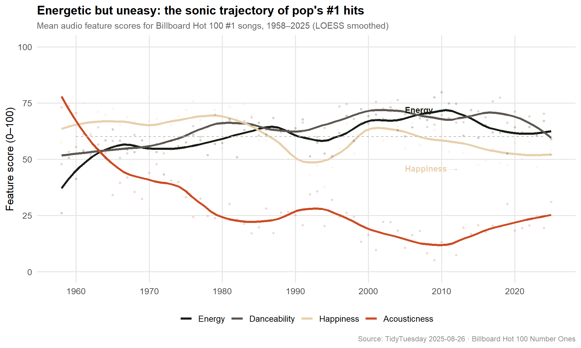
One of the most striking patterns in this data is what I’m calling the happiness paradox: over seven decades, #1 songs have become simultaneously more energetic and less happy. Songs got louder, more danceable, and more intense — but the emotional quality of those sounds turned darker.
stopifnot("Plot data has 0 rows — check pipeline"=nrow(sonic_year) >0)# Palette: MexBrewer::Atentado (qualitative, 10 colors; Alacena already used)feature_colors <- paletteer::paletteer_d("MexBrewer::Atentado", n =10)[c(1, 3, 6, 9)]names(feature_colors) <-c("Energy", "Danceability", "Happiness", "Acousticness")p_sonic <- sonic_year %>%ggplot(aes(x = year, y = value, color = feature)) +geom_smooth(se =FALSE, method ="loess", span =0.35, linewidth =1.4) +geom_point(alpha =0.15, size =0.8) +scale_color_manual(values = feature_colors) +scale_x_continuous(breaks =seq(1960, 2020, by =10)) +scale_y_continuous(limits =c(0, 100)) +annotate("text", x =2005, y =46, label ="Happiness →", color = feature_colors["Happiness"],hjust =0, fontface ="bold", size =3.5 ) +annotate("text", x =2005, y =72, label ="Energy →", color = feature_colors["Energy"],hjust =0, fontface ="bold", size =3.5 ) +annotate("segment", x =1960, xend =2024, y =60, yend =60,color ="grey70", linewidth =0.4, linetype ="dashed" ) +labs(title ="Energetic but uneasy: the sonic trajectory of pop's #1 hits",subtitle ="Mean audio feature scores for Billboard Hot 100 #1 songs, 1958–2025 (LOESS smoothed)",x =NULL,y ="Feature score (0–100)",color =NULL,caption ="Source: TidyTuesday 2025-08-26 · Billboard Hot 100 Number Ones" ) +theme_minimal(base_size =13) +theme(plot.title =element_text(face ="bold", size =15),plot.subtitle =element_text(color ="grey40", size =11),legend.position ="bottom",panel.grid.minor =element_blank(),panel.grid.major =element_line(color ="grey90"),plot.caption =element_text(color ="grey55", size =9) )p_sonic
ImportantThe Happiness Paradox
Energy rose sharply from the 1970s into the 2000s. Danceability climbed steadily. Happiness fell. Since its peak in the early 1970s (the golden era of Motown and disco), the average emotional valence of #1 songs has declined by nearly 20 points — a generation-long drift toward darker, more complex emotional expression in mainstream pop. Meanwhile, Acousticness cratered as electronic production took over, bottoming out in the 2000s before a slight folk/country revival in the 2010s–2020s.
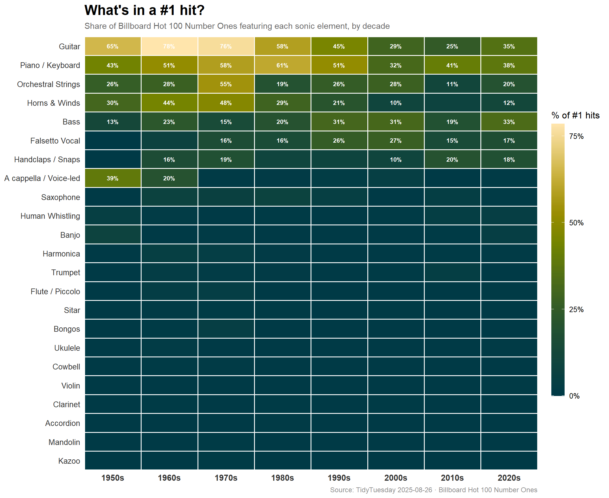
Instrument Archaeology: What’s in a #1 Hit?
Beyond the aggregate audio features, this dataset contains binary flags for 23 specific instruments or sonic elements. Looking at how often each one appears in #1 songs — broken out by decade — tells a fascinating story about what pop music has kept, discarded, and occasionally rediscovered.
stopifnot("Plot data has 0 rows"=nrow(inst_decade) >0)# Order instruments by overall prevalence (most present at top after flipping coords)inst_order <- inst_decade %>%group_by(instrument) %>%summarise(total =sum(proportion), .groups ="drop") %>%arrange(desc(total)) %>%pull(instrument)inst_decade <- inst_decade %>%mutate(instrument =factor(instrument, levels =rev(inst_order)))# Validate proportions look reasonablepct_summary <- inst_decade %>%summarise(min_pct =min(pct), max_pct =max(pct), mean_pct =mean(pct))cat(sprintf("Pct range: %.1f%% to %.1f%% (mean %.1f%%)\n", pct_summary$min_pct, pct_summary$max_pct, pct_summary$mean_pct))
Pct range: 0.0% to 78.3% (mean 9.8%)
stopifnot("All pct values identical — check grouping"=length(unique(inst_decade$pct)) >1)p_heat <- inst_decade %>%ggplot(aes(x = decade, y = instrument, fill = pct)) +geom_tile(color ="white", linewidth =0.6) +geom_text(aes(label =ifelse(pct >=10, paste0(round(pct), "%"), "")),color ="white", size =2.8, fontface ="bold" ) + paletteer::scale_fill_paletteer_c("scico::bamako",direction =1,breaks =c(0, 25, 50, 75),labels = scales::label_percent(scale =1) ) +scale_x_discrete(expand =c(0, 0)) +scale_y_discrete(expand =c(0, 0)) +labs(title ="What's in a #1 hit?",subtitle ="Share of Billboard Hot 100 Number Ones featuring each sonic element, by decade",x =NULL,y =NULL,fill ="% of #1 hits",caption ="Source: TidyTuesday 2025-08-26 · Billboard Hot 100 Number Ones" ) +theme_minimal(base_size =12) +theme(plot.title =element_text(face ="bold", size =18),plot.subtitle =element_text(color ="grey40", size =11, margin =margin(b =8)),plot.caption =element_text(color ="grey55", size =9),axis.text.y =element_text(size =10, color ="grey20"),axis.text.x =element_text(size =11, face ="bold", color ="grey20"),legend.position ="right",legend.key.height =unit(2.5, "cm"),panel.grid =element_blank() )p_heat
NoteReading the heat map
Each cell shows what percentage of that decade’s #1 songs featured a given instrument or sonic element. Light cream = rarely present; dark teal = present in most hits. Percentages are shown for cells ≥ 10%.
What the heatmap reveals
Guitar’s long decline. Guitar was the backbone of pop in the 1960s — present in ~78% of chart-toppers — but fell steadily through every subsequent decade. By the 2010s it appeared in roughly one in four #1 songs. The rise of synthesizer-based pop, hip-hop production, and DAW-native music making rendered the guitar optional in ways that would have been unthinkable to Elvis or the Beatles.
The brief, glorious reign of the sitar. The sitar — a niche South Asian instrument that found its way into Western pop via Ravi Shankar and George Harrison — had a concentrated burst of chart presence in the 1960s. Its rapid disappearance mirrors the waning of the psychedelic era and the cultural novelty of Indian classical influences on rock.
Bass going deeper, everywhere. Bass presence in #1 songs grew from around 13% in the 1950s to over 30% in the 2020s. As guitar retreated, bass became more prominent — whether in funk, hip-hop, electronic, or trap production, low-end is now the near-universal foundation of the chart.
Accordion and banjo: ghosts of pop’s folk past. Both instruments were modestly common in the 1950s–60s charts (country crossovers, novelty records, Cajun-inflected pop) and essentially vanished. Banjo made a brief, charming reappearance in the 2010s — largely courtesy of Lil Nas X’s Old Town Road, which blended country trap with a literal banjo sample.
The a cappella era. The “A cappella / Voice-led” row shows the highest presence in the 1950s — reflecting the doo-wop era, when vocal harmony groups dominated the charts with minimal instrumental backing. This dropped sharply as rock and soul production formulas took hold in the 1960s.
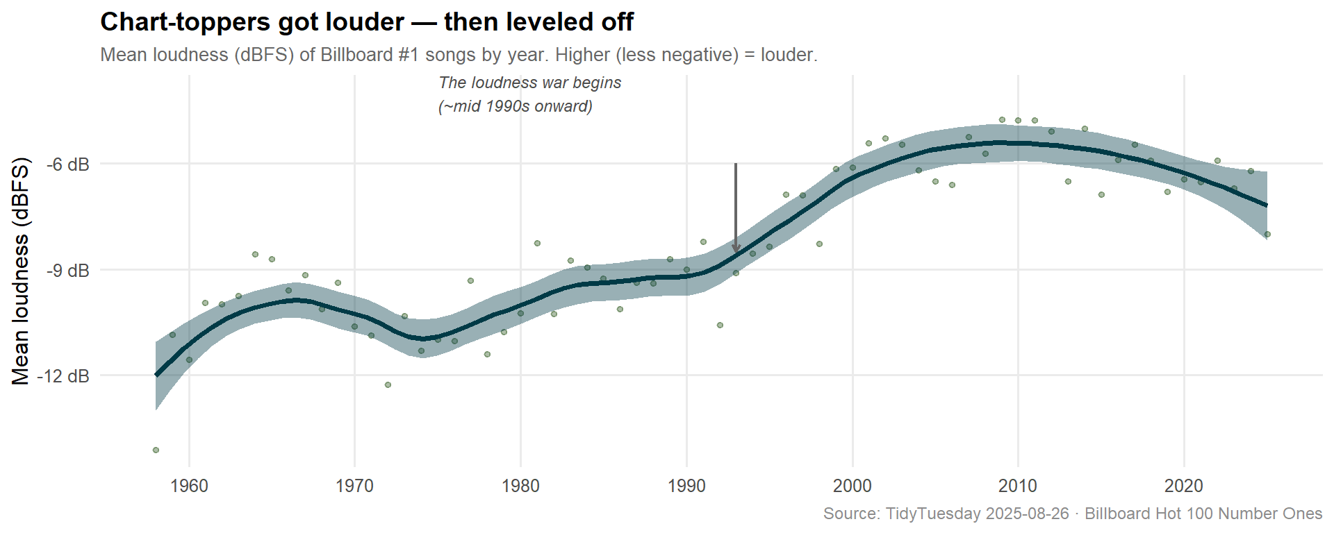
The Loudness War in Numbers
# Loudness by yearloud_year <- billboard %>%mutate(year =as.integer(format(date, "%Y"))) %>%group_by(year) %>%summarise(mean_loudness =mean(loudness_d_b, na.rm =TRUE), .groups ="drop")cat(sprintf("loud_year: %d rows\n", nrow(loud_year)))
loud_year: 68 rows
stopifnot("Plot data has 0 rows"=nrow(loud_year) >0)p_loud <- loud_year %>%ggplot(aes(x = year, y = mean_loudness)) +geom_point(alpha =0.4, size =1.2, color ="#355E26") +geom_smooth(se =TRUE, method ="loess", span =0.4,color ="#003A46", fill ="#003A4633", linewidth =1.4) +annotate("text", x =1975, y =-4,label ="The loudness war begins\n(~mid 1990s onward)",hjust =0, color ="grey30", size =3.2, fontface ="italic" ) +annotate("segment", x =1993, xend =1993, y =-6, yend =-8.5,arrow =arrow(length =unit(0.15, "cm")), color ="grey40", linewidth =0.8) +scale_x_continuous(breaks =seq(1960, 2020, 10)) +scale_y_continuous(labels = scales::label_number(suffix =" dB")) +labs(title ="Chart-toppers got louder — then leveled off",subtitle ="Mean loudness (dBFS) of Billboard #1 songs by year. Higher (less negative) = louder.",x =NULL, y ="Mean loudness (dBFS)",caption ="Source: TidyTuesday 2025-08-26 · Billboard Hot 100 Number Ones" ) +theme_minimal(base_size =12) +theme(plot.title =element_text(face ="bold", size =14),plot.subtitle =element_text(color ="grey40", size =10),panel.grid.minor =element_blank(),plot.caption =element_text(color ="grey55", size =9) )p_loud
The loudness trajectory tells the story of mastering technology as a competitive weapon. From the 1950s through the early 1990s, #1 songs averaged around -10 to -12 dBFS. Then, as CD mastering tools became widespread and the streaming era introduced per-track normalization, producers pushed loudness to the ceiling — around -5 to -6 dBFS in the 2000s–2010s. More recent years show a slight pullback, possibly reflecting streaming platforms’ loudness normalization standards.
Final thoughts and takeaways
Seventy years of Billboard #1 hits are, in aggregate, a sociological X-ray of American pop culture. A few things stand out:
Pop got louder, more energetic, and more danceable — but emotionally darker. The happiness paradox is real. The biggest hits of the 1970s were, on average, 15–20 points “happier” than the biggest hits of the 2020s. This isn’t coincidence: the decades after 1980 saw the mainstreaming of hip-hop (which often foregrounds struggle, defiance, and loss), the emo and post-grunge eras, and a general cultural turn toward complexity and irony in mainstream art.
Instruments encode eras. The sitar’s one-decade cameo in the 1960s is more historically dense than any Wikipedia entry about the British Invasion. The accordion’s disappearance from the charts coincides almost exactly with the fading of regional folk sounds from national pop. The banjo’s reappearance in the 2010s — driven by one song — shows how thoroughly a single massive hit can distort decade-level statistics.
The guitar’s demotion is the defining structural change in pop music. It was once the instrument of the chart — in the 1960s you’d be hard pressed to find a #1 song without one. Today, it’s a stylistic option, reaching for the emotional register of “authenticity” or “roots” when producers invoke it deliberately. Its decline isn’t the death of rock guitar; it’s the rise of everything else.
What this data can’t tell us is whether any of these changes are “good” or “bad” for popular music — that’s in the ear of the beholder. What it does confirm is that the Billboard Hot 100 has been a remarkably faithful mirror of broader cultural and technological shifts. The chart doesn’t just reflect taste; it reflects who gets to make music, how they make it, and what emotional language an era considers worth broadcasting.