p <- ggplot2::ggplot() +
# Background: individual country trajectories (faint)
ggplot2::geom_line(
data = country_trajectories,
ggplot2::aes(x = year, y = visa_free_count, group = code, color = region),
alpha = 0.08, linewidth = 0.3
) +
# IQR ribbon per region
ggplot2::geom_ribbon(
data = regional_trends,
ggplot2::aes(x = year, ymin = p25_vfc, ymax = p75_vfc, fill = region),
alpha = 0.12
) +
# Bold regional median line
ggplot2::geom_line(
data = regional_trends,
ggplot2::aes(x = year, y = median_vfc, color = region),
linewidth = 1.6
) +
# Endpoint dots at 2025
ggplot2::geom_point(
data = region_labels_2025,
ggplot2::aes(x = 2025, y = median_vfc, color = region),
size = 3, shape = 21, fill = "white", stroke = 1.8
) +
# Region labels at 2025
ggrepel::geom_text_repel(
data = region_labels_2025,
ggplot2::aes(x = 2025, y = median_vfc, label = region, color = region),
nudge_x = 1.5,
hjust = 0,
size = 3.2,
fontface = "bold",
segment.size = 0.3,
direction = "y",
show.legend = FALSE
) +
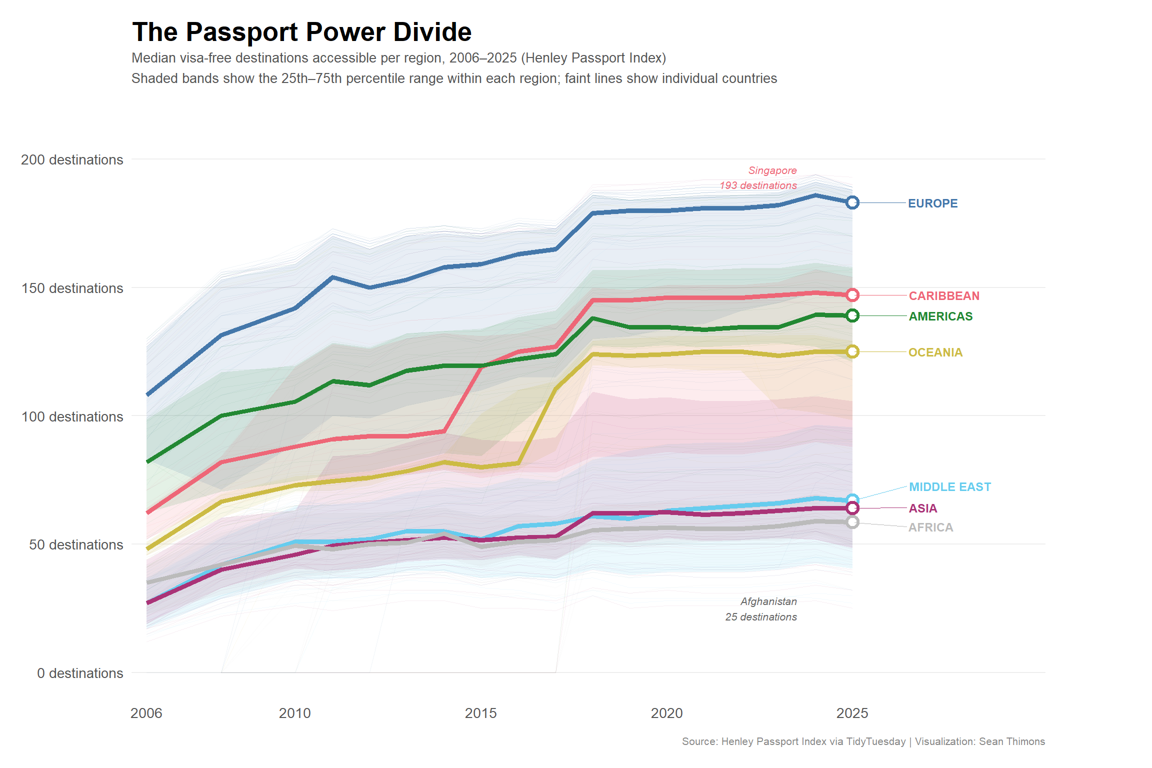
# Annotation: Singapore at top in 2025
ggplot2::annotate(
"text",
x = 2023.5, y = 193,
label = "Singapore\n193 destinations",
size = 2.8, color = "#EE6677", hjust = 1, fontface = "italic"
) +
# Annotation: Afghanistan at bottom
ggplot2::annotate(
"text",
x = 2023.5, y = 25,
label = "Afghanistan\n25 destinations",
size = 2.8, color = "#666666", hjust = 1, fontface = "italic"
) +
# Scales
paletteer::scale_color_paletteer_d(
"khroma::bright",
name = "Region"
) +
paletteer::scale_fill_paletteer_d(
"khroma::bright",
name = "Region"
) +
ggplot2::scale_x_continuous(
breaks = c(2006, 2010, 2015, 2020, 2025),
expand = ggplot2::expansion(mult = c(0.02, 0.18))
) +
ggplot2::scale_y_continuous(
limits = c(0, 210),
breaks = seq(0, 200, 50),
labels = function(x) paste0(x, " destinations")
) +
# Labels
ggplot2::labs(
title = "The Passport Power Divide",
subtitle = "Median visa-free destinations accessible per region, 2006–2025 (Henley Passport Index)\nShaded bands show the 25th–75th percentile range within each region; faint lines show individual countries",
x = NULL,
y = NULL,
caption = "Source: Henley Passport Index via TidyTuesday | Visualization: Sean Thimons"
) +
# Theme
ggplot2::theme_minimal(base_size = 13) +
ggplot2::theme(
plot.title = ggplot2::element_text(face = "bold", size = 20, margin = ggplot2::margin(b = 4)),
plot.subtitle = ggplot2::element_text(size = 10, color = "#555555", lineheight = 1.3,
margin = ggplot2::margin(b = 16)),
plot.caption = ggplot2::element_text(size = 8, color = "#888888", margin = ggplot2::margin(t = 12)),
panel.grid.minor = ggplot2::element_blank(),
panel.grid.major.x = ggplot2::element_blank(),
panel.grid.major.y = ggplot2::element_line(color = "#EEEEEE", linewidth = 0.5),
legend.position = "none",
axis.text = ggplot2::element_text(color = "#555555"),
plot.margin = ggplot2::margin(16, 80, 16, 16)
)
p