Tidy Tuesday: How Likely Is “Likely”?

tidytuesday
R
linguistics
probability
cognitive-science
Mapping the fuzzy space between ‘remote chance’ and ‘will happen’ — how 5,000 people assigned numbers to probability words.
Author

Sean Thimons

Published

March 10, 2026

Preface

From the TidyTuesday repository.

This dataset explores how people interpret common probability phrases through an online quiz created by Adam Kucharski, with over 5,000 participants. Respondents were asked to assign numerical probabilities (0–100) to phrases like “likely,” “probable,” “remote chance,” and “realistic possibility,” as well as to make pairwise comparisons between phrases. Three tables capture absolute judgements, pairwise comparisons, and respondent demographics (age, education, English-language background, and country).

Loading necessary packages

My handy booster pack that allows me to install (if needed) and load my usual and favorite packages, as well as some helpful functions.

Code
# Packages ----------------------------------------------------------------

{
  # Install pak if it's not already installed
  if (!requireNamespace("pak", quietly = TRUE)) {
    install.packages(
      "pak",
      repos = sprintf(
        "https://r-lib.github.io/p/pak/stable/%s/%s/%s",
        .Platform$pkgType,
        R.Version()$os,
        R.Version()$arch
      )
    )
  }

  # CRAN Packages ----
  install_booster_pack <- function(package, load = TRUE) {
    for (pkg in package) {
      if (!requireNamespace(pkg, quietly = TRUE)) {
        pak::pkg_install(pkg)
      }
      if (load) {
        library(pkg, character.only = TRUE)
      }
    }
  }

  booster_pack <- c(
    ### IO ----
    'fs',
    'here',
    'janitor',
    'rio',
    'tidyverse',

    ### EDA ----
    'skimr',

    ### Plot ----
    'paletteer',         # Color palette collection
    'ggridges',          # Ridge/joy plots for distributions
    'ggtext',            # Rich text in ggplot (title markdown)
    'ggrepel',           # Non-overlapping labels

    ### Misc ----
    'tidytuesdayR'
  )

  # ! Change load flag to load packages
  install_booster_pack(package = booster_pack, load = TRUE)
  rm(install_booster_pack, booster_pack)

  # Custom Functions ----

  `%ni%` <- Negate(`%in%`)

  geometric_mean <- function(x) {
    exp(mean(log(x[x > 0]), na.rm = TRUE))
  }

  my_skim <- skim_with(
    numeric = sfl(
      n = length,
      min = ~ min(.x, na.rm = T),
      p25 = ~ stats::quantile(., probs = .25, na.rm = TRUE, names = FALSE),
      med = ~ median(.x, na.rm = T),
      p75 = ~ stats::quantile(., probs = .75, na.rm = TRUE, names = FALSE),
      max = ~ max(.x, na.rm = T),
      mean = ~ mean(.x, na.rm = T),
      geo_mean = ~ geometric_mean(.x),
      sd = ~ stats::sd(., na.rm = TRUE),
      hist = ~ inline_hist(., 5)
    ),
    append = FALSE
  )
}

Load raw data from package

raw <- tidytuesdayR::tt_load('2026-03-10')

absolute_judgements  <- raw$absolute_judgements
pairwise_comparisons <- raw$pairwise_comparisons
respondent_metadata  <- raw$respondent_metadata

Exploratory Data Analysis

The my_skim() function is a modified version of the skimr::skim() function that returns the number of missing data points (cells as NA) as well as the inverse (e.g.: number of rows that are not NA), the count, minimum, 25%, median, 75%, max, mean, geometric mean, and standard deviation. It also generates a little ASCII histogram. Neat!

Absolute judgements

Each of the 5,174 respondents rated all 19 probability phrases, yielding 98,306 rows. We drop response_id (a participant key) and order (presentation sequence — useful for order-effects analysis but not our primary focus here) before skimming.

absolute_judgements %>%
  select(term, probability) %>%
  my_skim()
Data summary
Name Piped data
Number of rows 98306
Number of columns 2
_______________________
Column type frequency:
character 1
numeric 1
________________________
Group variables None

Variable type: character

skim_variable n_missing complete_rate min max empty n_unique whitespace
term 0 1 6 21 0 19 0

Variable type: numeric

skim_variable n_missing complete_rate n min p25 med p75 max mean geo_mean sd hist
probability 0 1 98306 0 10 50 75 100 45.56 27.79 32.93 ▇▂▅▃▃

The probability column ranges from 0 to 100 with a median right at 50 — unsurprising given the full spectrum of phrases from “Almost No Chance” to “Will Happen.” The real story is in per-phrase variation.

Term-level statistics

term_stats <- absolute_judgements %>%
  group_by(term) %>%
  summarise(
    n            = n(),
    mean_prob    = round(mean(probability, na.rm = TRUE), 1),
    median_prob  = median(probability, na.rm = TRUE),
    sd_prob      = round(sd(probability, na.rm = TRUE), 1),
    p10          = quantile(probability, 0.10, na.rm = TRUE),
    p90          = quantile(probability, 0.90, na.rm = TRUE),
    .groups      = "drop"
  ) %>%
  arrange(median_prob)

print(term_stats, n = 19)
# A tibble: 19 × 7
   term                      n mean_prob median_prob sd_prob   p10   p90
   <chr>                 <int>     <dbl>       <dbl>   <dbl> <dbl> <dbl>
 1 Almost No Chance       5174       3.9           2     6     1      10
 2 Highly Unlikely        5174       9.2           5    12.4   1      20
 3 Remote Chance          5174       8.7           5     9.9   1      20
 4 Chances are Slight     5174      13            10    10.2   5      25
 5 Improbable             5174      13.4          10    11.6   1      30
 6 Little Chance          5174      11.7          10     8.1   5      20
 7 Unlikely               5174      19            20    11.3   5      30
 8 Could Happen           5174      39.7          40    18.2  15      60
 9 May Happen             5174      41.9          40    17    20      60
10 Might Happen           5174      40            40    17.7  15      60
11 About Even             5174      50            50     3.7  50      50
12 Better than Even       5174      58.1          60     6.8  51      65
13 Realistic Possibility  5174      57            60    20.5  25      80
14 Likely                 5174      72.6          75    10.3  60      85
15 Probable               5174      71.4          75    12    60      85
16 Very Good Chance       5174      79.2          80     9.9  70      90
17 Highly Likely          5174      85.3          90    10.9  75      95
18 Almost Certain         5174      94            95     5.8  90      99
19 Will Happen            5174      97.6         100     6.9  91.3   100

The standout outlier is “Realistic Possibility” with a standard deviation of 20.5 — by far the widest spread of any phrase. Its median sits at 60, but the 10th–90th percentile range spans 25–80: a 55-point gulf. That’s not a phrase — that’s a Rorschach test.

At the other extreme, “About Even” has a standard deviation of just 3.7. Everyone agrees it means 50%. Its histogram will look like a spike.

Respondent metadata

respondent_metadata %>%
  select(-response_id, -timestamp) %>%
  my_skim()
Data summary
Name Piped data
Number of rows 5174
Number of columns 4
_______________________
Column type frequency:
character 4
________________________
Group variables None

Variable type: character

skim_variable n_missing complete_rate min max empty n_unique whitespace
age_band 437 0.92 3 8 0 8 0
english_background 421 0.92 28 52 0 3 0
education_level 663 0.87 8 21 0 5 0
country_of_residence 720 0.86 4 30 0 64 0
cat("\nAge distribution:\n")

Age distribution:
count(respondent_metadata, age_band, sort = TRUE)
# A tibble: 9 × 2
  age_band     n
  <chr>    <int>
1 35-44     1405
2 45-54     1163
3 25-34      868
4 55-64      734
5 <NA>       437
6 65-74      328
7 18-24      141
8 75+         79
9 Under 18    19
cat("\nEnglish background:\n")

English background:
count(respondent_metadata, english_background, sort = TRUE)
# A tibble: 4 × 2
  english_background                                       n
  <chr>                                                <int>
1 English is my first language                          3993
2 English is not my first language but I am fluent       720
3 <NA>                                                   421
4 English is not my first language and I am not fluent    40
cat("\nTop countries:\n")

Top countries:
count(respondent_metadata, country_of_residence, sort = TRUE) %>% head(10)
# A tibble: 10 × 2
   country_of_residence     n
   <chr>                <int>
 1 United Kingdom        2018
 2 United States         1436
 3 <NA>                   720
 4 Canada                 161
 5 Australia              121
 6 Germany                108
 7 Norway                  74
 8 New Zealand             52
 9 Ireland                 50
10 Netherlands             48

The sample skews toward English-first-language, UK/US, and highly educated respondents — worth noting when interpreting results. These are people who likely encounter probability language professionally (policy, science, finance). Their intuitions may differ from a general population sample.

Mapping the probability spectrum

The central question: how does language map onto numbers? And where does it fall apart?

Each phrase was rated by 5,174 respondents. Plotting the full distribution of estimates for each phrase — ordered from lowest to highest median — reveals both the consensus and the disagreement embedded in everyday probability language.

# Build ordered factor for y-axis
term_order <- term_stats %>%
  arrange(median_prob) %>%
  pull(term)

plot_data <- absolute_judgements %>%
  mutate(
    term = factor(term, levels = term_order),
    median_prob = term_stats$median_prob[match(term, term_stats$term)]
  )

cat(sprintf("plot_data: %d rows, %d cols\n", nrow(plot_data), ncol(plot_data)))
stopifnot("Plot data has 0 rows" = nrow(plot_data) > 0)

# Build annotation data: median + SD label per term
annot_data <- term_stats %>%
  mutate(
    term   = factor(term, levels = term_order),
    label  = sprintf("med=%g, sd=%g", median_prob, sd_prob),
    # flag the most ambiguous term
    is_ambiguous = term == "Realistic Possibility"
  )

cat(sprintf("annot_data: %d rows\n", nrow(annot_data)))
p <- ggplot2::ggplot(plot_data,
       ggplot2::aes(
         x    = probability,
         y    = term,
         fill = ggplot2::after_stat(x)
       )
     ) +

  # Ridge plot with gradient fill — each ridge's color encodes the x-value
  ggridges::geom_density_ridges_gradient(
    scale         = 2.2,
    rel_min_height = 0.01,
    color         = "white",
    linewidth     = 0.35,
    show.legend   = FALSE
  ) +

  # Median tick marks
  ggplot2::geom_point(
    data    = annot_data,
    mapping = ggplot2::aes(x = median_prob, y = term),
    inherit.aes = FALSE,
    shape   = 124,       # vertical bar
    size    = 4,
    color   = "white",
    alpha   = 0.85
  ) +

  # SD annotation — right-aligned labels
  ggplot2::geom_text(
    data    = annot_data,
    mapping = ggplot2::aes(
      x     = 102,
      y     = term,
      label = sprintf("sd = %g", sd_prob),
      color = is_ambiguous
    ),
    inherit.aes = FALSE,
    hjust   = 0,
    vjust   = 0.5,
    size    = 2.8,
    family  = "mono",
    fontface = "plain",
    show.legend = FALSE
  ) +

  # Highlight "Realistic Possibility" annotation
  ggplot2::annotate(
    "text",
    x     = 102,
    y     = "Realistic Possibility",
    label = "← most ambiguous",
    vjust = -0.8,
    hjust = 0,
    size  = 2.6,
    color = "#E07B54",
    fontface = "italic"
  ) +

  # Reference lines at 25 / 50 / 75
  ggplot2::geom_vline(
    xintercept = c(25, 50, 75),
    linetype   = "dashed",
    color      = "white",
    alpha      = 0.3,
    linewidth  = 0.4
  ) +

  # Gradient fill using scico::lapaz (unused palette — blue-purple to cream)
  paletteer::scale_fill_paletteer_c("scico::lapaz", direction = -1) +

  # Color for SD label (highlight ambiguous term)
  ggplot2::scale_color_manual(
    values = c(`FALSE` = "grey70", `TRUE` = "#E07B54")
  ) +

  # x-axis labels at reference lines
  ggplot2::scale_x_continuous(
    limits = c(0, 130),
    breaks = c(0, 25, 50, 75, 100),
    labels = c("0", "25%", "50%", "75%", "100%"),
    expand = ggplot2::expansion(mult = c(0, 0))
  ) +

  ggplot2::labs(
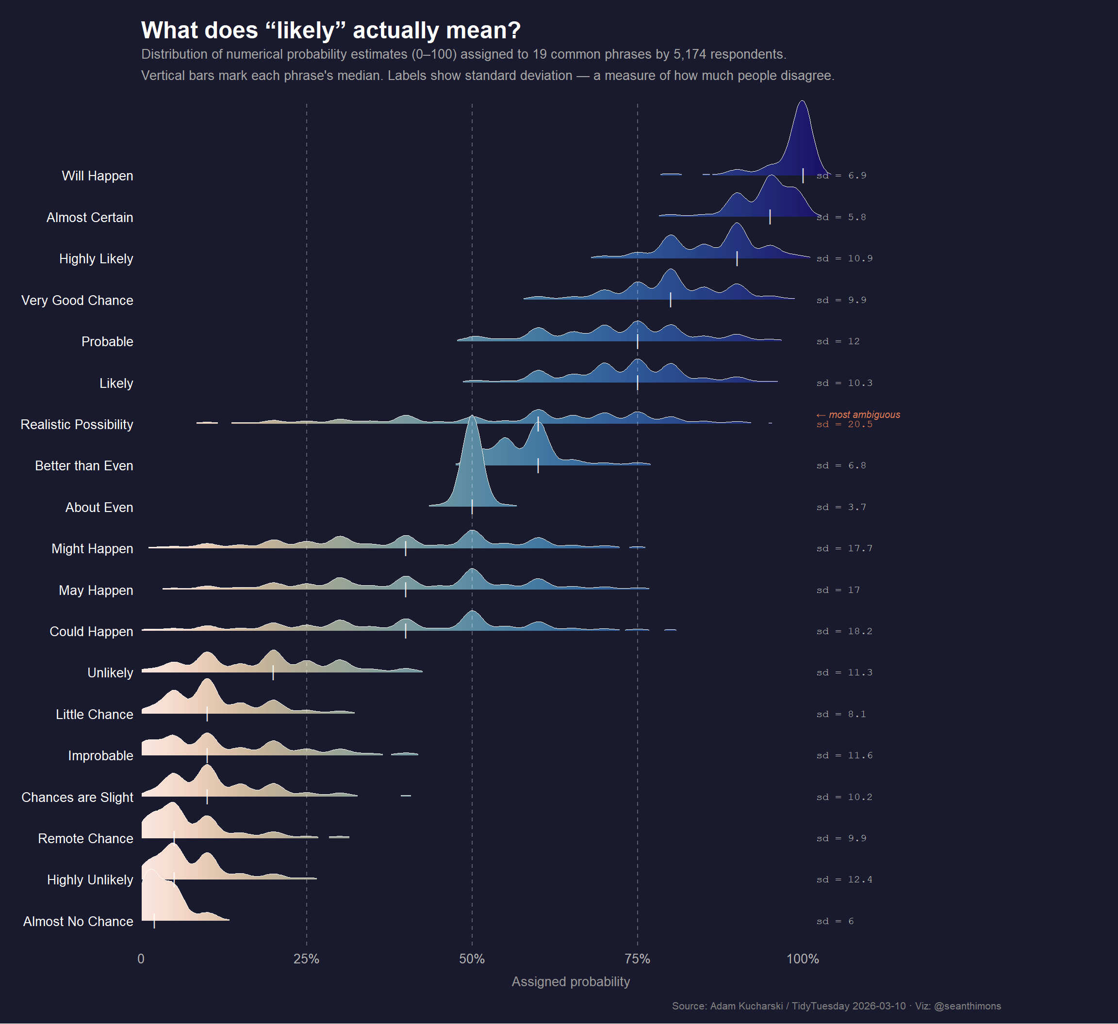
    title    = "**What does \"likely\" actually mean?**",
    subtitle = "Distribution of numerical probability estimates (0–100) assigned to 19 common phrases by 5,174 respondents.\nVertical bars mark each phrase's median. Labels show standard deviation — a measure of how much people disagree.",
    x        = "Assigned probability",
    y        = NULL,
    caption  = "Source: Adam Kucharski / TidyTuesday 2026-03-10 · Viz: @seanthimons"
  ) +

  ggplot2::theme_minimal(base_size = 13) +
  ggplot2::theme(
    plot.background    = ggplot2::element_rect(fill = "#1a1a2e", color = NA),
    panel.background   = ggplot2::element_rect(fill = "#1a1a2e", color = NA),
    panel.grid.major.x = ggplot2::element_blank(),
    panel.grid.minor   = ggplot2::element_blank(),
    panel.grid.major.y = ggplot2::element_blank(),
    axis.text.x        = ggplot2::element_text(color = "grey70", size = 10),
    axis.text.y        = ggplot2::element_text(color = "white",  size = 10, hjust = 1),
    axis.title.x       = ggplot2::element_text(color = "grey60", size = 10, margin = ggplot2::margin(t = 8)),
    plot.title         = ggtext::element_markdown(color = "white", size = 18, face = "bold", margin = ggplot2::margin(b = 4)),
    plot.subtitle      = ggplot2::element_text(color = "grey65", size = 10, lineheight = 1.4, margin = ggplot2::margin(b = 14)),
    plot.caption       = ggplot2::element_text(color = "grey50", size = 8,  hjust = 1, margin = ggplot2::margin(t = 10)),
    plot.margin        = ggplot2::margin(16, 90, 10, 16)
  )

p

Note

Reading the ridges: Each mountain represents the full distribution of responses for that phrase. A narrow spike means high agreement (everyone assigns similar numbers). A wide, flat ridge means high disagreement. The white bar inside each ridge marks the median.

Important

“Realistic Possibility” is the most contested phrase in the dataset. Its standard deviation of 20.5 is nearly three times that of “Likely” (sd = 10.3) and more than five times that of “About Even” (sd = 3.7). Some respondents read it as ~25%; others as ~80%. Yet intelligence analysts, policy documents, and risk reports use it constantly as if its meaning were self-evident.

Consensus vs. ambiguity: a closer look

# Rank terms by ambiguity (SD)
term_stats %>%
  select(term, median_prob, sd_prob, p10, p90) %>%
  mutate(
    range_80pct = p90 - p10,
    ambiguity_rank = rank(-sd_prob, ties.method = "min")
  ) %>%
  arrange(ambiguity_rank) %>%
  print(n = 19)
# A tibble: 19 × 7
   term               median_prob sd_prob   p10   p90 range_80pct ambiguity_rank
   <chr>                    <dbl>   <dbl> <dbl> <dbl>       <dbl>          <int>
 1 Realistic Possibi…          60    20.5  25      80       55                 1
 2 Could Happen                40    18.2  15      60       45                 2
 3 Might Happen                40    17.7  15      60       45                 3
 4 May Happen                  40    17    20      60       40                 4
 5 Highly Unlikely              5    12.4   1      20       19                 5
 6 Probable                    75    12    60      85       25                 6
 7 Improbable                  10    11.6   1      30       29                 7
 8 Unlikely                    20    11.3   5      30       25                 8
 9 Highly Likely               90    10.9  75      95       20                 9
10 Likely                      75    10.3  60      85       25                10
11 Chances are Slight          10    10.2   5      25       20                11
12 Remote Chance                5     9.9   1      20       19                12
13 Very Good Chance            80     9.9  70      90       20                12
14 Little Chance               10     8.1   5      20       15                14
15 Will Happen                100     6.9  91.3   100        8.70             15
16 Better than Even            60     6.8  51      65       14                16
17 Almost No Chance             2     6     1      10        9                17
18 Almost Certain              95     5.8  90      99        9                18
19 About Even                  50     3.7  50      50        0                19

The three “fuzzy middle” phrases — Could Happen, May Happen, and Might Happen — all cluster around 40% with nearly identical distributions (SDs of 18.2, 17.0, and 17.7 respectively). They are, for practical purposes, synonyms in how people interpret them numerically, yet writers and speakers treat them as meaningfully distinct.

The top end of the spectrum is tighter: Almost Certain (sd = 5.8) and Will Happen (sd = 6.9) leave little room for debate. Certainty turns out to be more legible than near-certainty.

ambig_data <- term_stats %>%
  mutate(
    term    = factor(term, levels = term_order),
    is_high = sd_prob >= 17
  ) %>%
  arrange(median_prob)

cat(sprintf("ambig_data: %d rows\n", nrow(ambig_data)))
ambig_data: 19 rows
stopifnot("ambig_data is empty" = nrow(ambig_data) > 0)

p2 <- ggplot2::ggplot(ambig_data,
       ggplot2::aes(x = median_prob, y = term, color = sd_prob, size = sd_prob)
     ) +
  ggplot2::geom_segment(
    ggplot2::aes(x = p10, xend = p90, yend = term),
    linewidth = 1.5, alpha = 0.6
  ) +
  ggplot2::geom_point(size = 3) +
  ggrepel::geom_text_repel(
    data = ambig_data %>% dplyr::filter(is_high),
    ggplot2::aes(label = sprintf("sd = %g", sd_prob)),
    size = 3,
    color = "#E07B54",
    nudge_x = 8,
    segment.color = "grey50",
    segment.size  = 0.3,
    min.segment.length = 0
  ) +
  paletteer::scale_color_paletteer_c("scico::lapaz", direction = -1,
                                      name = "Std. dev.") +
  ggplot2::scale_size_continuous(range = c(2, 5), guide = "none") +
  ggplot2::scale_x_continuous(
    limits = c(0, 115),
    breaks = c(0, 25, 50, 75, 100),
    labels = c("0", "25%", "50%", "75%", "100%")
  ) +
  ggplot2::labs(
    title    = "Median estimate ± 80% range for each probability phrase",
    subtitle = "Segments span 10th–90th percentile. Wider = more disagreement.",
    x        = "Assigned probability",
    y        = NULL,
    caption  = "Source: Adam Kucharski / TidyTuesday 2026-03-10"
  ) +
  ggplot2::theme_minimal(base_size = 12) +
  ggplot2::theme(
    plot.background  = ggplot2::element_rect(fill = "#1a1a2e", color = NA),
    panel.background = ggplot2::element_rect(fill = "#1a1a2e", color = NA),
    panel.grid.major.x = ggplot2::element_line(color = "#2d2d4e", linewidth = 0.4),
    panel.grid.major.y = ggplot2::element_blank(),
    panel.grid.minor   = ggplot2::element_blank(),
    axis.text          = ggplot2::element_text(color = "grey70"),
    axis.title.x       = ggplot2::element_text(color = "grey60", margin = ggplot2::margin(t = 8)),
    plot.title         = ggplot2::element_text(color = "white", face = "bold", size = 14),
    plot.subtitle      = ggplot2::element_text(color = "grey65", size = 10),
    plot.caption       = ggplot2::element_text(color = "grey50", size = 8, hjust = 1),
    legend.text        = ggplot2::element_text(color = "grey70"),
    legend.title       = ggplot2::element_text(color = "grey70"),
    plot.margin        = ggplot2::margin(16, 16, 10, 16)
  )

p2

Log palette

Final thoughts and takeaways

Language is imprecise — but we’ve long known that. What this dataset makes viscerally clear is which words are imprecise and by how much.

A few takeaways:

  1. “Realistic Possibility” is a linguistic landmine. Intelligence reports, policy briefs, and scientific summaries lean on it heavily, but 5,000 respondents couldn’t agree within 55 percentage points on what it means. Using it to communicate risk is roughly equivalent to shrugging.

  2. The extremes are remarkably stable. “Almost Certain” and “Will Happen” show tight distributions (sd ~6–7). When we want to convey near-certainty, our vocabulary is actually quite reliable. The breakdown happens in the middle.

  3. “Could Happen,” “May Happen,” and “Might Happen” are functionally synonymous in this dataset — same median, same spread. If you’re choosing between them for stylistic variety, know that your reader assigns them the same number.

  4. “About Even” is the Schelling point of probability language. Everyone knows 50-50 when they see it. Its sd of 3.7 makes it the most precisely communicated phrase in the entire lexicon.

The deeper lesson: if precision matters — in medical communications, intelligence assessments, financial disclosures, or risk reporting — probability words should come with numbers attached. The data shows conclusively that “likely” to you may mean 60%; to your reader, it may mean 80%. In high-stakes contexts, that gap has consequences.