Norway raises the world’s salmon — and loses hundreds of millions of them every year. Six years of aquaculture mortality data reveal a counterintuitive seasonal rhythm and an industry operating at staggering scale.
This week’s data comes from the Norwegian Directorate of Fisheries (Fiskeridirektoratet), tracking monthly mortality statistics for Atlantic salmon (Salmo salar) and rainbow trout (Oncorhynchus mykiss) in Norwegian aquaculture from 2020 through 2025. Two tables are provided: monthly_losses_data records the absolute count of fish lost each month by cause (dead, discarded, escaped, other), and monthly_mortality_data records the monthly mortality rate (median and interquartile range across individual aquaculture sites) by region. Norway produces roughly two-thirds of the world’s farmed Atlantic salmon, making this one of the most consequential datasets in global food production.
Loading necessary packages
My handy booster pack that allows me to install (if needed) and load my usual and favorite packages, as well as some helpful functions.
raw <- tidytuesdayR::tt_load('2026-03-17')losses <- raw$monthly_losses_datamortality <- raw$monthly_mortality_data
Exploratory Data Analysis
The my_skim() function is a modified version of the skimr::skim() function that returns the number of missing data points (cells as NA) as well as the inverse (e.g.: number of rows that are notNA), the count, minimum, 25%, median, 75%, max, mean, geometric mean, and standard deviation. It also generates a little ASCII histogram. Neat!
The losses dataset spans 2,808 rows covering January 2020 through December 2025 for two species (salmon and rainbow trout) across three geographic groupings: individual production areas (area, numbered 1–13), Norwegian counties (county), and the national total (country). There are no missing values anywhere.
The distribution of losses is heavily right-skewed (the histogram shows mass at the lower end with a long right tail), reflecting the enormous difference in farm density across regions — some areas contain far more active sites than others. The dead column dominates total losses; escaped and other are orders of magnitude smaller, visible only in their maxima.
monthly_mortality_data
mortality %>%select(median, q1, q3) %>%my_skim()
Data summary
Name
Piped data
Number of rows
1788
Number of columns
3
_______________________
Column type frequency:
numeric
3
________________________
Group variables
None
Variable type: numeric
skim_variable
n_missing
complete_rate
n
min
p25
med
p75
max
mean
geo_mean
sd
hist
median
0
1
1788
0.14
0.45
0.59
0.77
2.89
0.64
0.59
0.27
▇▃▁▁▁
q1
0
1
1788
0.08
0.22
0.29
0.38
1.72
0.32
0.29
0.15
▇▂▁▁▁
q3
0
1
1788
0.24
0.88
1.22
1.64
11.90
1.34
1.20
0.73
▇▁▁▁▁
The mortality dataset provides 1,788 rows of monthly mortality rates — the percentage of standing stock that perishes each month — with median, first quartile, and third quartile across sites within each reporting unit. Rates range from 0.14% to 2.89% with a mean of 0.64%. The wide IQR (q1 ≈ 0.27%, q3 ≈ 1.30%) reflects genuine heterogeneity across farms: some operations run tight, others face chronic mortality challenges.
NoteWhat the mortality rate measures
The monthly mortality rate is expressed as a percentage of the fish present at the start of the month. A rate of 0.6% means that for every 1,000 fish in the sea cage, roughly 6 die during that month. At industrial scale — Norwegian salmon farms hold hundreds of millions of fish simultaneously — even a small shift in this rate translates to millions of additional deaths.
Industrial Scale: The Arithmetic of Aquaculture Loss
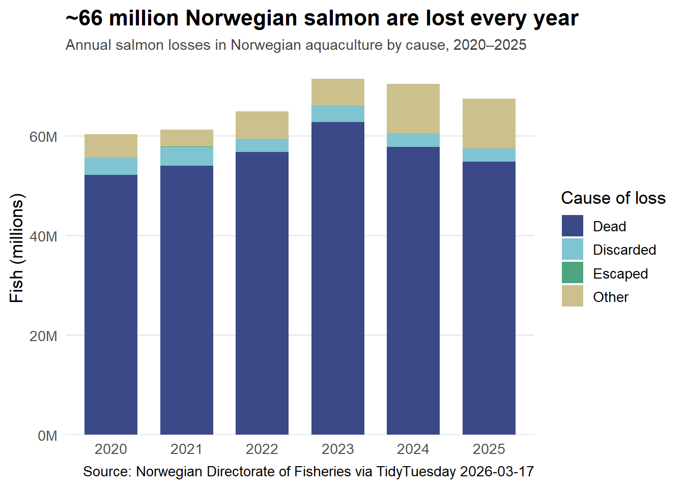
stopifnot("Empty stacked data"=nrow(annual_long) >0)# Palette: MetBrewer::Hokusai2 — 6 qualitative colors, wave/water inspired# (Hokusai3 was used 2025-09-30; Hokusai2 is fresh)cause_colors <-c(Dead ="#3B4988FF", # deep ocean blueDiscarded ="#7EC5D1FF", # pale tealEscaped ="#4CA57EFF", # sea greenOther ="#CCC18CFF"# sand/kelp)p_bars <- annual_long %>% ggplot2::ggplot(ggplot2::aes(x = year, y = count_m, fill = cause)) + ggplot2::geom_col(width =0.7) + ggplot2::scale_fill_manual(values = cause_colors,guide = ggplot2::guide_legend(reverse =TRUE) ) + ggplot2::scale_y_continuous(labels = scales::label_number(suffix ="M"),expand = ggplot2::expansion(mult =c(0, 0.05)) ) + ggplot2::labs(title ="~66 million Norwegian salmon are lost every year",subtitle ="Annual salmon losses in Norwegian aquaculture by cause, 2020–2025",x =NULL,y ="Fish (millions)",fill ="Cause of loss",caption ="Source: Norwegian Directorate of Fisheries via TidyTuesday 2026-03-17" ) + ggplot2::theme_minimal(base_size =13) + ggplot2::theme(plot.title = ggplot2::element_text(face ="bold", size =16),plot.subtitle = ggplot2::element_text(color ="#444444", size =11),panel.grid.major.x = ggplot2::element_blank(),panel.grid.minor = ggplot2::element_blank(),legend.position ="right" )p_bars
Norway lost between 60 and 71 million salmon per year over this period — rising from 60.3M in 2020 to a peak of 71.4M in 2023, then easing slightly toward 67.5M in 2025. The breakdown is striking: ~85% die outright, roughly 5% are discarded (culled for health reasons before death), a small fraction escape into the wild, and the remainder are attributed to “other” causes (primarily fish removed for slaughter ahead of schedule due to disease pressure).
ImportantEscaped fish: a small count, a large ecological concern
Just 127,762 salmon escaped into Norwegian waters over six years — a fraction of a percent of total losses. But escaped farmed salmon are genetically distinct from wild populations, and even small numbers can interbreed with wild Atlantic salmon, diluting local adaptations that wild fish have developed over millennia. Norway has strict reporting requirements precisely because the impact-per-fish of escapes vastly exceeds that of mortality.
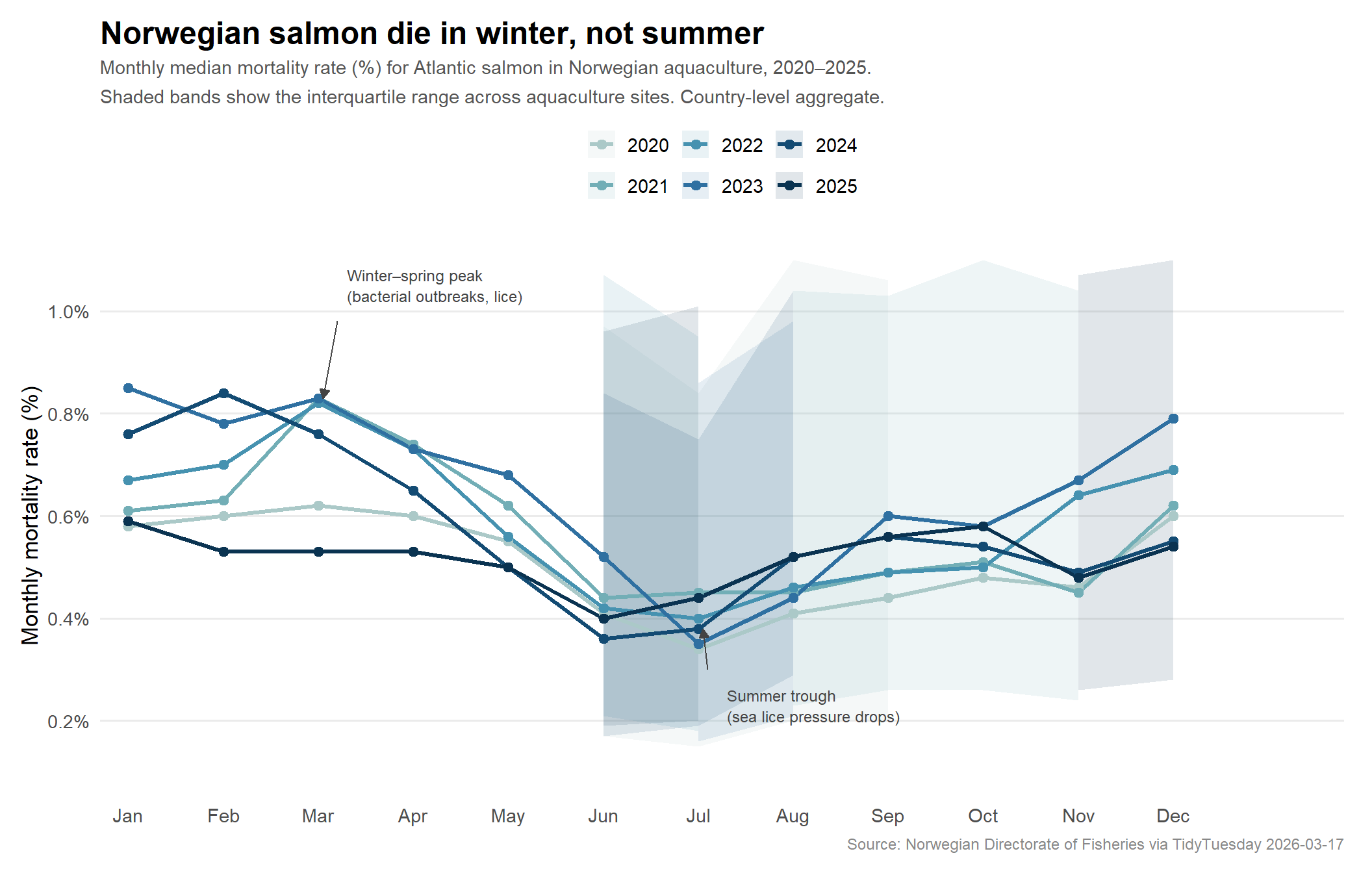
The Winter Mortality Paradox
Conventional intuition might suggest that warm summer waters — stressful for cold-water salmonids — would drive peak mortality. Norwegian data tells the opposite story.
March carries the highest average mortality (0.73%), while July is the lowest (0.39%) — a near-doubling of mortality rate from summer to late winter. In Norwegian aquaculture this is well understood: winter and spring are peak periods for sea lice infestations and for the bacterial pathogen Pasteurella, both of which thrive in cold, dense cage conditions. Summer months bring better water circulation, lower lice pressure, and the physiological boost of longer daylight.
The Hero Visualization: Six Years of Salmon Mortality
The most revealing view of this dataset isn’t a single year or a single region — it’s the repeating seasonal wave, seen six times, charting whether Norwegian aquaculture is getting better or worse at keeping its fish alive.
# Prepare data: salmon, country level, with year and month columnssalmon_cycle <- mortality %>%filter(species =="salmon", geo_group =="country") %>%mutate(month =as.integer(format(date, "%m")),year =factor(format(date, "%Y")) ) %>%arrange(year, month)cat(sprintf("salmon_cycle: %d rows, %d cols\n", nrow(salmon_cycle), ncol(salmon_cycle)))
# Palette: MetBrewer::Hokusai2# Great Wave–inspired palette. Six colors for six years.# Not used previously (Hokusai3 used 2025-09-30, Hokusai2 is fresh).year_pal <- paletteer::paletteer_d("MetBrewer::Hokusai2")cat("Hokusai2 colors:", as.character(year_pal), "\n")
# Annotation: highlight the summer trough and winter peakanno_low <-data.frame(month =7, y =0.20, label ="Summer trough\n(sea lice pressure drops)")anno_high <-data.frame(month =3, y =1.05, label ="Winter–spring peak\n(lice & bacterial outbreaks)")p_hero <- salmon_cycle %>% ggplot2::ggplot(ggplot2::aes(x = month, y = median,color = year, fill = year, group = year )) +# IQR ribbon ggplot2::geom_ribbon( ggplot2::aes(ymin = q1, ymax = q3),alpha =0.12, color =NA ) +# Median line ggplot2::geom_line(linewidth =1.1) +# Points at each month ggplot2::geom_point(size =2.2) +# Annotations ggplot2::annotate("text",x =7.3, y =0.23,label ="Summer trough\n(sea lice pressure drops)",hjust =0, size =3.2, color ="#444444", lineheight =1.1 ) + ggplot2::annotate("segment",x =7.1, xend =7.05, y =0.30, yend =0.38,color ="#444444", linewidth =0.5,arrow = ggplot2::arrow(length = ggplot2::unit(0.08, "inches"), type ="closed") ) + ggplot2::annotate("text",x =3.3, y =1.05,label ="Winter–spring peak\n(bacterial outbreaks, lice)",hjust =0, size =3.2, color ="#444444", lineheight =1.1 ) + ggplot2::annotate("segment",x =3.2, xend =3.05, y =0.98, yend =0.83,color ="#444444", linewidth =0.5,arrow = ggplot2::arrow(length = ggplot2::unit(0.08, "inches"), type ="closed") ) + ggplot2::scale_x_continuous(breaks =1:12,labels = month.abb,expand = ggplot2::expansion(add =c(0.3, 1.8)) ) + ggplot2::scale_y_continuous(labels = scales::label_number(suffix ="%"),breaks =seq(0.2, 1.0, by =0.2),limits =c(0.1, 1.1) ) + ggplot2::scale_color_manual(values =as.character(year_pal)) + ggplot2::scale_fill_manual(values =as.character(year_pal)) + ggplot2::labs(title ="Norwegian salmon die in winter, not summer",subtitle =paste0("Monthly median mortality rate (%) for Atlantic salmon in Norwegian aquaculture, 2020–2025.\n","Shaded bands show the interquartile range across aquaculture sites. Country-level aggregate." ),x =NULL,y ="Monthly mortality rate (%)",color =NULL,fill =NULL,caption ="Source: Norwegian Directorate of Fisheries via TidyTuesday 2026-03-17" ) + ggplot2::theme_minimal(base_size =13) + ggplot2::theme(plot.title = ggplot2::element_text(face ="bold", size =18, margin = ggplot2::margin(b =5)),plot.subtitle = ggplot2::element_text(color ="#555555", size =11, lineheight =1.3),plot.caption = ggplot2::element_text(color ="#888888", size =9),legend.position ="top",legend.direction ="horizontal",legend.text = ggplot2::element_text(size =11),panel.grid.minor = ggplot2::element_blank(),panel.grid.major.x = ggplot2::element_blank(),axis.text.x = ggplot2::element_text(size =11),plot.margin = ggplot2::margin(12, 16, 12, 12) )p_hero
Each colored line traces the seasonal mortality cycle for a single calendar year. The wave shape is consistent: mortality rises to a plateau in winter and early spring, collapses in midsummer, then recovers through autumn. Year-to-year, the level of the wave shifts — 2023 and 2024 carried notably higher winter mortality than 2020, with January 2023 reaching a median of 0.85% (more than double the July trough). By 2025, rates appear to be moderating.
Final thoughts and takeaways
Norwegian aquaculture is an industrial enterprise at a scale most people find difficult to visualize. Between 2020 and 2025, Norwegian fish farms lost roughly 396 million Atlantic salmon at the country level — not to fishing nets, but to mortality inside the cages. That is more salmon than the entire wild Atlantic salmon population by many orders of magnitude.
Three findings from this data stand out:
1. Winter is deadlier than summer for farmed salmon. The seasonal mortality curve peaks in January–March and hits its low in June–August. This reflects the biology of Lepeophtheirus salmonis (sea lice), which reproduces more slowly in cold water but accumulates across the winter, and the spring recurrence of bacterial diseases like Pasteurella. The pattern is so consistent that Norwegian fish health authorities use it as a baseline; a year where the winter peak is unusually high signals an industry-wide problem.
2. 2021–2024 saw elevated winter mortality. Looking at the seasonal cycles, 2020 was the mildest year. From 2021 onward, the winter plateaus climbed — reaching a peak in January 2023 (0.85% median mortality) and January–February 2024. The 2025 data suggests a return toward lower levels, but it is one year and too early to call a trend.
3. Dead fish vastly outnumber every other loss category. Discarded fish (culled alive for welfare or disease management), escaped fish, and other losses together account for fewer than 15% of total losses. The dominant story is simply: fish die in the cages. Reducing that mortality is not only an ethical priority but an economic one — at 2024 spot prices, 70 million salmon represent several billion dollars in unrecoverable biomass.
The escaped fish figure, though small in absolute terms, deserves separate scrutiny. Each escaped farmed salmon carries genes selected for growth in captivity rather than survival in the wild, and interbreeding with wild Atlantic salmon — already under pressure from overfishing and habitat loss — can reduce the adaptive fitness of wild populations for generations.
Norwegian aquaculture has made real progress on sea lice resistance, vaccination protocols, and smolt health over the past decade. This dataset captures a moment where the industry’s losses remain massive in absolute terms, but the seasonal pattern — predictable, biological, partially manageable — at least tells us where to look.