This week’s data comes from the Norwegian Veterinary Institute’s salmonid mortality datasets. The Norwegian government aims to reduce fish farming mortality, making this data relevant to public health policy. Two datasets are provided: monthly loss counts (dead, discarded, escaped, other) and monthly mortality rate summaries (median, Q1, Q3) across regions and species.
Suggested questions:
How does monthly mortality vary over the available time period?
Which regions demonstrate the lowest mortality rates?
Beyond fish deaths, what other loss categories significantly impact operations?
Loading necessary packages
My handy booster pack that allows me to install (if needed) and load my usual and favorite packages, as well as some helpful functions.
raw <- tidytuesdayR::tt_load('2026-03-17')losses <- raw$monthly_losses_datamortality <- raw$monthly_mortality_data
Exploratory Data Analysis
The my_skim() function is a modified version of the skimr::skim() function that returns the number of missing data points (cells as NA) as well as the inverse (e.g.: number of rows that are notNA), the count, minimum, 25%, median, 75%, max, mean, geometric mean, and standard deviation. It also generates a little ASCII histogram. Neat!
The losses data spans January 2020 through December 2025 — six full years of monthly records. Two species are tracked: Atlantic salmon and rainbow trout. Data is reported at three geographic levels: numbered production areas (1–13), named counties, and a country-level aggregate (“Norge”).
The escaped column is heavily right-skewed with a median near zero but occasional massive spikes — these represent dramatic escape events from damaged net pens. The dead column dominates the losses total, accounting for ~85% of all recorded losses.
The mortality dataset reports distributional summaries (median, Q1, Q3) of monthly mortality rates across farms within each region. This captures the spread of farm-level performance, not just the aggregate — a region’s median might look acceptable while its Q3 reveals a long tail of struggling farms.
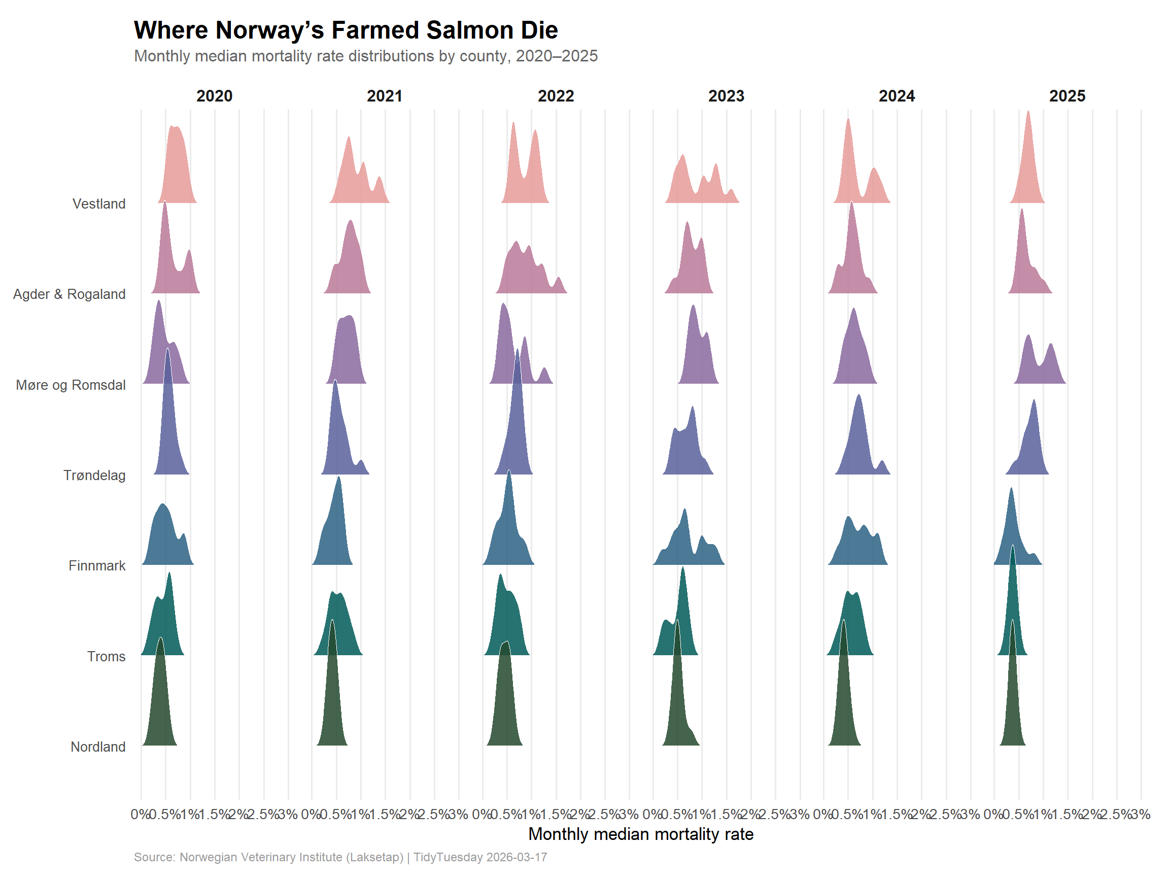
The Geography of Mortality
Norway’s aquaculture industry stretches along its western and northern coastline, from Agder in the south to Finnmark in the Arctic. But the fish don’t die equally everywhere.
Regional mortality rankings
# Focus on salmon at the county levelcounty_mortality <- mortality %>%filter(geo_group =="county", species =="salmon") %>%mutate(year =year(date))# Verify county namescat("Counties in mortality data:\n")
The mortality dataset uses combined regions for some counties (e.g., “Agder & Rogaland”) that differ slightly from the losses dataset’s individual county reporting. This is because mortality rates are computed per-farm within production zones, while absolute losses are tallied per administrative county.
Mortality distributions over time
Let’s look at how the distribution of mortality rates across farms has shifted year-by-year in each county. This is where ridgeline plots shine — they reveal whether the entire distribution is shifting, or whether improvements are concentrated at the top or bottom.
# Reshape mortality data: each row gives us median, q1, q3 for a county-month# We'll use the median values for ridgelines across months, grouped by year and countycounty_monthly <- mortality %>%filter(geo_group =="county", species =="salmon") %>%mutate(year =factor(year(date)),month =month(date) )cat(sprintf("county_monthly: %d rows, %d cols\n", nrow(county_monthly), ncol(county_monthly)))
county_monthly: 504 rows, 9 cols
stopifnot("county_monthly is empty"=nrow(county_monthly) >0)# Order counties by overall median mortality (highest at top)county_order <- county_monthly %>%group_by(region) %>%summarise(avg_mort =mean(median, na.rm =TRUE), .groups ="drop") %>%arrange(avg_mort) %>%pull(region)county_monthly <- county_monthly %>%mutate(region =factor(region, levels = county_order))# Palette checkpalette_log <-read.csv(here::here("posts", "palette-log.csv"))cat("Already used palettes:\n")
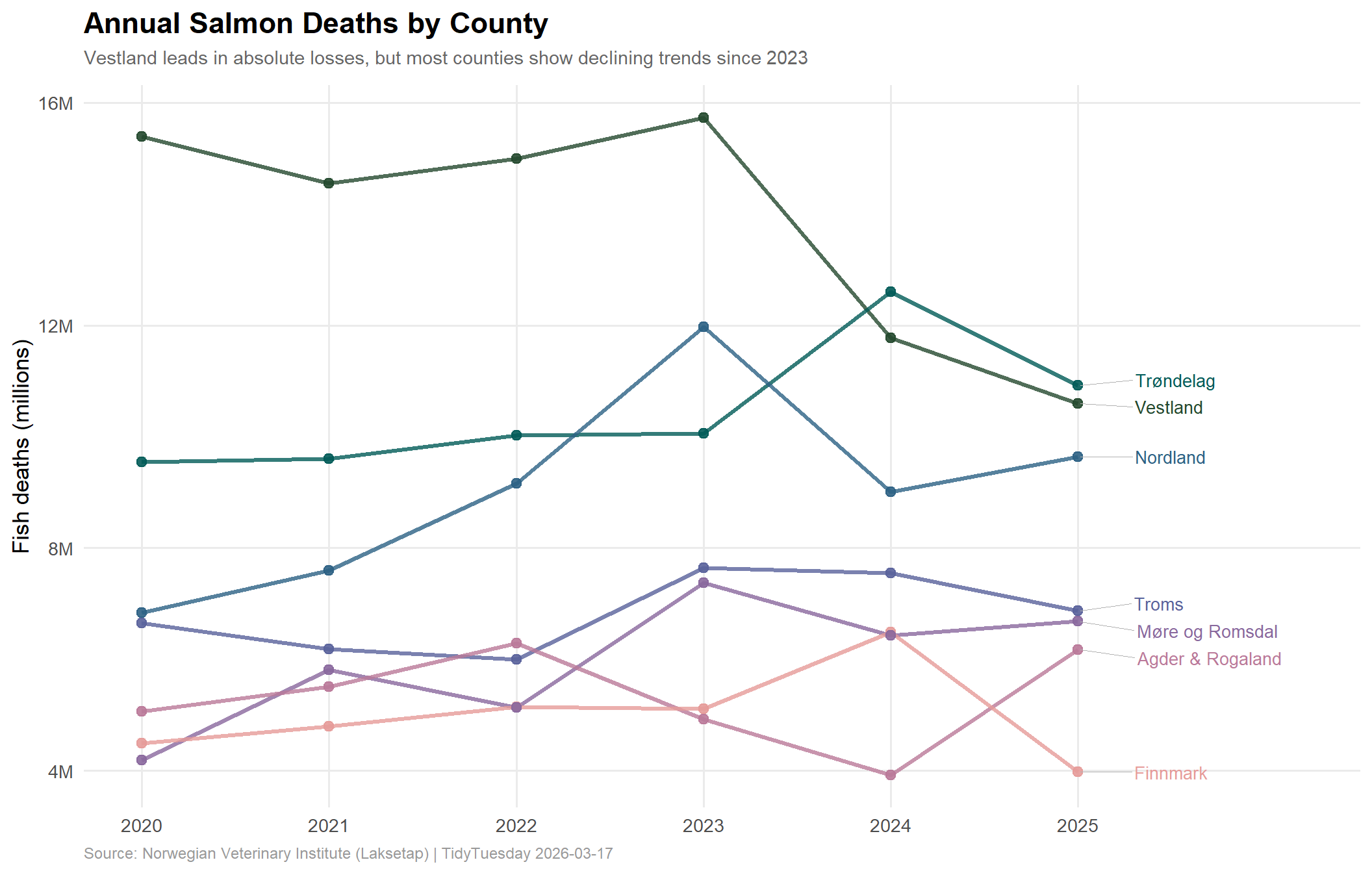
The mortality rate tells one story, but absolute numbers tell another. A small county with a high rate may lose fewer fish than a massive production hub with a moderate rate.
county_losses <- losses %>%filter(geo_group =="county", species =="salmon") %>%mutate(year =year(date),# Combine Agder + Rogaland to match mortality data's groupingregion =case_when( region %in%c("Agder", "Rogaland") ~"Agder & Rogaland",TRUE~ region ) ) %>%# Drop Akershus (0 across all months)filter(region !="Akershus")# Verify countiescat("Counties in losses data (after combining):\n")
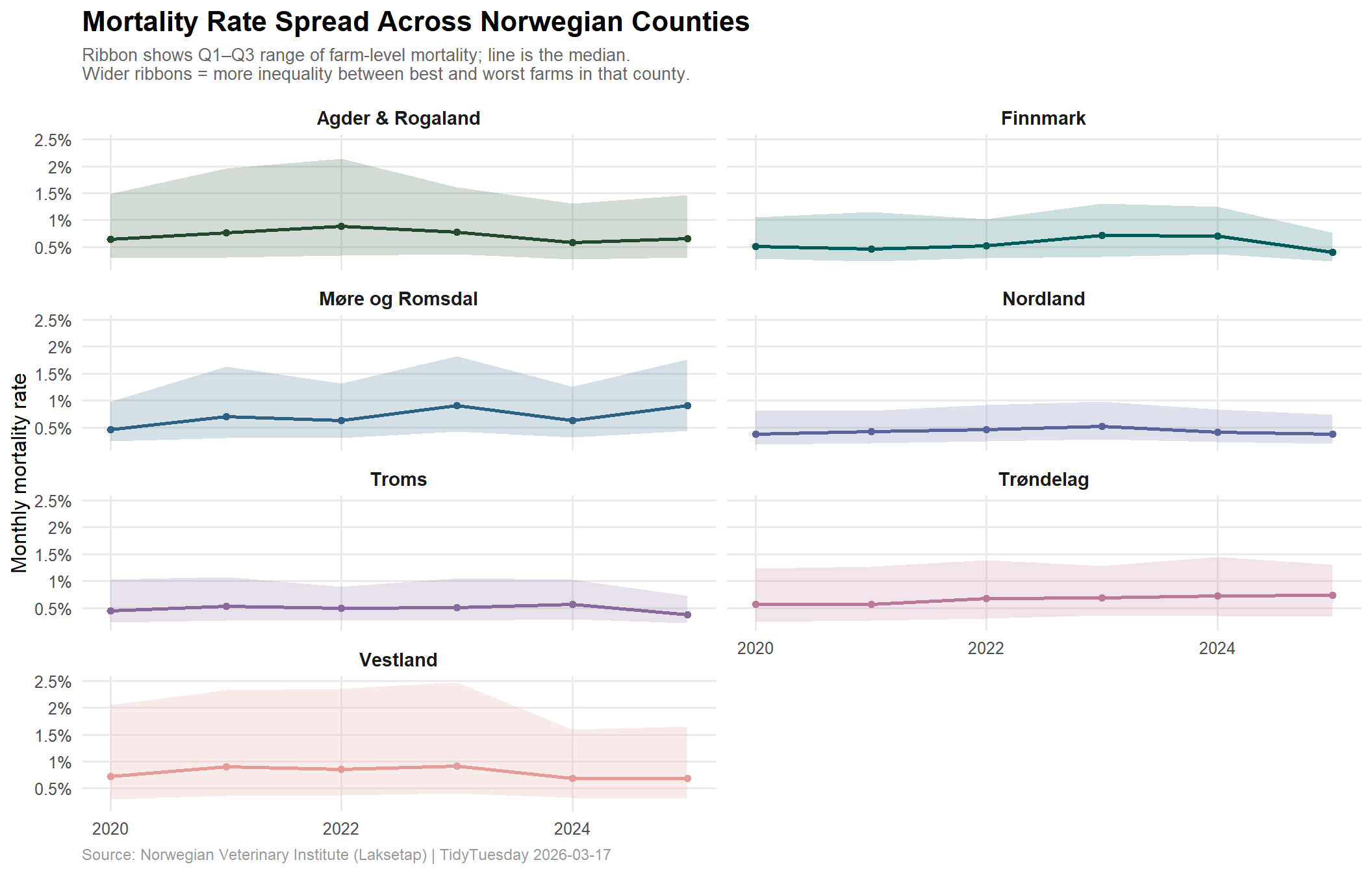
# Show the IQR (Q1 to Q3) spread by county over time# This captures farm-level inequality within regionscounty_spread <- mortality %>%filter(geo_group =="county", species =="salmon") %>%mutate(year =year(date),iqr = q3 - q1 ) %>%group_by(region, year) %>%summarise(avg_median =mean(median, na.rm =TRUE),avg_q1 =mean(q1, na.rm =TRUE),avg_q3 =mean(q3, na.rm =TRUE),avg_iqr =mean(iqr, na.rm =TRUE),.groups ="drop" )cat(sprintf("county_spread: %d rows\n", nrow(county_spread)))
county_spread: 42 rows
stopifnot("county_spread is empty"=nrow(county_spread) >0)# Sanity checkif (length(unique(county_spread$avg_iqr)) ==1) {warning("All IQR values are identical — check grouping logic")}p3 <- ggplot2::ggplot( county_spread, ggplot2::aes(x = year, y = avg_median, ymin = avg_q1, ymax = avg_q3,fill = region, color = region)) + ggplot2::geom_ribbon(alpha =0.2, color =NA) + ggplot2::geom_line(linewidth =1) + ggplot2::geom_point(size =1.5) + ggplot2::facet_wrap(~ region, ncol =2) + paletteer::scale_fill_paletteer_d("PNWColors::Starfish") + paletteer::scale_color_paletteer_d("PNWColors::Starfish") + ggplot2::scale_y_continuous(labels =function(x) paste0(x, "%")) + ggplot2::scale_x_continuous(breaks =c(2020, 2022, 2024)) + ggplot2::labs(title ="Mortality Rate Spread Across Norwegian Counties",subtitle ="Ribbon shows Q1–Q3 range of farm-level mortality; line is the median.\nWider ribbons = more inequality between best and worst farms in that county.",x =NULL,y ="Monthly mortality rate",caption ="Source: Norwegian Veterinary Institute (Laksetap) | TidyTuesday 2026-03-17" ) + ggplot2::theme_minimal(base_size =12) + ggplot2::theme(legend.position ="none",plot.title = ggtext::element_markdown(face ="bold", size =16),plot.subtitle = ggplot2::element_text(color ="grey40", size =10, margin = ggplot2::margin(b =10)),plot.caption = ggplot2::element_text(color ="grey60", size =9, hjust =0),strip.text = ggplot2::element_text(face ="bold", size =11),panel.grid.minor = ggplot2::element_blank() )p3
NoteReading the spread
A county where the IQR ribbon is narrow has farms performing similarly — good or bad, they’re consistent. A wide ribbon means some farms in that county are doing well while others are hemorrhaging fish. Policy interventions might focus differently: narrow-and-high counties need systemic change, while wide-ribbon counties need to bring their worst performers up to the level of their best.
Rainbow trout consistently shows higher median mortality rates than salmon, despite being a much smaller share of Norwegian aquaculture production. The trout industry may face different biological pressures or have less operational investment in mortality reduction.
Final thoughts and takeaways
Vestland is the epicenter. With 83 million salmon deaths over six years and the highest average mortality rate (0.80%), Vestland stands apart. It’s also Norway’s largest salmon-producing county, so some of this is scale — but the rate being highest suggests structural challenges beyond just volume.
2023 was the turning point — maybe. National salmon deaths peaked at 62.8 million in 2023 and declined in 2024–2025. Several counties show similar patterns. Whether this reflects genuine policy impact from Norway’s aquaculture reforms or just cyclical variation will take more years to confirm.
The IQR tells the real story. Average mortality rates can mask enormous variation between farms within the same county. Vestland’s wide Q1–Q3 spread suggests that some farms there have cracked the code while others haven’t — a more targeted intervention strategy could focus on knowledge transfer rather than blanket regulation.
The North does better. Troms and Nordland consistently show the lowest mortality rates and narrowest spreads. Colder waters, lower sea lice pressure, or simply more space between farms may all contribute. As the industry considers Arctic expansion, these mortality advantages are part of the calculus.
338 million dead salmon in six years is a staggering number by any measure. Norway’s ambition to grow its aquaculture industry while reducing mortality is one of the more concrete sustainability challenges in global food production — and this data makes it clear where the hardest work remains.