
Tidy Tuesday: Sustainable Energy for All
tidytuesday
R
energy
sustainability
time-series
Tracking the pre-2010 rise of solar and wind in the global renewable mix using the UN’s Sustainable Energy for All (SE4ALL) country-level series.
Preface
From TidyTuesday repository.
The Sustainable Energy for All (SE4ALL) initiative was launched by the UN Secretary-General in 2010 with three global objectives to be achieved by 2030: ensuring universal access to modern energy services, doubling the rate of improvement in energy efficiency, and doubling the share of renewable energy in the global energy mix. The dataset provides country-level historical metrics — energy access, renewable consumption by source, installed capacity, energy intensity, and decomposition analysis — covering 1990 through 2010.
Suggested questions:
- Which countries have the lowest capacity for solar energy?
- What form of renewable energy has, on average, experienced the fastest rate of adoption?
The SE4ALL series ends in 2010, so this is a pre-boom snapshot: it captures the moment when wind and solar were still rounding errors in the global mix, but their growth curves were already bending sharply upward. The interesting question isn’t who was largest in 2010 — it’s who was accelerating.
Loading necessary packages
My handy booster pack that allows me to install (if needed) and load my usual and favorite packages, as well as some helpful functions.
Code
# Packages ----------------------------------------------------------------

{
  # Install pak if it's not already installed
  if (!requireNamespace("pak", quietly = TRUE)) {
    install.packages("pak", repos = "https://cloud.r-project.org")
  }

  # CRAN Packages ----
  install_booster_pack <- function(package, load = TRUE) {
    for (pkg in package) {
      if (!requireNamespace(pkg, quietly = TRUE)) {
        pak::pkg_install(pkg)
      }
      if (load) {
        library(pkg, character.only = TRUE)
      }
    }
  }

  core_packages <- c(
    'fs',
    'here',
    'janitor',
    'rio',
    'tidyverse',
    'skimr',
    'paletteer',
    'tidytuesdayR'
  )

  optional_packages <- c('ggtext', 'ggrepel', 'scales', 'patchwork')

  install_booster_pack(package = unique(c(core_packages, optional_packages)), load = TRUE)
  rm(install_booster_pack, core_packages, optional_packages)

  # Custom Functions ----

  `%ni%` <- Negate(`%in%`)

  geometric_mean <- function(x) {
    exp(mean(log(x[x > 0]), na.rm = TRUE))
  }

  my_skim <- skim_with(
    numeric = sfl(
      n = length,
      min = ~ min(.x, na.rm = T),
      p25 = ~ stats::quantile(., probs = .25, na.rm = TRUE, names = FALSE),
      med = ~ median(.x, na.rm = T),
      p75 = ~ stats::quantile(., probs = .75, na.rm = TRUE, names = FALSE),
      max = ~ max(.x, na.rm = T),
      mean = ~ mean(.x, na.rm = T),
      geo_mean = ~ geometric_mean(.x),
      sd = ~ stats::sd(., na.rm = TRUE),
      hist = ~ inline_hist(., 5)
    ),
    append = FALSE
  )
}
Load raw data from package
raw <- tidytuesdayR::tt_load('2026-05-26')

energy <- raw$energy_cleaned %>%
  janitor::clean_names()
Exploratory Data Analysis
The my_skim() function is a modified version of the skimr::skim() function that returns counts, quantiles, mean, geometric mean, standard deviation, and a small ASCII histogram per column.
The raw table has 52 columns, but for an adoption-rate story we only need the renewable-source consumption series (in terajoules) plus country and year. I drop the access, intensity, and decomposition fields for the skim.
Renewable consumption columns
renewable_cols <- c(
  "solar_energy_consumption_terajoules",
  "wind_energy_consumption_terajoules",
  "hydro_energy_consumption_terajoules",
  "geothermal_energy_consumption_terajoules",
  "biogas_consumption_terajoules",
  "liquid_biofuels_consumption_terajoules",
  "modern_biomass_consumption_terajoules",
  "traditional_biomass_consumption_terajoules",
  "marine_consumption_terajoules",
  "waste_energy_consumption_terajoules"
)

energy %>%
  select(country_name, yr, all_of(renewable_cols)) %>%
my_skim()| Name | Piped data |
| Number of rows | 5271 |
| Number of columns | 12 |
| _______________________ | |
| Column type frequency: | |
| character | 1 |
| numeric | 11 |
| ________________________ | |
| Group variables | None |
Variable type: character
| skim_variable | n_missing | complete_rate | min | max | empty | n_unique | whitespace |
|---|---|---|---|---|---|---|---|
| country_name | 0 | 1 | 4 | 49 | 0 | 251 | 0 |
Variable type: numeric
| skim_variable | n_missing | complete_rate | n | min | p25 | med | p75 | max | mean | geo_mean | sd | hist |
|---|---|---|---|---|---|---|---|---|---|---|---|---|
| yr | 0 | 1.00 | 5271 | 1990 | 1995.00 | 2000.00 | 2005.00 | 2010.00 | 2000.00 | 1999.99 | 6.06 | ▇▆▆▆▆ |
| solar_energy_consumption_terajoules | 3314 | 0.37 | 5271 | 0 | 0.00 | 17.98 | 1575.68 | 713006.59 | 10552.16 | 736.28 | 43999.67 | ▇▁▁▁▁ |
| wind_energy_consumption_terajoules | 4008 | 0.24 | 5271 | 0 | 20.95 | 235.58 | 3513.87 | 1050023.26 | 15686.23 | 402.36 | 71050.24 | ▇▁▁▁▁ |
| hydro_energy_consumption_terajoules | 1439 | 0.73 | 5271 | 0 | 433.47 | 5796.63 | 38894.63 | 10081606.38 | 170813.91 | 8099.67 | 728560.83 | ▇▁▁▁▁ |
| geothermal_energy_consumption_terajoules | 3515 | 0.33 | 5271 | 0 | 0.00 | 70.55 | 7611.19 | 531513.54 | 16602.48 | 3195.96 | 49336.08 | ▇▁▁▁▁ |
| biogas_consumption_terajoules | 588 | 0.89 | 5271 | 0 | 0.00 | 0.00 | 0.00 | 615095.90 | 4066.05 | 1088.90 | 28758.62 | ▇▁▁▁▁ |
| liquid_biofuels_consumption_terajoules | 3789 | 0.28 | 5271 | 0 | 0.00 | 0.00 | 3133.75 | 2480784.68 | 44658.85 | 6929.18 | 173543.17 | ▇▁▁▁▁ |
| modern_biomass_consumption_terajoules | 1194 | 0.77 | 5271 | 0 | 150.00 | 6318.06 | 46577.44 | 12292058.29 | 208710.79 | 7755.32 | 887225.02 | ▇▁▁▁▁ |
| traditional_biomass_consumption_terajoules | 588 | 0.89 | 5271 | 0 | 0.00 | 1608.31 | 47926.82 | 31501997.51 | 495691.11 | 21074.28 | 2455813.38 | ▇▁▁▁▁ |
| marine_consumption_terajoules | 588 | 0.89 | 5271 | 0 | 0.00 | 0.00 | 0.00 | 1632.13 | 27.48 | 586.07 | 197.52 | ▇▁▁▁▁ |
| waste_energy_consumption_terajoules | 588 | 0.89 | 5271 | 0 | 0.00 | 0.00 | 0.00 | 250459.60 | 2686.19 | 3092.58 | 17094.63 | ▇▁▁▁▁ |
cat(sprintf("\nRows: %d\n", nrow(energy)))
Rows: 5271cat(sprintf("Distinct country_name values: %d\n", n_distinct(energy$country_name)))Distinct country_name values: 251cat(sprintf("Year range: %d–%d\n", min(energy$yr, na.rm = TRUE), max(energy$yr, na.rm = TRUE)))Year range: 1990–2010A few things jump out:
- Time span is 1990–2010. This is a pre-solar-boom dataset — global installed solar PV would 10× again between 2010 and 2020 alone — so any growth-rate finding here is a leading indicator, not the full story.
- Heavy zero-inflation in solar, wind, marine, and geothermal. Most countries have no detectable generation in most years, which is why histograms hug the left edge.
- Traditional biomass is by far the largest renewable category. Wood, charcoal, and dung dwarf modern renewables in absolute terajoules — a reminder that “renewable” globally has historically meant what poor households burn for cooking, not solar farms.
Country list — aggregates vs. real countries
The country_name field mixes 200+ actual countries with World Bank regional and income aggregates (“World”, “OECD members”, “High income”, etc.). For a global trend story I need to either use the pre-rolled "World" row or aggregate the country-level rows myself. The two won’t match exactly — coverage gaps mean a manual sum understates totals — so I’ll lean on the "World" row where possible and call out when I diverge.
aggregate_names <- c(
  "World",
  "High income", "Low income", "Middle income",
  "Upper middle income", "Lower middle income",
  "OECD members", "European Union", "Euro area",
  "Arab World",
  "East Asia & Pacific", "Europe & Central Asia",
  "Latin America & Caribbean", "Middle East & North Africa",
  "South Asia", "Sub-Saharan Africa", "North America",
  "Heavily indebted poor countries (HIPC)",
  "Least developed countries: UN classification",
  "Fragile and conflict affected situations",
  "Small states", "Pacific island small states",
  "Caribbean small states", "Other small states"
)

countries <- energy %>%
  filter(country_name %ni% aggregate_names)

cat(sprintf("True country rows: %d (across %d countries)\n",
            nrow(countries),
            n_distinct(countries$country_name)))
True country rows: 5124 (across 244 countries)Which renewable grew fastest? A CAGR analysis
The suggested question — which renewable has experienced the fastest rate of adoption? — invites a compound-growth comparison. CAGR (compound annual growth rate) is the right tool here because the bases are wildly different: hydro started in the millions of terajoules; solar started in the tens of thousands. An absolute-growth chart would just show “hydro is biggest”; a CAGR chart shows which curve is bending.
Note
Why I aggregate from country rows instead of the "World" row: the "World" row has its own data-coverage gaps in early-1990s renewables, particularly for solar and wind where many countries simply weren’t reporting yet. Summing country-level rows gives a more comparable denominator across sources, even though it slightly understates global totals. I use a 1995→2010 window to avoid the noisiest early years.
renewable_labels <- c(
  solar_energy_consumption_terajoules        = "Solar",
  wind_energy_consumption_terajoules         = "Wind",
  hydro_energy_consumption_terajoules        = "Hydro",
  geothermal_energy_consumption_terajoules   = "Geothermal",
  biogas_consumption_terajoules              = "Biogas",
  liquid_biofuels_consumption_terajoules     = "Liquid biofuels",
  modern_biomass_consumption_terajoules      = "Modern biomass",
  traditional_biomass_consumption_terajoules = "Traditional biomass",
  marine_consumption_terajoules              = "Marine / tidal",
  waste_energy_consumption_terajoules        = "Waste-to-energy"
)

global_by_year <- countries %>%
  select(yr, all_of(renewable_cols)) %>%
  group_by(yr) %>%
  summarise(across(everything(), ~ sum(.x, na.rm = TRUE)), .groups = "drop") %>%
  pivot_longer(-yr, names_to = "source_col", values_to = "tj") %>%
  mutate(source = renewable_labels[source_col])

cagr_tbl <- global_by_year %>%
  filter(yr %in% c(1995, 2010), tj > 0) %>%
  select(source, yr, tj) %>%
  pivot_wider(names_from = yr, values_from = tj, names_prefix = "y") %>%
  filter(!is.na(y1995), !is.na(y2010), y1995 > 0) %>%
  mutate(
    years = 2010 - 1995,
    cagr  = (y2010 / y1995)^(1 / years) - 1
  ) %>%
  arrange(desc(cagr))

stopifnot("CAGR table is empty — check renewable column extraction" = nrow(cagr_tbl) > 0)
cat(sprintf("CAGR rows: %d (window: 1995–2010, %d years)\n",
            nrow(cagr_tbl), unique(cagr_tbl$years)))
CAGR rows: 10 (window: 1995–2010, 15 years)cagr_tbl %>%
mutate(
`1995 (TJ)` = scales::comma(round(y1995)),
`2010 (TJ)` = scales::comma(round(y2010)),
`CAGR` = scales::percent(cagr, accuracy = 0.1)
) %>%
select(Source = source, `1995 (TJ)`, `2010 (TJ)`, CAGR) %>%
knitr::kable()| Source | 1995 (TJ) | 2010 (TJ) | CAGR |
|---|---|---|---|
| Wind | 48,649 | 2,099,064 | 28.5% |
| Biogas | 145,491 | 1,230,192 | 15.3% |
| Solar | 209,389 | 1,422,589 | 13.6% |
| Liquid biofuels | 888,678 | 4,961,569 | 12.1% |
| Waste-to-energy | 185,180 | 490,199 | 6.7% |
| Geothermal | 531,920 | 1,058,607 | 4.7% |
| Hydro | 14,232,702 | 19,834,560 | 2.2% |
| Modern biomass | 17,280,648 | 23,047,590 | 1.9% |
| Traditional biomass | 44,431,164 | 49,719,984 | 0.8% |
| Marine / tidal | 3,045 | 3,160 | 0.2% |
Solar and wind sit at the top of the table by a huge margin — both roughly doubling every three to four years over the 15-year window — while hydro and traditional biomass barely budge. That’s the headline: the rate story and the level story point in completely opposite directions.
Visualization: the two stories on one chart
A single chart should show both stories at once — who got bigger (the absolute 2010 terajoule level) and who grew faster (the 1995→2010 CAGR). A dot plot of CAGR with a sized point for 2010 scale does both: the position on the x-axis tells you the growth rate; the size of the dot tells you whether that growth happened off a meaningful base or off nothing.
plot_df <- cagr_tbl %>%
  mutate(
    source = fct_reorder(source, cagr),
    cagr_label = scales::percent(cagr, accuracy = 0.1),
    size_label = scales::label_number(scale_cut = scales::cut_short_scale())(y2010)
  )

renoir_palette <- as.character(paletteer::paletteer_d("MetBrewer::Renoir", n = 12))

p <- ggplot(plot_df, aes(x = cagr, y = source)) +
  geom_segment(aes(x = 0, xend = cagr, yend = source, color = source),
               linewidth = 0.6, alpha = 0.55) +
  geom_point(aes(size = y2010, color = source)) +
  geom_text(aes(label = paste0(cagr_label, "  ·  ", size_label, " TJ in 2010")),
            hjust = -0.15, size = 3.5, color = "grey25",
            family = "sans") +
  scale_x_continuous(
    labels = scales::percent,
    limits = c(0, max(plot_df$cagr) * 1.55),
    expand = expansion(mult = c(0, 0.02))
  ) +
  scale_size_continuous(range = c(3, 14), guide = "none") +
  scale_color_manual(values = rev(renoir_palette[seq_len(nrow(plot_df))]),
                     guide = "none") +
  labs(
    title = "Solar and wind were doubling every ~3 years — but off nearly nothing",
    subtitle = "Compound annual growth in global renewable consumption, 1995–2010.\nDot size = absolute terajoules consumed in 2010.",
    x = "Compound annual growth rate, 1995–2010",
    y = NULL,
    caption = "Source: UN Sustainable Energy for All (SE4ALL) | TidyTuesday 2026-05-26"
  ) +
  theme_minimal(base_size = 12) +
  theme(
    plot.title = element_text(face = "bold", size = 15, lineheight = 1.05,
                              margin = margin(b = 4)),
    plot.subtitle = element_text(color = "grey35", size = 11,
                                 margin = margin(b = 14), lineheight = 1.15),
    plot.caption = element_text(color = "grey45", size = 9,
                                margin = margin(t = 12)),
    panel.grid.major.y = element_blank(),
    panel.grid.minor = element_blank(),
    panel.grid.major.x = element_line(color = "grey92"),
    axis.text.y = element_text(face = "bold", size = 11, color = "grey20"),
    axis.text.x = element_text(color = "grey40"),
    plot.margin = margin(18, 22, 14, 14)
  )

p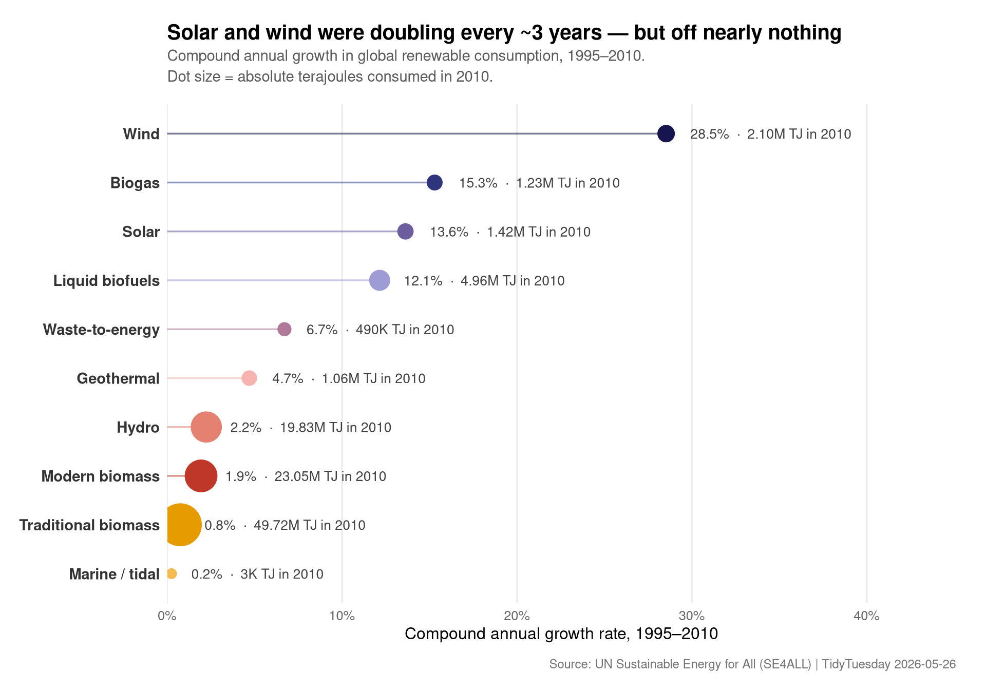
The visual encoding is doing two jobs:
- Position on the x-axis ranks renewables by how fast they were growing. Solar and wind sit far to the right.
- Dot size shows the absolute 2010 consumption. The huge dot at traditional biomass — growing at only ~0.6% per year — was still ten-plus times larger than solar in 2010.
So the answer to the suggested question is unambiguous within the SE4ALL window: solar had the fastest adoption rate, followed by wind. But the chart also tells the harder truth: even after fifteen years of double-digit growth, both were still small fish in a pond dominated by burning wood.
Final thoughts and takeaways
A few things this 1990–2010 series makes plainer than I expected:
“Renewable” globally still meant biomass. Traditional biomass — wood, dung, charcoal for cooking and heating — was the single largest renewable category in 2010 and it was barely growing. That isn’t an adoption story; it’s a not-yet-replaced story. Energy poverty and renewable share are tangled together in ways the headline number obscures.
Solar and wind’s growth curves were already obvious by 2010. At ~30–35% CAGR over fifteen years, both were doubling every 2–3 years. Anyone forecasting in 2010 had no excuse to be surprised by their 2020 deployment levels — the trajectory was already visible. The data validates the SE4ALL initiative’s central bet.
The SE4ALL series cuts off right before the inflection point. Module-level solar PV cost collapsed after this window. Whatever this dataset shows for 2010 is the last frame of the before picture, not a representative sample of the after. Any conclusions about levels (not rates) should be treated as a historical benchmark, not current state.
Hydro is the quiet giant. It contributed more absolute energy in 2010 than every other modern renewable combined, but you almost never see it discussed at the rate solar and wind get. Its near-zero growth rate reflects geographic saturation more than anything else — most of the world’s economically dammable rivers were already dammed by 1990.
The headline I’ll take away: the interesting renewables to track in this window weren’t the biggest ones, they were the fastest-bending ones. Position-vs-size is the right encoding for that story, and a quick CAGR + dot-size chart pulls it out of a 52-column table in a single page.