library(tidyverse)
library(tidytuesdayR)
library(scales)
library(grid)

raw <- tidytuesdayR::tt_load("2026-06-30")
wreck_inventory <- raw$wreck_inventoryTidy Tuesday: Wreck Inventory of Ireland
tidytuesday
maritime
history
ireland
Inventory records turn Irish shipwrecks into a coastline-shaped archive of vessel types, dates, and places of loss.
Preface
From the TidyTuesday repository.
The Irish wreck inventory is not just a catalogue of ship names. It is a coastline-shaped memory system: 17,981 records, a long tail of vessel classifications, narrative descriptions of weather and cargo, and enough coordinates to show where archive work becomes geography.
What is in the file
The dataset contains a loss date, parsed year, wreck name and number, classification, a free-text description, place of loss, coordinates, and coordinate source. I treated it as an inventory rather than a casualty model: the important first pass is coverage, not causal inference.
| Measure | Value |
|---|---|
| Records | 17,981 |
| Distinct classifications | 138 |
| Records with usable coordinates | 3,564 |
| Earliest parsed year | 1300s |
| Latest parsed year | 2010s |
The shape of the archive
coords_all <- wreck_inventory %>%
  filter(!is.na(longitude), !is.na(latitude))

coords <- coords_all %>%
  filter(between(longitude, -12, -4), between(latitude, 50, 56.5))

unknown_n <- wreck_inventory %>%
  filter(classification == "Unknown") %>%
  nrow()

top_classes <- wreck_inventory %>%
  filter(!is.na(classification), classification != "", classification != "Unknown") %>%
  count(classification, sort = TRUE) %>%
  slice_head(n = 9) %>%
  mutate(
    classification = str_to_title(classification),
    classification = fct_reorder(classification, n),
    label = comma(n)
  )

coast <- map_data("world") %>%
  filter(region == "Ireland" | (region == "UK" & subregion == "Northern Ireland"))

lon_grid <- seq(-11, -5, by = 1)
lat_grid <- seq(51, 56, by = 1)

n_records <- nrow(wreck_inventory)
n_coords_total <- nrow(coords_all)
n_coords_mapped <- nrow(coords)
n_classes <- wreck_inventory %>%
  filter(!is.na(classification), classification != "") %>%
  distinct(classification) %>%
  nrow()

paper <- "#f4efe4"
panel <- "#efe8dc"
ink <- "#17252f"
muted <- "#6f7d7f"
rust <- "#a24f2f"
line <- "#cfc4b5"

map_plot <- ggplot(coords, aes(longitude, latitude)) +
  geom_vline(xintercept = lon_grid, color = "#d8cdc0", linewidth = 0.28, linetype = "22") +
  geom_hline(yintercept = lat_grid, color = "#d8cdc0", linewidth = 0.28, linetype = "22") +
  geom_polygon(
    data = coast,
    aes(long, lat, group = group),
    inherit.aes = FALSE,
    fill = "#f1eadf",
    color = "#7e8b87",
    linewidth = 0.42,
    alpha = 0.9
  ) +
  stat_density_2d_filled(
    aes(fill = after_stat(level)),
    bins = 8,
    alpha = 0.68,
    contour_var = "ndensity",
    show.legend = FALSE
  ) +
  stat_density_2d(
    color = "#7a4f39",
    linewidth = 0.18,
    alpha = 0.36,
    bins = 8,
    contour_var = "ndensity"
  ) +
  # Repaint land after the kernel estimate so density stays offshore.
  geom_polygon(
    data = coast,
    aes(long, lat, group = group),
    inherit.aes = FALSE,
    fill = "#f1eadf",
    color = NA
  ) +
  geom_point(color = ink, alpha = 0.18, size = 0.42) +
  geom_path(
    data = coast,
    aes(long, lat, group = group),
    inherit.aes = FALSE,
    color = "#354c4d",
    linewidth = 0.48,
    alpha = 0.85
  ) +
  annotate(
    "curve",
    x = -10.6, y = 55.2, xend = -9.35, yend = 54.1,
    curvature = -0.22,
    color = rust,
    linewidth = 0.55,
    arrow = arrow(length = unit(0.12, "inches"), type = "closed")
  ) +
  annotate(
    "text",
    x = -10.95, y = 55.45,
    label = "coordinate-bearing records\nfollow the coastline",
    hjust = 0,
    vjust = 1,
    family = "serif",
    color = rust,
    size = 4.0,
    lineheight = 0.92
  ) +
  annotate(
    "label",
    x = -5.05, y = 51.2,
    label = sprintf("%s mapped coordinate records", comma(n_coords_mapped)),
    hjust = 1,
    vjust = 0,
    family = "serif",
    color = ink,
    fill = "#f7f2e9",
    label.r = unit(0.08, "lines"),
    size = 3.1
  ) +
  coord_fixed(xlim = c(-11.3, -4.7), ylim = c(50.8, 56.2), expand = FALSE) +
  scale_fill_manual(values = c("#dce7e4", "#bfd4d1", "#93b8ba", "#6f9aa3", "#d4b879", "#c77a3d", "#a24f2f", "#6b251e")) +
  labs(x = NULL, y = NULL) +
  theme_void(base_size = 12) +
  theme(
    plot.background = element_rect(fill = panel, color = NA),
    panel.background = element_rect(fill = panel, color = NA),
    plot.margin = margin(4, 8, 4, 4)
  )

ledger_plot <- ggplot(top_classes, aes(n, classification)) +
  geom_segment(aes(x = 0, xend = n, yend = classification), color = line, linewidth = 1.05) +
  geom_point(color = rust, size = 4.1) +
  geom_text(aes(x = n + 170, label = label), hjust = 0, color = ink, family = "serif", size = 3.25) +
  scale_x_continuous(labels = comma, limits = c(0, 2800), expand = expansion(mult = c(0, 0))) +
  labs(x = NULL, y = NULL) +
  theme_minimal(base_size = 11) +
  theme(
    plot.background = element_rect(fill = panel, color = NA),
    panel.background = element_rect(fill = panel, color = NA),
    panel.grid.major.y = element_blank(),
    panel.grid.minor = element_blank(),
    panel.grid.major.x = element_line(color = "#ded4c5", linewidth = 0.35),
    axis.text.y = element_text(color = ink, family = "serif", size = 9.8),
    axis.text.x = element_blank(),
    axis.ticks.x = element_blank(),
    plot.margin = margin(4, 16, 4, 6)
  )

grid.newpage()
grid.rect(gp = gpar(fill = paper, col = NA))
grid.text(
  "Ireland's wreck register is a coastline-shaped ledger",
  x = unit(0.045, "npc"), y = unit(0.94, "npc"),
  just = c("left", "top"),
  gp = gpar(col = ink, fontsize = 28, fontfamily = "serif", fontface = "bold")
)
grid.text(
  sprintf("%s records · %s with usable coordinates · %s named vessel classifications", comma(n_records), comma(n_coords_total), comma(n_classes)),
  x = unit(0.045, "npc"), y = unit(0.885, "npc"),
  just = c("left", "top"),
  gp = gpar(col = muted, fontsize = 12, fontfamily = "serif")
)
grid.lines(x = unit(c(0.045, 0.955), "npc"), y = unit(c(0.842, 0.842), "npc"), gp = gpar(col = line, lwd = 1.1))
grid.roundrect(x = unit(0.34, "npc"), y = unit(0.44, "npc"), width = unit(0.58, "npc"), height = unit(0.74, "npc"), r = unit(0.012, "npc"), gp = gpar(fill = panel, col = line, lwd = 1.1))
print(map_plot, vp = viewport(x = 0.34, y = 0.44, width = 0.56, height = 0.70))
grid.roundrect(x = unit(0.795, "npc"), y = unit(0.44, "npc"), width = unit(0.30, "npc"), height = unit(0.74, "npc"), r = unit(0.012, "npc"), gp = gpar(fill = panel, col = line, lwd = 1.1))
grid.text(
  "named vessel classes",
  x = unit(0.665, "npc"), y = unit(0.795, "npc"),
  just = c("left", "top"),
  gp = gpar(col = rust, fontsize = 11, fontfamily = "serif", fontface = "bold")
)
grid.text(
  sprintf("%s records are classified only as Unknown —\nthe largest category and an archival caution.", comma(unknown_n)),
  x = unit(0.665, "npc"), y = unit(0.752, "npc"),
  just = c("left", "top"),
  gp = gpar(col = muted, fontsize = 8.9, fontfamily = "serif", lineheight = 0.92)
)
print(ledger_plot, vp = viewport(x = 0.795, y = 0.425, width = 0.28, height = 0.55))
grid.text(
  "TidyTuesday 2026-06-30 · Wreck Inventory of Ireland · density map uses records with plausible Ireland-region coordinates",
  x = unit(0.045, "npc"), y = unit(0.035, "npc"),
  just = c("left", "bottom"),
  gp = gpar(col = "#7a7470", fontsize = 8.5, fontfamily = "serif")
)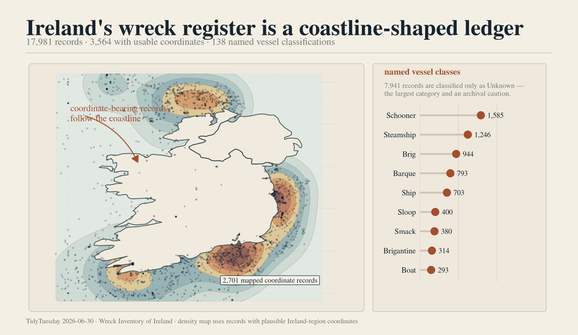
The lead figure now carries the two most important first-pass ideas together: the coordinate-bearing records form a coastal archive, and the named classes are dominated by ordinary working vessels. The density layer is useful, but only with the caption’s constraint. It shows where mapped records cluster; it does not estimate wreck risk or historical exposure.
Time
decade_counts <- wreck_inventory %>%
  filter(!is.na(year)) %>%
  mutate(decade = floor(year / 10) * 10) %>%
  count(decade)

peak_decade <- decade_counts %>%
  slice_max(n, n = 1, with_ties = FALSE)

decade_counts %>%
  ggplot(aes(decade, n)) +
  geom_col(fill = "#a24f2f", width = 8, alpha = 0.86) +
  geom_vline(xintercept = peak_decade$decade, color = "#17252f", linewidth = 0.35, linetype = "22") +
  annotate(
    "text",
    x = peak_decade$decade + 15,
    y = peak_decade$n * 0.98,
    label = paste0(peak_decade$decade, "s peak\nrecord intensity"),
    hjust = 0,
    vjust = 1,
    family = "serif",
    color = "#17252f",
    size = 3.5,
    lineheight = 0.92
  ) +
  scale_x_continuous(breaks = breaks_width(50)) +
  scale_y_continuous(labels = comma) +
  labs(x = "Decade", y = "Wreck records") +
  theme_minimal(base_size = 12) +
  theme(
    plot.background = element_rect(fill = "#f4efe4", color = NA),
    panel.background = element_rect(fill = "#f4efe4", color = NA),
    panel.grid.minor = element_blank(),
    panel.grid.major.x = element_blank(),
    panel.grid.major.y = element_line(color = "#ded4c5", linewidth = 0.35),
    axis.text = element_text(color = "#17252f", family = "serif"),
    axis.title = element_text(color = "#17252f", family = "serif")
  )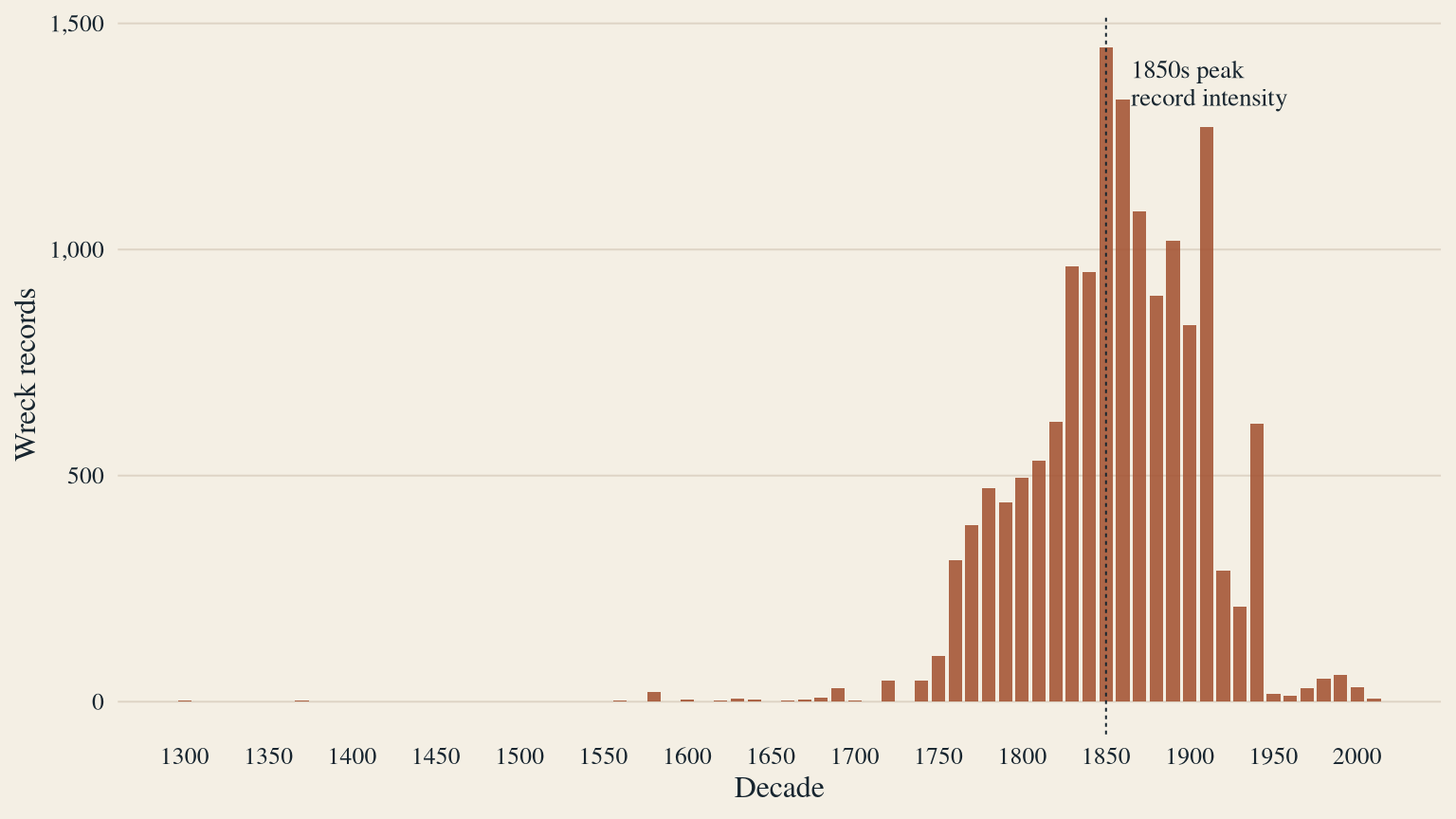
The decade curve should be read as recorded inventory intensity, not a clean rate of maritime danger. Still, the broad shape is useful. The 19th and early 20th century concentration reflects the age when Irish coastal trade, sail-to-steam transition, and documentary survival overlap most visibly.
Reading the map with restraint
The map is the right lead image because geography is genuinely part of the record. It is also the wrong place to overclaim. Only about one fifth of the inventory has coordinates, and those coordinates come from mixed sources. A hot patch on the map means “more coordinate-bearing records here,” not “this coast was objectively more dangerous” without exposure, traffic, weather, and search-effort denominators.
That limitation is not a failure of the figure. It is the point of the figure: administrative memory has a shape, and that shape is partly coastline, partly working-vessel history, and partly the survival of records.
Takeaway
This week rewards humble analysis. The wreck inventory is rich, but the mixed descriptions and uneven historical coverage make it risky to over-fit. The honest story is that administrative memory has a shape: categories reveal working vessels, dates reveal eras of documentation, and coordinates reveal where loss became record.