library(tidyverse)
library(tidytuesdayR)
library(scales)

raw <- tidytuesdayR::tt_load("2026-07-21")
nde_experiences <- raw$nde_experiencesTidy Tuesday: Near-Death Experiences (NDERF)
tidytuesday
health
narratives
archive
The NDERF archive is best read as sensitive public self-report data, where classifications and AI-coded motifs summarize narratives without replacing them.
Preface
From the TidyTuesday repository.
The NDERF file is sensitive data in the ordinary human sense, even when it is public and tabular. Each row points back to a narrated experience. I treated the dataset as a catalog of self-reports and labels, not as evidence for or against anyone’s metaphysics.
Coverage
| Measure | Value |
|---|---|
| Rows | 589 |
| Countries/regions represented | 65 |
| Classifications | 8 |
| AI motif columns | 8 |
Geography of the archive
nde_experiences %>%
  filter(!is.na(country), country != "") %>%
  count(country, sort = TRUE) %>%
  slice_head(n = 12) %>%
  mutate(country = fct_reorder(country, n)) %>%
  ggplot(aes(n, country)) +
  geom_col(fill = "#355070") +
  scale_x_continuous(labels = comma) +
  labs(x = "Reports", y = NULL) +
  theme_minimal(base_size = 12)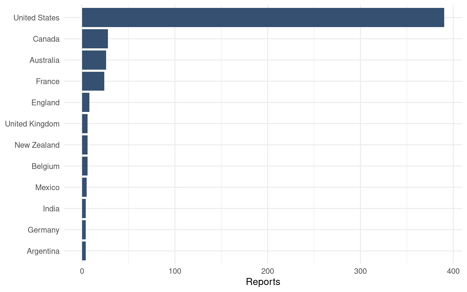
The country distribution is mostly an archive-access pattern. English-language web forms, internet access, and willingness to submit a narrative all sit between experience and row. That makes geographic interpretation tricky: this is where reports came from, not where near-death experiences “happen.”
Classifications
nde_experiences %>%
  filter(!is.na(classification), classification != "") %>%
  count(classification, sort = TRUE) %>%
  mutate(classification = fct_reorder(classification, n)) %>%
  ggplot(aes(n, classification)) +
  geom_col(fill = "#6d597a") +
  scale_x_continuous(labels = comma) +
  labs(x = "Reports", y = NULL) +
  theme_minimal(base_size = 12)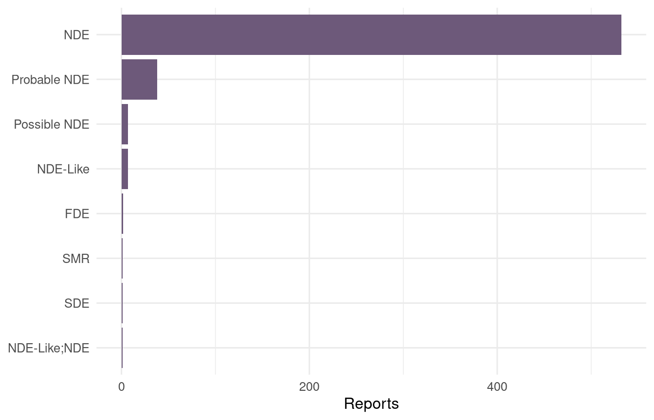
The classification field is helpful because it acknowledges that the archive is not one homogeneous phenomenon. Near-death reports sit beside related categories, and analysis should preserve that distinction unless there is a clear reason to pool them.
Coded motifs
nde_experiences %>%
  select(starts_with("ai_")) %>%
  summarise(across(everything(), ~ sum(.x, na.rm = TRUE))) %>%
  pivot_longer(everything(), names_to = "motif", values_to = "reports") %>%
  mutate(motif = str_remove(motif, "^ai_"), motif = str_replace_all(motif, "_", " "), motif = fct_reorder(motif, reports)) %>%
  ggplot(aes(reports, motif)) +
  # A lollipop preserves the honest global ranking without implying stable subgroup rates.
  geom_segment(aes(x = 0, xend = reports, yend = motif), color = "#dec4cc", linewidth = 0.8) +
  geom_point(color = "#b56576", size = 3.2) +
  geom_text(aes(label = comma(reports)), hjust = -0.5, size = 3.3) +
  scale_x_continuous(labels = comma, expand = expansion(mult = c(0, 0.12))) +
  labs(x = "Reports tagged TRUE", y = NULL) +
  theme_minimal(base_size = 12)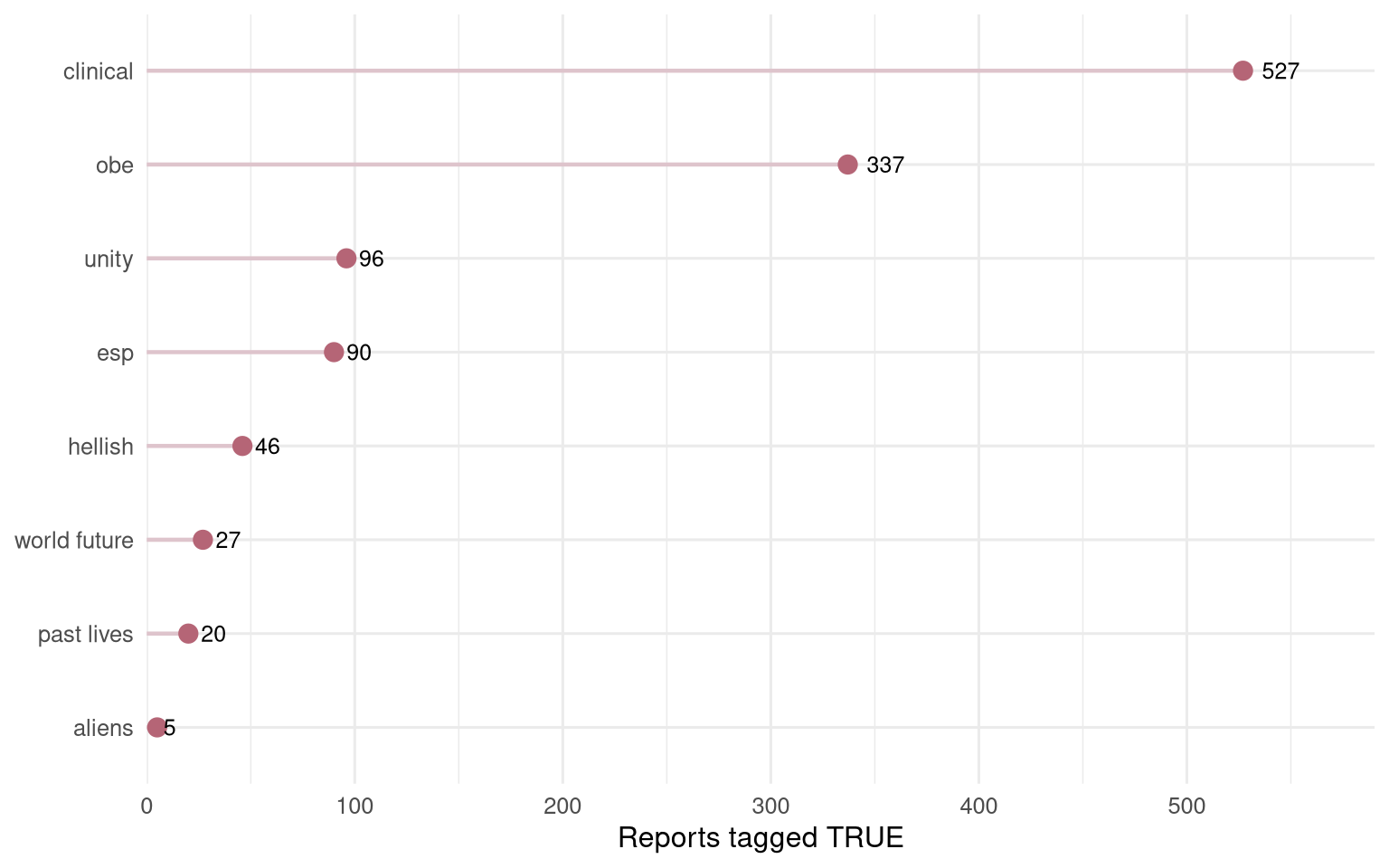
The AI motif columns are useful as a rough index, not as a final reading. They invite questions about out-of-body experience, unity, clinical details, ESP claims, and other themes, but the labels should be checked against source narratives before any strong claim.
Takeaway
This is a dataset where restraint is part of the method. Counts can summarize the archive, but they cannot carry the meaning of the stories alone. The right first pass is provenance-aware: who submitted, how the record was classified, and which computational labels are strong enough to support follow-up reading.